- Instantly extract effect sizes, F-ratios, and FDR-adjusted p-values from your models with the Calculate Effects Sizes extension, available now in the JMP Marketplace!
- New to JMP? Join us Sept. 23-24 for the Early User Edition of Discovery Summit, tailor-made for new users. Register now for free!
- Your voice matters! Tell us how you prefer to receive JMP updates, so we can tailor our communication to your needs. Take short survey.
- Subscribe to RSS Feed
- Mark Topic as New
- Mark Topic as Read
- Float this Topic for Current User
- Bookmark
- Subscribe
- Mute
- Printer Friendly Page
Discussions
Solve problems, and share tips and tricks with other JMP users.- JMP User Community
- :
- Discussions
- :
- How to create a side by side boxplot with data input as centered dots?

- Mark as New
- Bookmark
- Subscribe
- Mute
- Subscribe to RSS Feed
- Get Direct Link
- Report Inappropriate Content
How to create a side by side boxplot with data input as centered dots?
I'm trying to create a boxplot showing analysis data from different stations (placed on x- axis). When choosing plain boxes without the individual data shown as dots, it looks fine with the boxes within the same station placeded side to side. But when trying to add the dots, they are either displayed on the side of the boxes (some dots from different analyses overlap) or the boxes are overlapping, which makes it difficult to interpret the graph.
I would like to place the dots centered in each box, and at the same time place the boxes side by side. Is this possible?
I'm at beginners level, so I appreciate all the help I can get.
- Tags:
- windows

- Mark as New
- Bookmark
- Subscribe
- Mute
- Subscribe to RSS Feed
- Get Direct Link
- Report Inappropriate Content
Re: How to create a side by side boxplot with data input as centered dots?
Reformatting the data might be easiest option (you want to offset points). How to format the data is difficult to advice as there is no example data provided, but for example using JMP's Big Class:

then if data is stacked, you could plot something like this

- Mark as New
- Bookmark
- Subscribe
- Mute
- Subscribe to RSS Feed
- Get Direct Link
- Report Inappropriate Content
Re: How to create a side by side boxplot with data input as centered dots?
Thank you for your response!
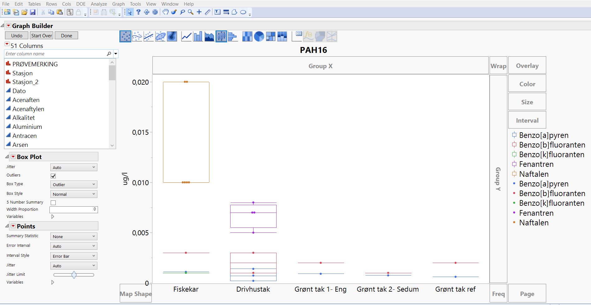
That looks like the result I am looking for. Looks like the lable in my case then should be the different stations where water samples were collected (i.e. fisketank, drivhustak etc. sorry- it is in norwegian) and insted of sex, I need the names of the different PAH contaminants. Then the question on how to actually reformat and stack data arises. This is the data table I am using atm, not sure if that helps?

Stasjon_2 = the column used in graph. It names the different stations where the water samples were collected
Dato = date
Columns to the right = different analyses including the PAH contaminants I am trying to present.
(More analyses in columns to the right)
- Mark as New
- Bookmark
- Subscribe
- Mute
- Subscribe to RSS Feed
- Get Direct Link
- Report Inappropriate Content
Re: How to create a side by side boxplot with data input as centered dots?
You would stack the analysis columns you have (or the ones you need for visualization). In this example height and weight.

Then when you have the graph and if you wish to hide some of those "labels" you can use local data filter
- Mark as New
- Bookmark
- Subscribe
- Mute
- Subscribe to RSS Feed
- Get Direct Link
- Report Inappropriate Content
Re: How to create a side by side boxplot with data input as centered dots?
Thank you so much, that worked! I hid the names of the different PAH contaminants on the x-axis, but that makes it a bit difficult to see which results belongs to which station (fiskekar, drivhustak etc). Do you know if there is a way to divide the graph for a better overview? For example with verticle lines or with a bigger gap between the stations?
The lines are added manually in word:

- Mark as New
- Bookmark
- Subscribe
- Mute
- Subscribe to RSS Feed
- Get Direct Link
- Report Inappropriate Content
Re: How to create a side by side boxplot with data input as centered dots?
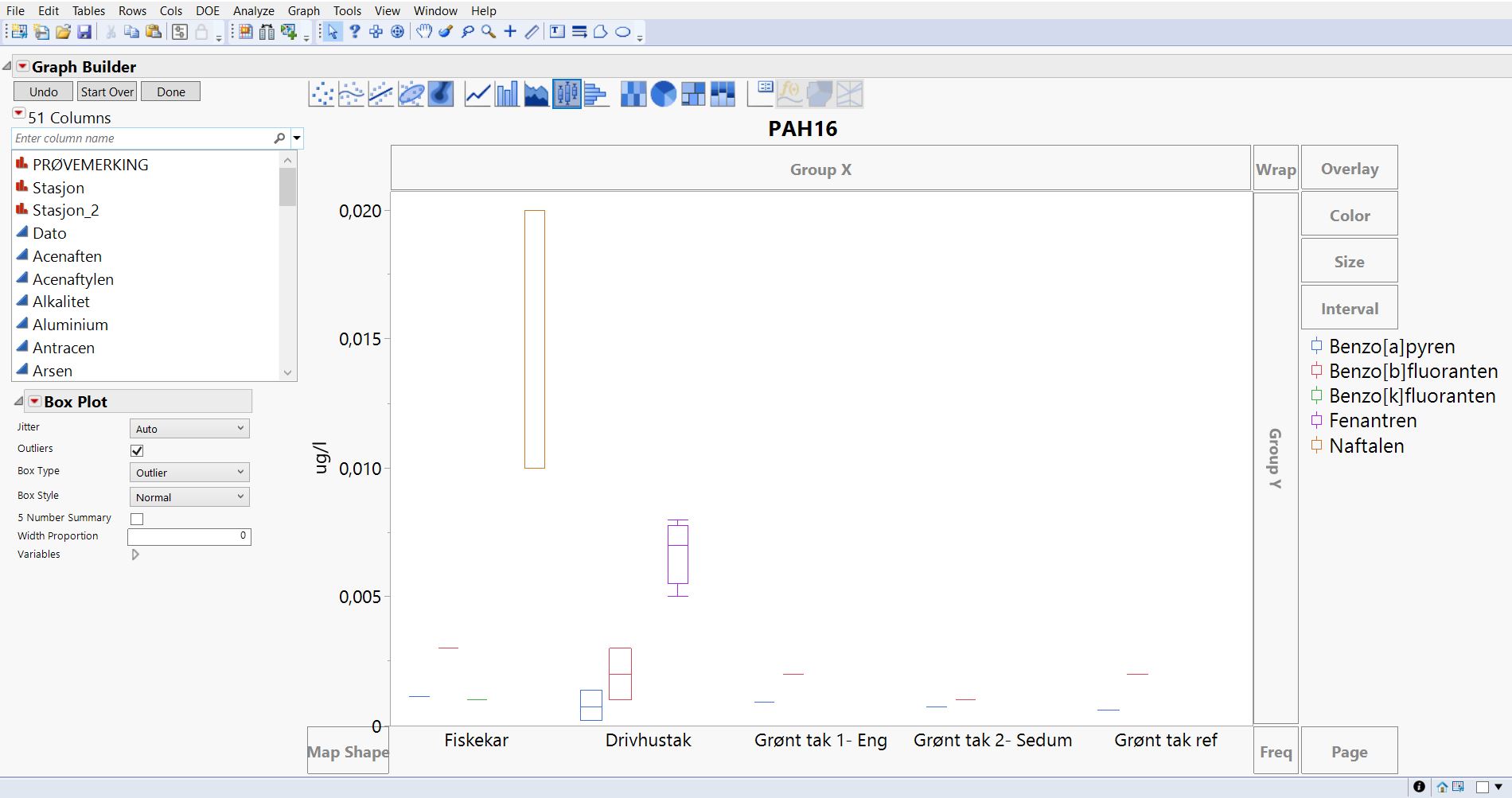
You could enable Show Grid from X-axis settings


and if your data works with X Group you could use that and add graph spacing


- Mark as New
- Bookmark
- Subscribe
- Mute
- Subscribe to RSS Feed
- Get Direct Link
- Report Inappropriate Content
Re: How to create a side by side boxplot with data input as centered dots?
Show grids was easy enough.
Not sure what you mean by "if your data works with X group". Nothing happens when trying to add graph spacing, so I guess the answer is no. Is there anything I can do to make it work?. I guess grids are good enogh, but spacing looks like an appealing solution.
Thank you for your help and patience!
Recommended Articles
- © 2026 JMP Statistical Discovery LLC. All Rights Reserved.
- Terms of Use
- Privacy Statement
- Contact Us