I'm using JMP 16.2.0 and I'm trying to automatically generate a graph builder with box plots and their mean values with the group X variable as the color. I'm using a bar chart with style=floating to display the mean value (inspired by this topic)
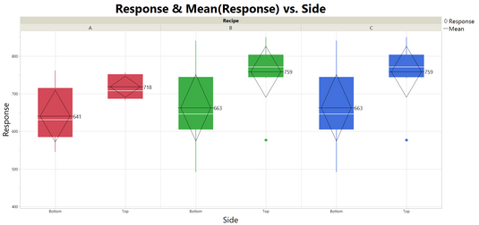
My current graph:

This is almost what I want, except for a few things.
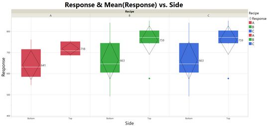
1. I'd like the Group X variable (Recipe) to be visible in the legend as well. One way I tried it is to use Color=Recipe in the graph builder (see image below). This produces a double entry for each grouping variable value however, and the horizontal line for the mean is no longer black. Can the duplicate entries be removed automatically? And how do I change the mean line color? Note that the number of distinct values of the "Recipe" variable can vary for different data sets.

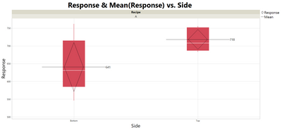
2. When the number of Recipe values is low, the mean value line becomes very wide with respect to the box plot. Can this be scripted to be equal to the box's width?

3. There is no padding between the mean line and the value label, which looks quite odd. Again, can all values be shifted automatically?

Attached is my jmp file with the script for the two graphs shown above, any help will be appreciated