- New to JMP? Let the Data Analysis Director guide you through selecting an analysis task, an analysis goal, and a data type. Available now in the JMP Marketplace!
- See how to install JMP Marketplace extensions to customize and enhance JMP.
- Subscribe to RSS Feed
- Mark Topic as New
- Mark Topic as Read
- Float this Topic for Current User
- Bookmark
- Subscribe
- Mute
- Printer Friendly Page
Discussions
Solve problems, and share tips and tricks with other JMP users.- JMP User Community
- :
- Discussions
- :
- How to create a bar-mekko chart (variable width bar chart) in JMP / Graph Builde...
- Mark as New
- Bookmark
- Subscribe
- Mute
- Subscribe to RSS Feed
- Get Direct Link
- Report Inappropriate Content
How to create a bar-mekko chart (variable width bar chart) in JMP / Graph Builder
Is it possible to create a bar-mekko chart in JMP? see e.g.
https://kb.tableau.com/articles/howto/create-a-variable-width-bar-chart-aka-cascade-chart
I can create a bar chart with categories on the X-axis and Numerical on the Y-axis, and sort ascending. Then, intuitively, dragging another numerical column to the "Size" field should create such a chart (Size = widths of the bars in the chart?) but nothing happens if I do that. I can only color the bars instead, i.e. dragging to the "Color" field in the Graph builder.
Thanks in advance for any help.
Accepted Solutions
- Mark as New
- Bookmark
- Subscribe
- Mute
- Subscribe to RSS Feed
- Get Direct Link
- Report Inappropriate Content
Re: How to create a bar-mekko chart (variable width bar chart) in JMP / Graph Builder
Two options that I can think of (neither is a bar chart) that would get you close are:
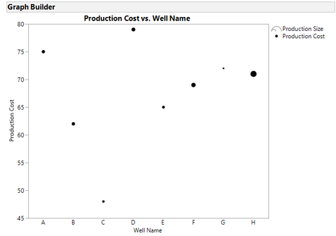
1) don't use bars. Stick with a scatterplot and set the size of the point to be the production size. That would give you something like this:
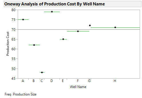
2) use Fit Y by X, put the Production Size in as a Frequency variable (Fit Y by X has an X-axis proportional default setting). That gives you something like this:
You could play around with some additional options to try and make them look a bit better.
Of course you could always write a script to do this.
- Mark as New
- Bookmark
- Subscribe
- Mute
- Subscribe to RSS Feed
- Get Direct Link
- Report Inappropriate Content
Re: How to create a bar-mekko chart (variable width bar chart) in JMP / Graph Builder
https://community.jmp.com/t5/JMP-Blog/Introducing-packed-bars-a-new-chart-form/ba-p/39972
- Mark as New
- Bookmark
- Subscribe
- Mute
- Subscribe to RSS Feed
- Get Direct Link
- Report Inappropriate Content
Re: How to create a bar-mekko chart (variable width bar chart) in JMP / Graph Builder
Thanks Mike, I had looked at that but this is not really what I intend here. Also, packed bars get very confusing because unrelated categories are mixed. The variable width bar charts are very common in the mining / oil & gas world, e.g. production cost on the y-axis, mine/well name as category on the x-axis, and mine/well production size as bar width. Would be cool if this could be added in the graph builder at some point (like I described via dragging a column on the size field with a bar chart).
- Mark as New
- Bookmark
- Subscribe
- Mute
- Subscribe to RSS Feed
- Get Direct Link
- Report Inappropriate Content
Re: How to create a bar-mekko chart (variable width bar chart) in JMP / Graph Builder
Two options that I can think of (neither is a bar chart) that would get you close are:
1) don't use bars. Stick with a scatterplot and set the size of the point to be the production size. That would give you something like this:
2) use Fit Y by X, put the Production Size in as a Frequency variable (Fit Y by X has an X-axis proportional default setting). That gives you something like this:
You could play around with some additional options to try and make them look a bit better.
Of course you could always write a script to do this.
- Mark as New
- Bookmark
- Subscribe
- Mute
- Subscribe to RSS Feed
- Get Direct Link
- Report Inappropriate Content
Re: How to create a bar-mekko chart (variable width bar chart) in JMP / Graph Builder
Thanks Dan, I will try the scripting and the suggested alternatives.
- Mark as New
- Bookmark
- Subscribe
- Mute
- Subscribe to RSS Feed
- Get Direct Link
- Report Inappropriate Content
Re: How to create a bar-mekko chart (variable width bar chart) in JMP / Graph Builder
Attached is a very simple script that builds on Dan's suggestion. It shows how to make bars instead of points. I tested it on JMP 12, 13 and 14.
If I were building an application, I'd create a summary table based upon user input and likely build the graph using Shape Seg with rowstates associated with the table.
- Mark as New
- Bookmark
- Subscribe
- Mute
- Subscribe to RSS Feed
- Get Direct Link
- Report Inappropriate Content
Re: How to create a bar-mekko chart (variable width bar chart) in JMP / Graph Builder
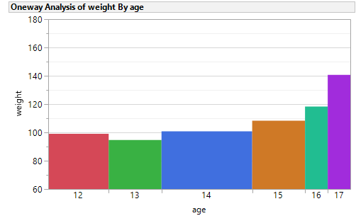
Oh, one more suggestion. Mosaic plots scale by N/Weight. You might want to resarch them in the Scripting Index.
Names Default To Here( 1 );
dt = Open( "$SAMPLE_DATA/Big Class.jmp" );
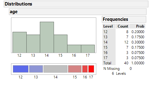
obj = Distribution( Column( :Age ) );
obj << Mosaic Plot( 1 );- Mark as New
- Bookmark
- Subscribe
- Mute
- Subscribe to RSS Feed
- Get Direct Link
- Report Inappropriate Content
Re: How to create a bar-mekko chart (variable width bar chart) in JMP / Graph Builder
Starting with JMP 16 the bars element will support the size role to allow for this kind of chart.
- Mark as New
- Bookmark
- Subscribe
- Mute
- Subscribe to RSS Feed
- Get Direct Link
- Report Inappropriate Content
Re: How to create a bar-mekko chart (variable width bar chart) in JMP / Graph Builder
In JMP17, Size is an element in the bar chart of the Chart Builder. However, assigning a quantitative column to this element does not change the bar widths.
Below is an example with state population data. The intention is for the bar width to be proprotional to the state population. That is similar to what user Achim_T wanted to do.
- Mark as New
- Bookmark
- Subscribe
- Mute
- Subscribe to RSS Feed
- Get Direct Link
- Report Inappropriate Content
Re: How to create a bar-mekko chart (variable width bar chart) in JMP / Graph Builder
I found the solution.
To get this output, I had to control (or right) click the x axis to bring up options. Then choose Size by..., then Other, then the column I wanted to use.
I'm putting the solution here so that I will find it when I forget next time. Perhaps others will too.
Dropping the intended variable into the size element on the right, as I did above, does not work.
Recommended Articles
- © 2026 JMP Statistical Discovery LLC. All Rights Reserved.
- Terms of Use
- Privacy Statement
- Contact Us


