- Learn how to build custom Python data connectors and further customize JMP’s Data Connector Framework with the Python Data Connector Demo, available now in the JMP Marketplace!
- See how to use Accelerated Life Testing (ALT) to evaluate reliability. Register for June 5 webinar, 2pm US Eastern Time.
- Subscribe to RSS Feed
- Mark Topic as New
- Mark Topic as Read
- Float this Topic for Current User
- Bookmark
- Subscribe
- Mute
- Printer Friendly Page
Discussions
Solve problems, and share tips and tricks with other JMP users.- JMP User Community
- :
- Discussions
- :
- Re: How to color points by one property and shape them by another and make legen...

- Mark as New
- Bookmark
- Subscribe
- Mute
- Subscribe to RSS Feed
- Get Direct Link
- Report Inappropriate Content
How to color points by one property and shape them by another and make legends for each
I have a data table with four columns. The first two are called X and Y and are continuous variables. The last two columns are categorical variables called Color and Shape.
I want to create a scatterplot of X by Y where the points are colored according to the entries in the Color column and the shape of the markers is selected according to the Shape column. I would like to make a row legend for Shape and a row legend for Color.
Is it possible to do this using the interface only in JMP 16?
Here are some example data

I have been able to make such a plot using Graph/Scatterplot Matrix and selecting X and Y to their respective roles. I can then make two legends (one for Color and then one for Shape) using right-click/Row menu

But when I add the second row menu for shape, the colors correspond to categories in the shape column.

I want them to stay as they were in the first screen shot instead of what I see below.

It seems like color and shape are coupled together and cannot be specified separately.
I also tried to do this using the graph builder without any success.
Accepted Solutions

- Mark as New
- Bookmark
- Subscribe
- Mute
- Subscribe to RSS Feed
- Get Direct Link
- Report Inappropriate Content
Re: How to color points by one property and shape them by another and make legends for each
Hi @MathBasilisk1p6,
Welcome in the Community !
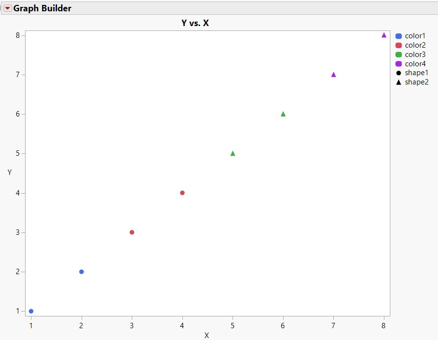
To have both informations (color and shape) in the same graph, it is relatively easy with Graph Builder :
- Specify your X and Y in the graph,
- Use your column "Color" in the "Color" panel of the Graph Builder,
- Use your column "Shape" in the "Overlay" panel of the Graph Builder.
Doing this, you can have the same type of graph as the image in copy.
By right-clicking in the legend on colors, you'll be able to change them, and on "shape" and then "marker", you'll be able to change the type of marker (circle, triangle, square, ...).
I also attached the toy datatable and script so you can use them and try.
Hope this answer will help you,
"It is not unusual for a well-designed experiment to analyze itself" (Box, Hunter and Hunter)
- Mark as New
- Bookmark
- Subscribe
- Mute
- Subscribe to RSS Feed
- Get Direct Link
- Report Inappropriate Content
Re: How to color points by one property and shape them by another and make legends for each
Hi @MathBasilisk1p6,
Welcome in the Community !
To have both informations (color and shape) in the same graph, it is relatively easy with Graph Builder :
- Specify your X and Y in the graph,
- Use your column "Color" in the "Color" panel of the Graph Builder,
- Use your column "Shape" in the "Overlay" panel of the Graph Builder.
Doing this, you can have the same type of graph as the image in copy.
By right-clicking in the legend on colors, you'll be able to change them, and on "shape" and then "marker", you'll be able to change the type of marker (circle, triangle, square, ...).
I also attached the toy datatable and script so you can use them and try.
Hope this answer will help you,
"It is not unusual for a well-designed experiment to analyze itself" (Box, Hunter and Hunter)
- Mark as New
- Bookmark
- Subscribe
- Mute
- Subscribe to RSS Feed
- Get Direct Link
- Report Inappropriate Content
Re: How to color points by one property and shape them by another and make legends for each
Thanks Victor. I accepted this solution since I think that it is the better way to solve the problem. However, my original post was for the Scatterplot Matrix platform and it turns out that the interface to this platform had a gotcha that I never caught until later - this was the real cause of my problem. I will add the solution in a separate post. It may also help people using the "Rows/Color or mark by column" interface.
- Mark as New
- Bookmark
- Subscribe
- Mute
- Subscribe to RSS Feed
- Get Direct Link
- Report Inappropriate Content
Re: How to color points by one property and shape them by another and make legends for each
Ok I understand the problem.
What you might do is select rows and right click in the data table for each group of rows (color or marker type) you want to specify and then indicate marker type and color.
This way, since the information will be directly in the rows of the data table, the colours and shape of the points will be used by the other platforms you use.
Hope this will provide a more general solution to your problem,
"It is not unusual for a well-designed experiment to analyze itself" (Box, Hunter and Hunter)
- Mark as New
- Bookmark
- Subscribe
- Mute
- Subscribe to RSS Feed
- Get Direct Link
- Report Inappropriate Content
Re: How to color points by one property and shape them by another and make legends for each
After creating the initial scatterplot from the table above (using Graph/Scatterplot Matrix), right-click on the graph and select "Row Legend". This dialog box appears:

Select "Color" and JMP automatically assigns colors to the categorical variable using "JMP Default" setting in the colors pull-down option. This can be changed but I left it as-is. Note that Markers is pre-selected as "None". I left this as is. Pressed ok.
On the resulting graph, I again right-clicked and selected "Row Legend". And I see this:

When I click on "Shape" under columns, note that JMP assumes that I want to use this column to again assign a color. I have to do two things. First, I have to select a marker scheme from the "Markers" pull-down menu. I chose "Solid" like this:

Then, for the most important step, I have to click on the Colors menu and change the pre-selected JMP Default" option to the "None" option which is "hidden" all the way at the top of the pull-down menu. Here:

Then click on ok. To get the final graph with two legends.

This is what I want.
The combination of the pre-selected Color menu-item and the "None" hidden all the way at the top cost me hoursOfFun (mostly searching through documentation and posts). Maybe this dialog box needs a bit of tweaking. It's the same that is under "Rows/Color or mark by column . . . " so it's a fairly important bit of kit.
Hope this helps someone else save some time.
- Mark as New
- Bookmark
- Subscribe
- Mute
- Subscribe to RSS Feed
- Get Direct Link
- Report Inappropriate Content
Re: How to color points by one property and shape them by another and make legends for each
Ok I see your pain point, and it is indeed not very intuitive to get to this result through this platform.
The different steps you present lead you to the right results, I was able to reproduce your final result.
However, I think it is always easier to use Graph Builder if/when possible, due to the interactivity and ease of use for most common graphs.
Glad you found the result with the Scatterplot matrix platform. As I stated before, you can also do manipulation on the datatable to specify markers and colors depending on some columns, or use column properties to set up conditions on the marker/color of your observations to get quickly to the results (but the legend behind markers and colors may not always be visible).
Have a nice day and happy holidays,
"It is not unusual for a well-designed experiment to analyze itself" (Box, Hunter and Hunter)
Recommended Articles
- © 2026 JMP Statistical Discovery LLC. All Rights Reserved.
- Terms of Use
- Privacy Statement
- Contact Us