- New to JMP? Let the Data Analysis Director guide you through selecting an analysis task, an analysis goal, and a data type. Available now in the JMP Marketplace!
- See how to install JMP Marketplace extensions to customize and enhance JMP.
- Subscribe to RSS Feed
- Mark Topic as New
- Mark Topic as Read
- Float this Topic for Current User
- Bookmark
- Subscribe
- Mute
- Printer Friendly Page
Discussions
Solve problems, and share tips and tricks with other JMP users.- JMP User Community
- :
- Discussions
- :
- Re: How to Plot graph with reference lines for each element of table summary
- Mark as New
- Bookmark
- Subscribe
- Mute
- Subscribe to RSS Feed
- Get Direct Link
- Report Inappropriate Content
How to Plot graph with reference lines for each element of table summary
Hi All,
I am trying to plot graphs (script , JMP 13) with reference lines for each element of my table summary (graph of score vs # try for each Name+Grade, then add reference line of 25 and 75 percentile of Score on x axis). Would appreciate any comment
| Name | Grade | Score | # try |
| name1 | A | 80 | 2 |
| name1 | A | 82 | 3 |
| name1 | B | 98 | 3 |
| name1 | C | 86 | 2 |
| name2 | A | 88 | 3 |
| name3 | A | 90 | 2 |
| name3 | A | 88 | 1 |
| name3 | A | 94 | 3 |
| name4 | B | 96 | 2 |
| name4 | B | 82 | 4 |
| name4 | A | 100 | 1 |
| name4 | C | 92 | 2 |
| name5 | A | 84 | 3 |
Accepted Solutions
- Mark as New
- Bookmark
- Subscribe
- Mute
- Subscribe to RSS Feed
- Get Direct Link
- Report Inappropriate Content
Re: How to Plot graph with reference lines for each element of table summary
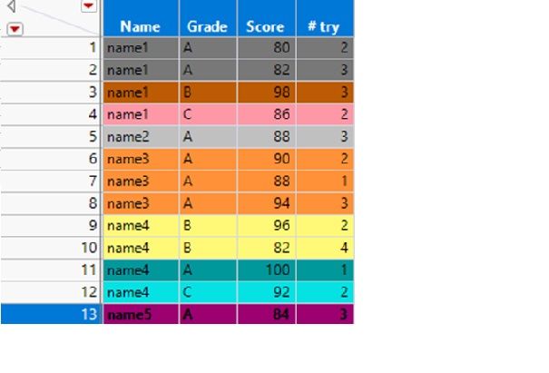
Thanks @Craige_Hales for the link, but my main difficulty is how to program to output the individual graphs as each have their own reference lines, more clearly, I am wondering how to generate graphs for each color in this data table :
Thanks!
- Mark as New
- Bookmark
- Subscribe
- Mute
- Subscribe to RSS Feed
- Get Direct Link
- Report Inappropriate Content
Re: How to Plot graph with reference lines for each element of table summary
Hi @spinup,
I think I understand what you want. But, I'm also a little confused: are you wanting to summarize or just graph the 9 separate bivariate graphs?
Working off your original data table, you can easily create all 9 graphs if you do a bivariate fit, e.g.:
Bivariate(
  Y( :Score ), X( :Name( "# try" ) ),
  By( :Name, :Grade )
);
This will generate your nine graphs that you had colored in your previous post.
Then, what you'll probably have to do is use a For Loop(s) to generate the quantile lines (or shaded area).
The script for the first graph would be something like:
Bivariate(
	Y( :Score ),
	X( :Name( "# try" ) ),
	Where( :Name == "name1" & :Grade == "A" ), // this would be selecting
	SendToReport(
		Dispatch(
			{},
			"2",
			ScaleBox,
			{Min( 75 ), Max( 100 ), Inc( 5 ), Minor Ticks( 1 ), // this sets the appearance of the y-axis
			Add Ref Line( 83, "Solid", "Blue", "25th quantile", 1 ),
			Add Ref Line( 95, "Solid", "Blue", "75th quantile", 1 )}
		)
	)
);
In fact, if you set up a list of the names NameList={"Name1", "Name2"...}, or pull it from the column elements, then you can have a very short script by putting in For Loops and just us reference the NameList[i] element. This would be also the case for the Where(:Name==NameList[i] & Grade == GradeList[i]).
Another option would be to inspect the tree structure of the output from the first script I included above and then you'd reference the AxisBox(i) for each of the y-axes for the 9 graphs. The y-axes are all odd, so if you do a For Loop, then you'd have to do i++ so that it iterates from 1 to 3 to 5 and so on in the loop.
There's some really good stuff in the link that @Craige_Hales provided.
For your specific issue, I think you'll definitely need to do some looping. Either that, or you can do the whole thing manually once and then just save the script to the data table (probably as a group), and then you can copy/paste that and save as a separate JSL file in a new script window. If you can figure out how to do it manually, JMP will write the JSL for you, and all you need to do is put it all together into a master JSL file that takes care of it all for you. The only issue there is if you decide to change names or column references or things like that. If you do, then you'll need to start using local variables.
Hope this helps!,
DS
- Mark as New
- Bookmark
- Subscribe
- Mute
- Subscribe to RSS Feed
- Get Direct Link
- Report Inappropriate Content
Re: How to Plot graph with reference lines for each element of table summary
Hi @spinup,
I'm not sure I understand entirely what you want to do, but you might have a hard time scripting the whole thing entirely. If you are keeping the data table around for a while, or load it in, you might want to do the analyses separately and then save them to the data table.
If you do want to script the whole thing, you'll need to still run the analyses to determine the 25/75 quantiles, etc.
When you say you're graphing "score vs # try", do you mean when you do a "fit y by x" that score is "y" and "# try" is "x"?
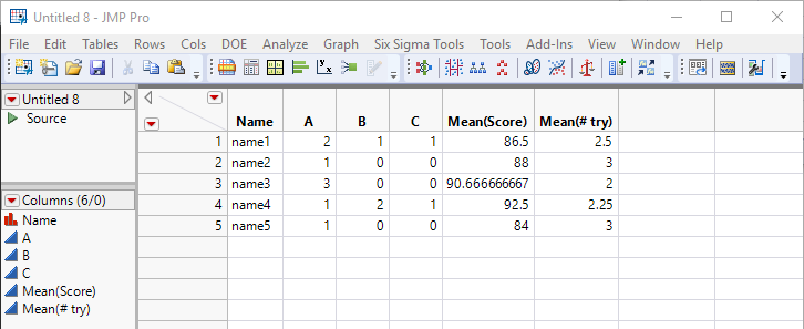
Also, when you say table summary, do you mean you're finding the mean of score and #try while grouping by name and grade? Or, do you mean you're tabulating by name the grade and finding the mean of score & #try values?
You could do it a couple ways though. I took your table and brought it into JMP, and here's what I did (assuming I am thinking about it the same way as you):
Tabulate by Name (A, B, C are the # tries), this helps to get the means, but you can script this separately if needed.
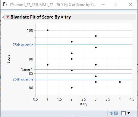
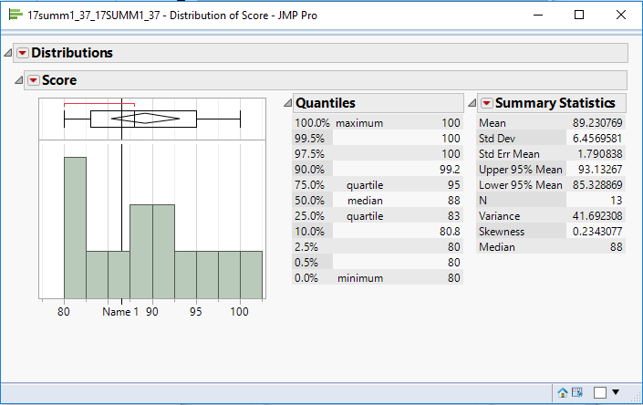
With this at hand, I graphed it a couple different ways: bivariate fit or histogram (histogram already has the quartile info readily available from the box plot). and then you can add reference lines via the normal way.
For scripting all this out, be sure to use the red hot button to get to the actual JSL script to generate what you want. But again, if you save the script to the data table, then each time you open up the data table, you can click the green hot button and re-run it quickly.
Hope this helps!,
DS
- Mark as New
- Bookmark
- Subscribe
- Mute
- Subscribe to RSS Feed
- Get Direct Link
- Report Inappropriate Content
Re: How to Plot graph with reference lines for each element of table summary
Thanks @SDF1 for your reply and sorry for not being very clear. Here I would like to explain a little more:
first of all, I am trying to write the script in a separate script window so I can run it independently, here is the first part of the script where I am trying to get the summary:
Names Default To Here( 1 );
dt = Current Data Table();
Summary = dt << Summary(
	Group( :Name, :Grade ),
	Median( :Score ),
// other statistics can be added here//
	Link to Original Data Table( 0 )
);
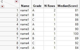
the Output will look like this :
Now , What I really want is the 9 graphs ( Score vs # try) (one for each row (having N Rows datapoints) ), and then use the statistics of each group to add to the reference lines ( all by scripting).
In your graph example, looks it is for name1 with any Grade.
Thanks
- Mark as New
- Bookmark
- Subscribe
- Mute
- Subscribe to RSS Feed
- Get Direct Link
- Report Inappropriate Content
Re: How to Plot graph with reference lines for each element of table summary
Here's a related post: https://community.jmp.com/t5/JSL-Cookbook/Use-Summary-to-Automatically-Add-Reference-Lines-to-Graph/...
- Mark as New
- Bookmark
- Subscribe
- Mute
- Subscribe to RSS Feed
- Get Direct Link
- Report Inappropriate Content
Re: How to Plot graph with reference lines for each element of table summary
Thanks @Craige_Hales for the link, but my main difficulty is how to program to output the individual graphs as each have their own reference lines, more clearly, I am wondering how to generate graphs for each color in this data table :
Thanks!
- Mark as New
- Bookmark
- Subscribe
- Mute
- Subscribe to RSS Feed
- Get Direct Link
- Report Inappropriate Content
Re: How to Plot graph with reference lines for each element of table summary
Maybe something like this
dtBigClass = Open( "$sample_data/big class.jmp" );

dtage = dtBigClass << Summary( Group( :age ) ); // makes a small table of unique ages
ages = dtage[0, 1]; // [12, 13, 14, 15, 16, 17]
Close( dtage, "nosave" ); // table no longer needed

grid = Lineup Box( N Col( 3 ), spacing( 20, 30 ) ); // Horz,Vert extra space between graphs in pixels
For( iAge = 1, iAge <= N Rows( ages ), iAge += 1, // for each age...

	dtBigClass << selectwhere( age == ages[iAge] );
	dtSubset = dtBigClass << subset( selectedrows( 1 ), linked( 1 ), "invisible" );

	// the summary will be a single row with the requested information
	dtSummary = dtSubset << Summary( Mean( :height ), Mean( :weight ), Std Dev( :height ), Std Dev( :weight ), Freq( "None" ), Weight( "None" ) );
	// grab the values of interest in simpler variable names
	heightMean = dtSummary:name( "Mean(height)" )[1]; // row one has the answers
	heightStdDev = dtSummary:name( "Std Dev(height)" )[1];
	weightMean = dtSummary:name( "Mean(weight)" )[1];
	weightStdDev = dtSummary:name( "Std Dev(weight)" )[1];
	Close( dtSummary, "nosave" ); // close the work table, no longer needed

	// make a graph, attach to a borderbox so it does not open in a window...
	bb = Border Box(
		dtSubset << Graph Builder(
			Size( 400, 300 ),
			Show Control Panel( 0 ),
			Show Legend( 0 ), // don't need a legend
			Variables( X( :height ), Y( :weight ) ),
			Elements( Points( X, Y, Legend( 5 ) ) ),
			// add ref lines. You can get a script like this GraphBuilder script by
			// making a graph builder interactively, then using the red triangle->get script.
			// below, the numbers in the script have been replaced with the variables above.
			SendToReport(
				Dispatch(
					{},
					"height",
					ScaleBox,
					{Add Ref Line( heightMean, "Dotted", "Red", "", 2 ), Add Ref Line( heightMean + heightStdDev, "Dotted", "Blue", "", 2 ),
					Add Ref Line( heightMean - heightStdDev, "Dotted", "Blue", "", 2 ),
						// force all axes to be the same...
					Min( 48.2828947368421 ), Max( 75.8776488919668 ), Inc( 5 ), Minor Ticks( 1 )}
				),
				Dispatch(
					{},
					"weight",
					ScaleBox,
					{Add Ref Line( weightMean, "Dotted", "Red", "", 2 ), Add Ref Line( weightMean + weightStdDev, "Dotted", "Blue", "", 2 ),
					Add Ref Line( weightMean - weightStdDev, "Dotted", "Blue", "", 2 ),
						// force all axes to be the same...
					Min( 55.2100840336134 ), Max( 188.127074359155 ), Inc( 20 ), Minor Ticks( 0 )}
				),
				Dispatch( {}, "Graph Builder", FrameBox, {Marker Size( 6 ), Transparency( 1 )} ), // make the markers bigger
				Dispatch( {}, "graph title", TextEditBox, {Set Text( "Age = " || Char( ages[iAge] ) )} ), // add the age= title
				Dispatch( {}, "Graph Builder", OutlineBox, {Set Title( "" )} ) // suppress the Graph Builder title
			)
		)
	);
	grid << append( bb ); // add the graph to the grid
); // the iAge loop

dtBigClass << clearRowStates; // undo the final selection
New Window( "the report", V List Box( H Center Box( Text Box( "Big Report", <<setFontSize( 20 ) ) ), grid ) );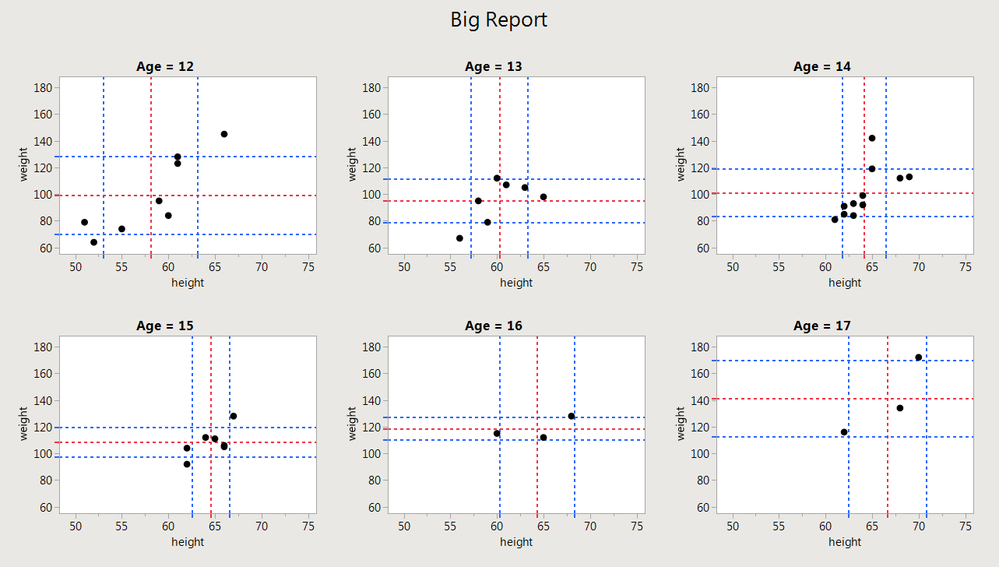
- Mark as New
- Bookmark
- Subscribe
- Mute
- Subscribe to RSS Feed
- Get Direct Link
- Report Inappropriate Content
Re: How to Plot graph with reference lines for each element of table summary
Hi @spinup,
I think I understand what you want. But, I'm also a little confused: are you wanting to summarize or just graph the 9 separate bivariate graphs?
Working off your original data table, you can easily create all 9 graphs if you do a bivariate fit, e.g.:
Bivariate(
  Y( :Score ), X( :Name( "# try" ) ),
  By( :Name, :Grade )
);
This will generate your nine graphs that you had colored in your previous post.
Then, what you'll probably have to do is use a For Loop(s) to generate the quantile lines (or shaded area).
The script for the first graph would be something like:
Bivariate(
	Y( :Score ),
	X( :Name( "# try" ) ),
	Where( :Name == "name1" & :Grade == "A" ), // this would be selecting
	SendToReport(
		Dispatch(
			{},
			"2",
			ScaleBox,
			{Min( 75 ), Max( 100 ), Inc( 5 ), Minor Ticks( 1 ), // this sets the appearance of the y-axis
			Add Ref Line( 83, "Solid", "Blue", "25th quantile", 1 ),
			Add Ref Line( 95, "Solid", "Blue", "75th quantile", 1 )}
		)
	)
);
In fact, if you set up a list of the names NameList={"Name1", "Name2"...}, or pull it from the column elements, then you can have a very short script by putting in For Loops and just us reference the NameList[i] element. This would be also the case for the Where(:Name==NameList[i] & Grade == GradeList[i]).
Another option would be to inspect the tree structure of the output from the first script I included above and then you'd reference the AxisBox(i) for each of the y-axes for the 9 graphs. The y-axes are all odd, so if you do a For Loop, then you'd have to do i++ so that it iterates from 1 to 3 to 5 and so on in the loop.
There's some really good stuff in the link that @Craige_Hales provided.
For your specific issue, I think you'll definitely need to do some looping. Either that, or you can do the whole thing manually once and then just save the script to the data table (probably as a group), and then you can copy/paste that and save as a separate JSL file in a new script window. If you can figure out how to do it manually, JMP will write the JSL for you, and all you need to do is put it all together into a master JSL file that takes care of it all for you. The only issue there is if you decide to change names or column references or things like that. If you do, then you'll need to start using local variables.
Hope this helps!,
DS
Recommended Articles
- © 2026 JMP Statistical Discovery LLC. All Rights Reserved.
- Terms of Use
- Privacy Statement
- Contact Us
