- New to JMP? Let the Data Analysis Director guide you through selecting an analysis task, an analysis goal, and a data type. Available now in the JMP Marketplace!
- See how to install JMP Marketplace extensions to customize and enhance JMP.
- Subscribe to RSS Feed
- Mark Topic as New
- Mark Topic as Read
- Float this Topic for Current User
- Bookmark
- Subscribe
- Mute
- Printer Friendly Page
Discussions
Solve problems, and share tips and tricks with other JMP users.- JMP User Community
- :
- Discussions
- :
- How to (1) change default color in AxisBox and (2) add reference line in only on...
- Mark as New
- Bookmark
- Subscribe
- Mute
- Subscribe to RSS Feed
- Get Direct Link
- Report Inappropriate Content
How to (1) change default color in AxisBox and (2) add reference line in only one Y-axis variable in grouped Y plots?
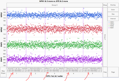
In the chart generated by the script below I would like to change the color of the lines indicated by the red arrows ("the separator lines") to purple. Also I would like to add a horizontal reference line only for the lowest y-axis variable (in this case PNP1).
How to do these via JSL?
(Note in my actual case the y-axis data is not from a column unlike in this example case)
Names Default To Here( 1 );
dt = Open( "$SAMPLE_DATA/Semiconductor Capability.jmp" );
Graph Builder(
	Size( 960, 695 ),
	Variables(
		X( :SITE ),
		X( :lot_id, Position( 1 ) ),
		X( :wafer, Position( 1 ) ),
		Y( :NPN1 ),
		Y( :NPN2 ),
		Y( :PNP3 ),
		Y( :PNP1 )
	),
	Elements( Position( 1, 1 ), Points( X( 1 ), X( 2 ), X( 3 ), Y, Legend( 44 ) ) ),
	Elements( Position( 1, 2 ), Points( X( 1 ), X( 2 ), X( 3 ), Y, Legend( 43 ) ) ),
	Elements( Position( 1, 3 ), Points( X( 1 ), X( 2 ), X( 3 ), Y, Legend( 38 ) ) ),
	Elements( Position( 1, 4 ), Points( X( 1 ), X( 2 ), X( 3 ), Y, Legend( 40 ) ) ),
	SendToReport(
		Dispatch(
			{},
			"SITE",
			ScaleBox,
			{Label Row( 3, {Major Grid Line Color( 8 ), Show Major Grid( 1 )} )}
		)
	)
);
- Tags:
- windows
- Mark as New
- Bookmark
- Subscribe
- Mute
- Subscribe to RSS Feed
- Get Direct Link
- Report Inappropriate Content
Re: How to (1) change default color in AxisBox and (2) add reference line in only one Y-axis variable in grouped Y plots?
the first time, you can run getTestStage(1) manually.
Please note that with the Data Filter there are 1-3 FrameBoxes in the GraphBuilder (most of the time, just 1?). So either you determine which FB to send the message to - or just select one TestStage and always send the command to Framebox 1.
- Mark as New
- Bookmark
- Subscribe
- Mute
- Subscribe to RSS Feed
- Get Direct Link
- Report Inappropriate Content
Re: How to (1) change default color in AxisBox and (2) add reference line in only one Y-axis variable in grouped Y plots?
By the way - there is a new feature in Jmp17:
add dynamic reference lines based on statistics values
Graph Builder(
	Y Group Edge( "Left" ),
	Summary Statistic( "Median" ),
	Variables( X( :PartNumber ), Y( :Median ), Group Y( :TestStage ) ),
	Elements(
		Points( X, Y, Legend( 33 ) ),
		Smoother( X, Y, Legend( 34 ) ),
		Caption Box(
			X,
			Y,
			Summary Statistic( "Median" ),
			Location( "Axis Reference Line" )
		)
	),
	Local Data Filter(
		Conditional,
		Add Filter( columns( :TestStage ), Where( :TestStage == 1 ) )
	)
)
- Mark as New
- Bookmark
- Subscribe
- Mute
- Subscribe to RSS Feed
- Get Direct Link
- Report Inappropriate Content
Re: How to (1) change default color in AxisBox and (2) add reference line in only one Y-axis variable in grouped Y plots?
Hi @Neo ,
That's a very cool idea that @hogi has in regards to using a Filter Change Handler. I hadn't thought of that. I modified your above code to fix the two issues you were having. The script will now create the first graph with the reference line, and then update each graph accordingly, even when choosing more than one data filter. Does this solve the issue?
Names Default To Here( 1 );

dt = Current Data Table();

//this creates a string list of the column names
ColNamesList = dt << Get Column Names( "string" );

//This tests if the there exist a :Mean Column. If not, it runs a summary to generate this data, updates the main table with the means and then deletes a column and closes out the summary table.
If( Contains( ColNamesList, "Mean" ) == 0,
	dtMeans = dt << Summary(
		Group( :TestParameter ),
		Mean( :Median ),
		Freq( "None" ),
		Weight( "None" ),
		statistics column name format( "stat" ),
		Link to original data table( 0 ),
		output table name( "MeanStats" )
	);
	dt << Update( With( dtMeans ), Match Columns( :TestParameter = :TestParameter ) );

	dt << Delete Columns( :N Rows );

	Close( dtMeans, NoSave );
);

//this makes the original graph with the reference line of the first row in column :Mean
gb = dt << Graph Builder(
	Y Group Edge( "Left" ),
	Variables( X( :PartNumber ), Y( :Median ), Group Y( :TestStage ) ),
	Elements( Points( X, Y, Legend( 33 ) ), Smoother( X, Y, Legend( 34 ) ) ),
	Dispatch(
		{},
		"Graph Builder",
		FrameBox( N Items( testStateFiltered ) ),
		{Add Graphics Script(
			2,
			Description( "" ),
			Pen Color( "red" );
			Line Style( "dashed" );
			Pen Size( 0.25 );
			Y Function( Eval( :Mean[1] ), x );
		)}
	),
	Local Data Filter( Conditional, Add Filter( columns( :TestStage ), Where( :TestStage == 1 ) ) )//no {} around the 1 here.
);

ldf = Current Report()["Local Data Filter"] << get scriptable object;

getTestStage = Function( {this}, //print (this);

	testStateFiltered = Associative Array( :TestStage[ldf << get filtered rows] ) << get keys;

	//this finds which row to grab the mean from
	mrows = dt << Get Rows where( :TestStage == testStateFiltered[1] );

	//this defines the mean to Eval() in the Y Function()
	gbmean = :Mean[mrows[1]];

	If( N Items( testStateFiltered ) == 1, //only does this if only one data filter is selected
		gbreport = gb << Report; //makes a report reference for the graph builder
		fb = gbreport[GraphBuilderComponentBox( 17 )];//accesses the frame to remove the script from
		fb << Remove Graphics Script( 1 );//removes most recent script from the frame
	);

	gb << SendToReport(

		Dispatch(
			{},
			"Graph Builder",
			FrameBox( N Items( testStateFiltered ) ),
			{Add Graphics Script(
				2,
				Description( "" ),
				Pen Color( "red" );
				Line Style( "dashed" );
				Pen Size( 0.25 );
				Y Function( Eval( GBMean ), x );
			)}
		)
	);
	Show( N Items( testStateFiltered ) );
	Print( testStateFiltered );
);

rs = ldf << Make Filter Change Handler( getTestStage() );
Hope this helps!,
DS
- Mark as New
- Bookmark
- Subscribe
- Mute
- Subscribe to RSS Feed
- Get Direct Link
- Report Inappropriate Content
Re: How to (1) change default color in AxisBox and (2) add reference line in only one Y-axis variable in grouped Y plots?
The data table I shared was a quickly put together as an example. I should have mentioned that I cannot use LSL/USL or any other number in this table for generating the reference line.
Any how, the following has worked for me.
- Calling getTestStage(1) before the Make Filter Change Handler call.
- Adding RemoveGraphicsScript (N) with appropriate handles inside getTestStage function where N is the FrameBox number obtained from last selected TestStage Framebox number generated when the TestStage filter is changed.
I will settle for this now. However, there is one remaining issue. If select one TestStage, then a second one and then a third one, everything works as expected, but if I go back from 3 selections back to one, my script does not work as expected.
When I get a chance, I will post a representative data set with the script explaining the issue.
- Mark as New
- Bookmark
- Subscribe
- Mute
- Subscribe to RSS Feed
- Get Direct Link
- Report Inappropriate Content
Re: How to (1) change default color in AxisBox and (2) add reference line in only one Y-axis variable in grouped Y plots?
This adds reference lines to all the subplots which is not what I want.
- Mark as New
- Bookmark
- Subscribe
- Mute
- Subscribe to RSS Feed
- Get Direct Link
- Report Inappropriate Content
Re: How to (1) change default color in AxisBox and (2) add reference line in only one Y-axis variable in grouped Y plots?
you could calculate the median directly from the values - and the LSL/USL could be read from the data table:
Graph Builder(
	Y Group Edge( "Left" ),

	Variables( X( :PartNumber ), Y( :Median ), Group Y( :TestStage ) ),
	Elements( Points( X, Y, Legend( 33 ) ), Smoother( X, Y, Legend( 34 ) ) )
);

myFB = Current Report()[FrameBox( 3 )];
myFB << Add Graphics Script(
	2,
	Description( "" ),
	mySeg = myFB << Find Seg( Marker Seg( 1 ) );
	value = Median( mySeg << Get Y Values );
	Pen Color( "red" );

	Pen Size( 3 );
	H Line( value );

	Pen Color( "blue" );
	Pen Size( 1 );
	myRow = (Current Data Table() << get rows where( :TestStage == 3 ))[1];
	myUSL = :USL[myRow];
	myLSL = :LSL[myRow];

	H Line( myUSL );
	H Line( myLSL );
);
- « Previous
-
- 1
- 2
- Next »
Recommended Articles
- © 2026 JMP Statistical Discovery LLC. All Rights Reserved.
- Terms of Use
- Privacy Statement
- Contact Us


