- New to JMP? Let the Data Analysis Director guide you through selecting an analysis task, an analysis goal, and a data type. Available now in the JMP Marketplace!
- See how to install JMP Marketplace extensions to customize and enhance JMP.
- Subscribe to RSS Feed
- Mark Topic as New
- Mark Topic as Read
- Float this Topic for Current User
- Bookmark
- Subscribe
- Mute
- Printer Friendly Page
Discussions
Solve problems, and share tips and tricks with other JMP users.- JMP User Community
- :
- Discussions
- :
- Re: How to (1) change default color in AxisBox and (2) add reference line in onl...
- Mark as New
- Bookmark
- Subscribe
- Mute
- Subscribe to RSS Feed
- Get Direct Link
- Report Inappropriate Content
How to (1) change default color in AxisBox and (2) add reference line in only one Y-axis variable in grouped Y plots?
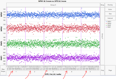
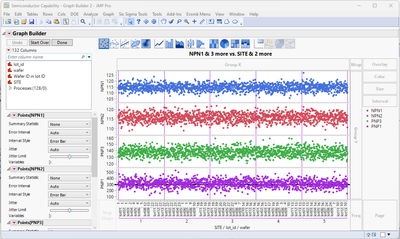
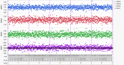
In the chart generated by the script below I would like to change the color of the lines indicated by the red arrows ("the separator lines") to purple. Also I would like to add a horizontal reference line only for the lowest y-axis variable (in this case PNP1).
How to do these via JSL?
(Note in my actual case the y-axis data is not from a column unlike in this example case)
Names Default To Here( 1 );
dt = Open( "$SAMPLE_DATA/Semiconductor Capability.jmp" );
Graph Builder(
	Size( 960, 695 ),
	Variables(
		X( :SITE ),
		X( :lot_id, Position( 1 ) ),
		X( :wafer, Position( 1 ) ),
		Y( :NPN1 ),
		Y( :NPN2 ),
		Y( :PNP3 ),
		Y( :PNP1 )
	),
	Elements( Position( 1, 1 ), Points( X( 1 ), X( 2 ), X( 3 ), Y, Legend( 44 ) ) ),
	Elements( Position( 1, 2 ), Points( X( 1 ), X( 2 ), X( 3 ), Y, Legend( 43 ) ) ),
	Elements( Position( 1, 3 ), Points( X( 1 ), X( 2 ), X( 3 ), Y, Legend( 38 ) ) ),
	Elements( Position( 1, 4 ), Points( X( 1 ), X( 2 ), X( 3 ), Y, Legend( 40 ) ) ),
	SendToReport(
		Dispatch(
			{},
			"SITE",
			ScaleBox,
			{Label Row( 3, {Major Grid Line Color( 8 ), Show Major Grid( 1 )} )}
		)
	)
);
- Tags:
- windows
Accepted Solutions
- Mark as New
- Bookmark
- Subscribe
- Mute
- Subscribe to RSS Feed
- Get Direct Link
- Report Inappropriate Content
Re: How to (1) change default color in AxisBox and (2) add reference line in only one Y-axis variable in grouped Y plots?
Hi @Neo ,
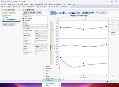
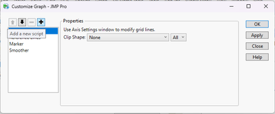
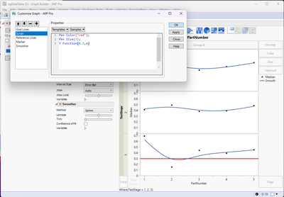
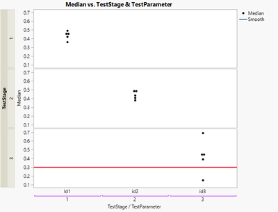
I would do as @hogi suggested and use the Customize option when you right click on the graph of interest, click on the the "+" to add a new script to GB, then type in the JSL for adding in a line.
Now, to have this dynamically respond to the local data filter, I think would be more challenging. If you need that kind of functionality, I would instead generate my own report window that has graph builder built into it and then maybe use check boxes to give the user options of updating the subplots with reference lines when they select the different TestStage check boxes.
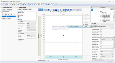
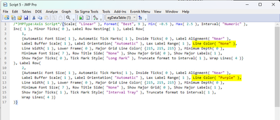
I did figure out a way to change the nested line color as well. I don't know if this is the "correct" way to do it, or even if it's the fastest way, but if you right click on the nested axis and then select show properties, if you click on the nested axis and then click the red hot-button next to AxisBox, select Copy Axis Settings, you can then paste it into a scripting window and edit it. Select the axis of interest, and change the Line Color from "None" to whatever color you want. You then have to copy this edited code, go back to the red hot-button, select Paste Axis Settings, and it will update the graph. This will get the job done, but I'm not sure how this can be done dynamically.
Saving the corresponding script to a scripting window, you can see the commands you need to send the Graph Builder and Label Row in order to get the outcome you want.
Graph Builder(
	Size( 592, 526 ),
	Y Group Edge( "Left" ),
	Graph Spacing( 4 ),
	Variables(
		X( :TestStage ),
		X( :TestParameter, Position( 1 ) ),
		Y( :Median ),
		Group Y( :TestStage )
	),
	Elements(
		Points( X( 1 ), X( 2 ), Y, Legend( 33 ) ),
		Smoother( X( 1 ), X( 2 ), Y, Legend( 34 ) )
	),
	Local Data Filter(
		Conditional,
		Add Filter( columns( :TestStage ), Where( :TestStage == {1, 2, 3} ) )
	),
	SendToReport(
		Dispatch(
			{},
			"TestStage",
			ScaleBox,
			{Label Row( 2, Line Color( "Purple" ) )}
		),
		Dispatch(
			{},
			"Graph Builder",
			FrameBox( 3 ),
			{Add Graphics Script(
				2,
				Description( "" ),
				Pen Color( "red" );
				Pen Size( 3 );
				Y Function( 0.3, x );
			)}
		)
	)
);
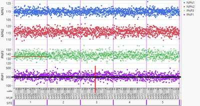
Using this bit of information and coming back to your original post using the Semiconductor Capability.jmp file, you can achieve what you were originally asking for, the nested axis is purple, the vertical grid lines are purple and there is a reference line only for the bottom-most graph. In this particular case, double clicking the axis that you want to add the reference line to will work because you are plotting different columns in the subplots of graph builder. For the example data table that you shared, you have to do it the other way with Customize, and adding a Y Function().
Here is the JSL code that generated the above graph. You can see where you need to make the appropriate edits for your specific case.
Names Default to Here(1);

dt = Open( "$SAMPLE_DATA/Semiconductor Capability.jmp" );

dt<<Graph Builder(
	Size( 752, 515 ),
	Graph Spacing( 4 ),
	Variables(
		X( :SITE ),
		X( :lot_id, Position( 1 ) ),
		X( :wafer, Position( 1 ) ),
		Y( :NPN1 ),
		Y( :NPN2 ),
		Y( :PNP3 ),
		Y( :PNP1 )
	),
	Elements( Position( 1, 1 ), Points( X( 1 ), X( 2 ), X( 3 ), Y, Legend( 50 ) ) ),
	Elements( Position( 1, 2 ), Points( X( 1 ), X( 2 ), X( 3 ), Y, Legend( 51 ) ) ),
	Elements( Position( 1, 3 ), Points( X( 1 ), X( 2 ), X( 3 ), Y, Legend( 52 ) ) ),
	Elements( Position( 1, 4 ), Points( X( 1 ), X( 2 ), X( 3 ), Y, Legend( 53 ) ) ),
	SendToReport(
		Dispatch(
			{},
			"SITE",
			ScaleBox,
			{Label Row(
				3,
				{Line Color( "Purple" ), Major Grid Line Color( "Purple" ),
				Show Major Grid( 1 )}
			)}
		),
		Dispatch(
			{},
			"PNP1",
			ScaleBox,
			{Add Ref Line( 300, "Solid", "Black", "", 3 )}
		)
	)
)
Hope this helps!,
DS
- Mark as New
- Bookmark
- Subscribe
- Mute
- Subscribe to RSS Feed
- Get Direct Link
- Report Inappropriate Content
Re: How to (1) change default color in AxisBox and (2) add reference line in only one Y-axis variable in grouped Y plots?
the first time, you can run getTestStage(1) manually.
Please note that with the Data Filter there are 1-3 FrameBoxes in the GraphBuilder (most of the time, just 1?). So either you determine which FB to send the message to - or just select one TestStage and always send the command to Framebox 1.
- Mark as New
- Bookmark
- Subscribe
- Mute
- Subscribe to RSS Feed
- Get Direct Link
- Report Inappropriate Content
Re: How to (1) change default color in AxisBox and (2) add reference line in only one Y-axis variable in grouped Y plots?
nice idea to link the vertical lines and the axis labels via color :)
Unfortunately, the lines are soo thin that it's difficult to notice the feature.
If you have the same feeling, please support this wish:
optimized graphics settings for hierarchical X categories - 2 options
alternatively, you could use the site as X Group - but most likely you will run into the problem with the synchronized X axis labels.
There is also a wish to fix this issue:
X group: restrict the values on the axis to the respective group
Names Default To Here( 1 );
dt = Open( "$SAMPLE_DATA/Semiconductor Capability.jmp" );
dt << Graph Builder(
	Size( 841, 485 ),
	Show Control Panel( 0 ),
	Show Title( 0 ),
	Show X Axis Title( 0 ),
	Variables(
		X( :SITE ),
		X( :lot_id, Position( 1 ) ),
		X( :wafer, Position( 1 ) ),
		Y( :NPN1 ),
		Y( :NPN2 ),
		Y( :PNP3 ),
		Y( :PNP1 )
	),
	Elements( Position( 1, 1 ), Points( X( 1 ), X( 2 ), X( 3 ), Y, Legend( 44 ) ) ),
	Elements( Position( 1, 2 ), Points( X( 1 ), X( 2 ), X( 3 ), Y, Legend( 43 ) ) ),
	Elements( Position( 1, 3 ), Points( X( 1 ), X( 2 ), X( 3 ), Y, Legend( 38 ) ) ),
	Elements( Position( 1, 4 ), Points( X( 1 ), X( 2 ), X( 3 ), Y, Legend( 40 ) ) ),
	SendToReport(
		Dispatch( {}, "SITE", ScaleBox,
			{Label Row(
				1,
				{Lower Frame( 1 ), Row Title Side( "Start" ), Show Major Grid( 0 ),
				Tick Mark Style( "Long Divider" )}
			), Label Row(
				2,
				{Lower Frame( 1 ), Row Title Side( "Start" ), Show Major Grid( 0 ),
				Tick Mark Style( "Long Divider" )}
			), Label Row(
				3,
				{Line Color( "Purple" ), Lower Frame( 1 ), Major Grid Line Color( "Purple" ),
				Row Title Side( "Start" ), Tick Mark Style( "Long Divider" )}
			)}
		),
		Dispatch( {}, "PNP1", ScaleBox, {Add Ref Line( 300, "Solid", "Black", "", 5 )} ),
		Dispatch( {}, "Graph Builder", FrameBox( 4 ), {Reference Line Order( 3 )} )
	)
)
- Mark as New
- Bookmark
- Subscribe
- Mute
- Subscribe to RSS Feed
- Get Direct Link
- Report Inappropriate Content
Re: How to (1) change default color in AxisBox and (2) add reference line in only one Y-axis variable in grouped Y plots?
what do you mean with
@Neo wrote:(Note in my actual case the y-axis data is not from a column unlike in this example case)
- Mark as New
- Bookmark
- Subscribe
- Mute
- Subscribe to RSS Feed
- Get Direct Link
- Report Inappropriate Content
Re: How to (1) change default color in AxisBox and (2) add reference line in only one Y-axis variable in grouped Y plots?
>> (Note in my actual case the y-axis data is not from a column unlike in this example case)
In my actual case, the y-axis parameters come from local data filter selection of row parameters
(If it was from a column, I could have had a limit set in specs for the reference line (not that I have tried this, but I expect it to work))
Let me see if I can cook up a data set for demo (I'll be back :)).
- Mark as New
- Bookmark
- Subscribe
- Mute
- Subscribe to RSS Feed
- Get Direct Link
- Report Inappropriate Content
Re: How to (1) change default color in AxisBox and (2) add reference line in only one Y-axis variable in grouped Y plots?
Hi @Neo ,
The code that @hogi posted will solve your issue for getting a reference line for a single subplot within your graph builder, but unfortunately, looking at the tree structure, I don't see a way to send a command that would change only that one line of the x-axis. In the tree structure, the entire x-axis is grouped in a single AxisBox(1) element, it's not divided up and nested, even though it is displayed that way in graph builder. I also couldn't find anything within the preferences that allows you to modify nested axes lines.
You can always right click on an axis that you want to have and then add a reference line, then go to the red hot-button next to graph builder and save script to scripting window, and you can see how the script is modified by the addition of the line.
Hope this helps!,
DS
Edit: It might be worthwhile to submit a request to be able to change the colors of nested axes. This should be doable and something that I would imagine many people could benefit from.
- Mark as New
- Bookmark
- Subscribe
- Mute
- Subscribe to RSS Feed
- Get Direct Link
- Report Inappropriate Content
Re: How to (1) change default color in AxisBox and (2) add reference line in only one Y-axis variable in grouped Y plots?
Which line is the problem?
At the moment, there is just a single horizontal line in the lowest plot.
If you have to hide parts of reference lines, you can use the fact that every subplot has it's own customization settings, so you can add some rectangles and put them in front of the reference line.
[alternatively, you could also directly use the customization script to add a line segment.]
Names Default To Here( 1 );
dt = Open( "$SAMPLE_DATA/Semiconductor Capability.jmp" );
dt << Graph Builder(
	Show Control Panel( 0 ),
	Show Title( 0 ),
	Show X Axis Title( 0 ),
	Variables(
		X( :SITE ),
		X( :lot_id, Position( 1 ) ),
		X( :wafer, Position( 1 ) ),
		Y( :NPN1 ),
		Y( :NPN2 ),
		Y( :PNP3 ),
		Y( :PNP1 )
	),
	Elements( Position( 1, 1 ), Points( X( 1 ), X( 2 ), X( 3 ), Y, Legend( 44 ) ) ),
	Elements( Position( 1, 2 ), Points( X( 1 ), X( 2 ), X( 3 ), Y, Legend( 43 ) ) ),
	Elements( Position( 1, 3 ), Points( X( 1 ), X( 2 ), X( 3 ), Y, Legend( 38 ) ) ),
	Elements( Position( 1, 4 ), Points( X( 1 ), X( 2 ), X( 3 ), Y, Legend( 40 ) ) ),
	SendToReport(
		Dispatch( {}, "SITE", ScaleBox,
			{Add Ref Line( 714.422378299564, "Solid", "Red", "", 4 ),
			Label Row(
				1,
				{Lower Frame( 1 ), Row Title Side( "Start" ), Show Major Grid( 0 ),
				Tick Mark Style( "Long Divider" )}
			), Label Row(
				2,
				{Lower Frame( 1 ), Row Title Side( "Start" ), Show Major Grid( 0 ),
				Tick Mark Style( "Long Divider" )}
			), Label Row(
				3,
				{Line Color( "Purple" ), Line Width( 3 ), Lower Frame( 1 ),
				Major Grid Line Color( "Purple" ), Row Title Side( "Start" ),
				Tick Mark Style( "Long Divider" )}
			)}
		),
		Dispatch( {}, "PNP3", ScaleBox, {Add Ref Line( 135, "Solid", "Red", "", 3 )} ),
		Dispatch( {}, "PNP1", ScaleBox, {Add Ref Line( 300, "Solid", "Black", "", 5 )} ),
		Dispatch( {}, "400", ScaleBox,
			{Legend Model( 38, Properties( 0, {Transparency( 0.5 )}, Item ID( "PNP3", 1 ) ) )}
		),
		Dispatch( {}, "Graph Builder", FrameBox,
			{Grid Line Order( 2 ), Reference Line Order( 1 ),
			Add Graphics Script(
				2,
				Description( "" ),
				Fill Color( white );
				Rect( -10000, 10000, 10000, -10000, 1 );
			)}
		),
		Dispatch( {}, "Graph Builder", FrameBox( 2 ),
			{Grid Line Order( 2 ), Reference Line Order( 1 ),
			Add Graphics Script(
				2,
				Description( "" ),
				Fill Color( white );
				Rect( -10000, 10000, 10000, -10000, 1 );
			)}
		),
		Dispatch( {}, "Graph Builder", FrameBox( 3 ),
			{Grid Line Order( 2 ), Reference Line Order( 1 ),
			Add Graphics Script(
				2,
				Description( "" ),
				Fill Color( white );
				Rect( 290, 10000, 10000, -10000, 1 );
			)}
		),
		Dispatch( {}, "Graph Builder", FrameBox( 4 ), {Reference Line Order( 3 )} )
	)
)
- Mark as New
- Bookmark
- Subscribe
- Mute
- Subscribe to RSS Feed
- Get Direct Link
- Report Inappropriate Content
Re: How to (1) change default color in AxisBox and (2) add reference line in only one Y-axis variable in grouped Y plots?
- Mark as New
- Bookmark
- Subscribe
- Mute
- Subscribe to RSS Feed
- Get Direct Link
- Report Inappropriate Content
Re: How to (1) change default color in AxisBox and (2) add reference line in only one Y-axis variable in grouped Y plots?
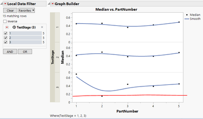
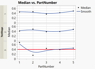
This the easy case where due to the Y Group the graphs are split into different FrameBoxes. Then you can just add individual Reference Lines via Customize.
Graph Builder(
	Y Group Edge( "Left" ),

	Variables( X( :PartNumber ), Y( :Median ), Group Y( :TestStage ) ),
	Elements( Points( X, Y, Legend( 33 ) ), Smoother( X, Y, Legend( 34 ) ) ),

	SendToReport(
		Dispatch(
			{},
			"Graph Builder",
			FrameBox( 3 ),
			{Add Graphics Script(
				2,
				Description( "" ),
				Pen Color( "red" );
				Pen Size( 3 );
				Y Function( 0.4, x );
			)}
		)
	)
)- Mark as New
- Bookmark
- Subscribe
- Mute
- Subscribe to RSS Feed
- Get Direct Link
- Report Inappropriate Content
Re: How to (1) change default color in AxisBox and (2) add reference line in only one Y-axis variable in grouped Y plots?
Hi @Neo ,
I would do as @hogi suggested and use the Customize option when you right click on the graph of interest, click on the the "+" to add a new script to GB, then type in the JSL for adding in a line.
Now, to have this dynamically respond to the local data filter, I think would be more challenging. If you need that kind of functionality, I would instead generate my own report window that has graph builder built into it and then maybe use check boxes to give the user options of updating the subplots with reference lines when they select the different TestStage check boxes.
I did figure out a way to change the nested line color as well. I don't know if this is the "correct" way to do it, or even if it's the fastest way, but if you right click on the nested axis and then select show properties, if you click on the nested axis and then click the red hot-button next to AxisBox, select Copy Axis Settings, you can then paste it into a scripting window and edit it. Select the axis of interest, and change the Line Color from "None" to whatever color you want. You then have to copy this edited code, go back to the red hot-button, select Paste Axis Settings, and it will update the graph. This will get the job done, but I'm not sure how this can be done dynamically.
Saving the corresponding script to a scripting window, you can see the commands you need to send the Graph Builder and Label Row in order to get the outcome you want.
Graph Builder(
	Size( 592, 526 ),
	Y Group Edge( "Left" ),
	Graph Spacing( 4 ),
	Variables(
		X( :TestStage ),
		X( :TestParameter, Position( 1 ) ),
		Y( :Median ),
		Group Y( :TestStage )
	),
	Elements(
		Points( X( 1 ), X( 2 ), Y, Legend( 33 ) ),
		Smoother( X( 1 ), X( 2 ), Y, Legend( 34 ) )
	),
	Local Data Filter(
		Conditional,
		Add Filter( columns( :TestStage ), Where( :TestStage == {1, 2, 3} ) )
	),
	SendToReport(
		Dispatch(
			{},
			"TestStage",
			ScaleBox,
			{Label Row( 2, Line Color( "Purple" ) )}
		),
		Dispatch(
			{},
			"Graph Builder",
			FrameBox( 3 ),
			{Add Graphics Script(
				2,
				Description( "" ),
				Pen Color( "red" );
				Pen Size( 3 );
				Y Function( 0.3, x );
			)}
		)
	)
);
Using this bit of information and coming back to your original post using the Semiconductor Capability.jmp file, you can achieve what you were originally asking for, the nested axis is purple, the vertical grid lines are purple and there is a reference line only for the bottom-most graph. In this particular case, double clicking the axis that you want to add the reference line to will work because you are plotting different columns in the subplots of graph builder. For the example data table that you shared, you have to do it the other way with Customize, and adding a Y Function().
Here is the JSL code that generated the above graph. You can see where you need to make the appropriate edits for your specific case.
Names Default to Here(1);

dt = Open( "$SAMPLE_DATA/Semiconductor Capability.jmp" );

dt<<Graph Builder(
	Size( 752, 515 ),
	Graph Spacing( 4 ),
	Variables(
		X( :SITE ),
		X( :lot_id, Position( 1 ) ),
		X( :wafer, Position( 1 ) ),
		Y( :NPN1 ),
		Y( :NPN2 ),
		Y( :PNP3 ),
		Y( :PNP1 )
	),
	Elements( Position( 1, 1 ), Points( X( 1 ), X( 2 ), X( 3 ), Y, Legend( 50 ) ) ),
	Elements( Position( 1, 2 ), Points( X( 1 ), X( 2 ), X( 3 ), Y, Legend( 51 ) ) ),
	Elements( Position( 1, 3 ), Points( X( 1 ), X( 2 ), X( 3 ), Y, Legend( 52 ) ) ),
	Elements( Position( 1, 4 ), Points( X( 1 ), X( 2 ), X( 3 ), Y, Legend( 53 ) ) ),
	SendToReport(
		Dispatch(
			{},
			"SITE",
			ScaleBox,
			{Label Row(
				3,
				{Line Color( "Purple" ), Major Grid Line Color( "Purple" ),
				Show Major Grid( 1 )}
			)}
		),
		Dispatch(
			{},
			"PNP1",
			ScaleBox,
			{Add Ref Line( 300, "Solid", "Black", "", 3 )}
		)
	)
)
Hope this helps!,
DS
- Mark as New
- Bookmark
- Subscribe
- Mute
- Subscribe to RSS Feed
- Get Direct Link
- Report Inappropriate Content
Re: How to (1) change default color in AxisBox and (2) add reference line in only one Y-axis variable in grouped Y plots?
@SDF1 Thanks. I will check how you managed to change the color of the nested axis to purple. Meanwhile I used @hogi suggestion and Make Filter Change Handler () to dynamically change the where JMP puts the reference line as the user changes filter selections. I haven't resolved two issues with this yet.
1. The filter change handler does not trigger when the chart is plotted the first time but only when the next TestStage is selected.
2. When the filter is changed the earlier reference line remains on a different test stage, which I understand why, but haven't been able to remove it yet.
Names Default To Here (1);
clear log ();

gb = Graph Builder(
	Y Group Edge( "Left" ),
	Variables( X( :PartNumber ), Y( :Median ), Group Y( :TestStage ) ),
	Elements( Points( X, Y, Legend( 33 ) ), Smoother( X, Y, Legend( 34 ) ) ),
	Local Data Filter(
		Conditional,
		Add Filter( columns( :TestStage ), Where( :TestStage == {1} ) )
	)
);

ldf = Current Report()["Local Data Filter"] << get scriptable object;

getTestStage = Function( {this}, //print (this);

                          testStateFiltered = Associative Array(:TestStage [ldf << get filtered rows]) << get keys;

                          gb << SendToReport(

								Dispatch({},"Graph Builder",
								FrameBox(N Items (testStateFiltered)), {Add Graphics Script( 2,	Description( "" ), Pen Color( "red" );	Line Style ("dashed"); Pen Size( 0.25 );
											Y Function( 0.2, x );
										)}
									)
								);
                          show (N Items (testStateFiltered));	 Print(testStateFiltered);
                          );
rs = ldf << Make Filter Change Handler( getTestStage() ); Recommended Articles
- © 2026 JMP Statistical Discovery LLC. All Rights Reserved.
- Terms of Use
- Privacy Statement
- Contact Us
