- New to JMP? Let the Data Analysis Director guide you through selecting an analysis task, an analysis goal, and a data type. Available now in the JMP Marketplace!
- See how to install JMP Marketplace extensions to customize and enhance JMP.
- Subscribe to RSS Feed
- Mark Topic as New
- Mark Topic as Read
- Float this Topic for Current User
- Bookmark
- Subscribe
- Mute
- Printer Friendly Page
Discussions
Solve problems, and share tips and tricks with other JMP users.- JMP User Community
- :
- Discussions
- :
- Re: How do I show labels for low N stacked bars and also show label above bar of...
- Mark as New
- Bookmark
- Subscribe
- Mute
- Subscribe to RSS Feed
- Get Direct Link
- Report Inappropriate Content
How do I show labels for low N stacked bars and also show label above bar of a separate column?
Hello,
In the stacked bar chart attached to this question I have low N sample set for one category (fail) and would like to show the N, however they are currently hidden below a certain value. I'd also like to display values from the column perc_fail above each stacked chart. Could you please advise?
Thank you in advance.
Accepted Solutions
- Mark as New
- Bookmark
- Subscribe
- Mute
- Subscribe to RSS Feed
- Get Direct Link
- Report Inappropriate Content
Re: How do I show labels for low N stacked bars and also show label above bar of a separate column?
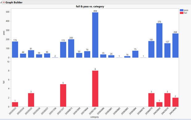
I don't see how to do what you want interactively. The problem is the stacking. You want JMP to put the labels above the "fail" bars, but not the "pass" bars. That would make the label for the fails look like a label for the entire bar. Plus, the scales for pass vs. fail are very different, which is why the fails look so small and are illegible.
Why not consider separating the passes and fails? I have provided an example below. It makes it pretty clear which categories have lots of fails and passes. Plus, the fail scale is much clearer so I can more easily see which categories have no fails. Before, any category with a 1 looked like a 0. This is much clearer to me, at least.
Recommended Articles
- © 2026 JMP Statistical Discovery LLC. All Rights Reserved.
- Terms of Use
- Privacy Statement
- Contact Us

