- New to JMP? Let the Data Analysis Director guide you through selecting an analysis task, an analysis goal, and a data type. Available now in the JMP Marketplace!
- See how to install JMP Marketplace extensions to customize and enhance JMP.
- Subscribe to RSS Feed
- Mark Topic as New
- Mark Topic as Read
- Float this Topic for Current User
- Bookmark
- Subscribe
- Mute
- Printer Friendly Page
Discussions
Solve problems, and share tips and tricks with other JMP users.- JMP User Community
- :
- Discussions
- :
- Re: How can I create a JSL script for saving a graph to the data table.
- Mark as New
- Bookmark
- Subscribe
- Mute
- Subscribe to RSS Feed
- Get Direct Link
- Report Inappropriate Content
How can I create a JSL script for saving a graph to the data table.
I have a scheduled script running daily which saves out a data table.
However I would like to include graphs which I can do manually and save to data table.
Is there away of putting this into the script ?
Any help appreciated.
Accepted Solutions
- Mark as New
- Bookmark
- Subscribe
- Mute
- Subscribe to RSS Feed
- Get Direct Link
- Report Inappropriate Content
Re: How can I create a JSL script for saving a graph to the data table.
You just need to use the New Script message. Here is the simple example from:
Help==>Scripting Index
Names Default To Here( 1 );
dt = Open( "$SAMPLE_DATA/Big Class.jmp" );
dt << New Script(
       "New Script",
       Distribution( Column( :Height, :Weight ), By( :sex ) )
);
- Mark as New
- Bookmark
- Subscribe
- Mute
- Subscribe to RSS Feed
- Get Direct Link
- Report Inappropriate Content
Re: How can I create a JSL script for saving a graph to the data table.
How do I use an instance of an object (such as Distribution or Gaph Builder) as an argument to the New Script function?
For example, I've attempted something similar to the example provided below, but the content of the "New Script" in the data table ends up being "dist" and not the script that dist was built from.
I've also tried replacing "dist" in the example below with "dist << Get Script", but once again the actual script that is saved to the table is populated with the explicit string "dist << Get Script", and not the script source.
I hope the quesiton is clear. Thanks.
dt = Open( "$SAMPLE_DATA/Big Class.jmp" );
dist = Distribution( Column( :Height, :Weight ), By( :sex ) )
dt << New Script(
       "New Script",
       dist
);
- Mark as New
- Bookmark
- Subscribe
- Mute
- Subscribe to RSS Feed
- Get Direct Link
- Report Inappropriate Content
Re: How can I create a JSL script for saving a graph to the data table.
You were on the right track:
Names Default to Here( 1 );

dt = Open( "$SAMPLE_DATA/Big Class.jmp" );

dist = dt << Distribution( Column( :Height, :Weight ), By( :sex ) );

dist expr = dist << Get Script;

Eval(
	Substitute(
		Expr(
			dt << New Script( "New Script",
			   sss
			);
		),
		Expr( sss ),
		Name Expr( dist expr )
	)
);
- Mark as New
- Bookmark
- Subscribe
- Mute
- Subscribe to RSS Feed
- Get Direct Link
- Report Inappropriate Content
Re: How can I create a JSL script for saving a graph to the data table.
Hi @txnelson, can you help me rewrite my code below? I want to create a JSL which can do the TOST for selected column named "XXXX", and then save the Script to JMP Table. There are some problems in the code below, firstly I need to put the XXXX twice in the code below which is not efficient, and also in the future I want to replace XXXX with a list so that I can do many analysis at once. Secondly I want to replace STD3X with an actual number in the script not a variable. I tried to modify it based on @Mark_Bailey 's code below, but it's not working. Could you please help me? Thank you so much.
dt = Current Data Table();
dt << New Script(
	"XXXX-TOST",
	ColName = "XXXX";
	STD3X = 3 * Col Std Dev( If( :"Size" == "Small", :Column( ColName ) ) );
	Oneway(
		Y( :Column( ColName ) ),
		X( :Scale ),
		Unequal Variances( 1 ),
		Std Dev Lines( 1 ),
		Equivalence Tests( STD3X, 0.05, "Pooled Variance" )
	);
);- Mark as New
- Bookmark
- Subscribe
- Mute
- Subscribe to RSS Feed
- Get Direct Link
- Report Inappropriate Content
Re: How can I create a JSL script for saving a graph to the data table.
Few questions:
- Selected column named "XXXX". Is this really selected column from table or just column name which will be pre-scripted?
- Putting XXXX twice. You mean in the table script name and then as column name? When you have a list, how should the table script be named? How long list may it be?
- STD3X with an actual number in the script not a variable. I'm not sure what is meant by this? Isn't it already number which is being calculated based on your data?
- Not as important as questions above: how is the script being built/run?
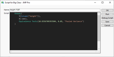
This won't handle list of column names, as I'm not sure what should be done with that list
Names Default To Here(1);
dt = Open("$SAMPLE_DATA/Big Class.jmp");

col_of_interest = "height";
std3x = 3 * Col Std Dev(If(:sex == "F", Column(col_of_interest)));

table_script_expr = EvalExpr(
	Oneway(
		Y(Expr(Column(col_of_interest))), X(:sex), Equivalence Tests(Expr(std3x), 0.05, "Pooled Variance");
	);
);

Eval(
	Substitute(
		Expr(dt << New Script(Eval Insert("^col_of_interest^-TOST"), _table_script_)),
		Expr(_table_script_), Name Expr(table_script_expr);
	)
);
- Mark as New
- Bookmark
- Subscribe
- Mute
- Subscribe to RSS Feed
- Get Direct Link
- Report Inappropriate Content
Re: How can I create a JSL script for saving a graph to the data table.
@jthi Thank you so much, this is exactly what I want. You are the best!!!
- Mark as New
- Bookmark
- Subscribe
- Mute
- Subscribe to RSS Feed
- Get Direct Link
- Report Inappropriate Content
Re: How can I create a JSL script for saving a graph to the data table.
From your request, it is difficult to determine if you are wanting to (1) use the JMP 12 feature to add the graphs as an expression column; or (2) you would like to embed a journal file of graphs; or (3) add a script to generate the graphs. Jim Nelson provided an example for #3.
The example code below uses the JMP sample data of SAT scores, creates a summary report of SAT Math and Verbal scores by State, and for each State embeds an Overlay trend plot in an expression column for the corresponding row, and makes the expression column a label.
It also includes using Graph Builder to provide an example usage of this table. Hover over a State and see the trend plot. This is an example for #1. If you are looking for an example for #2, or something else, please provide more details.
dtraw = Open("$sample_data\SATByYear.jmp");
ovl = Overlay Plot(
       X( :Year ),
       Y( :SAT Verbal, :SAT Math ),
       Y Scale( Left, Right ),
       Connect Thru Missing( 1 ),
       By( :State ),
       SendToReport(
             Dispatch( {}, "Overlay Plot Graph", FrameBox, {Frame Size( 288, 158 )} ),
             Dispatch(
                    {},
                    "Overlay Plot Graph",
                    FrameBox( 2 ),
                    {Frame Size( 288, 158 )}
             )
       )
);

dtsumry = dtraw << Summary(
       Group( :State ),
       Mean( :SAT Verbal ),
       Mean( :SAT Math ),
       Freq( "None" ),
       Weight( "None" )
);

dtsumry << new Column("ByYearPic", Expression);

for(i=1, i<=nitems(ovl), i++,
  ttl = report(ovl[i])[OutlineBox(1)] << get title();
  report(ovl[i])[OutlineBox(1)] << set title(word(2,ttl, "=") || " Scores by Year");
  pic = ovl[i] <<get picture;
  column(dtsumry, "ByYearPic")[i] = pic;
);

column(dtsumry, "ByYearPic")<<label(1);

ovl<< close window();

New window("View", VListBox(
       Graph Builder(
       Level Spacing Color( "Medium Light Gray" ),
       Graph Spacing( 6 ),
       Variables( Color( :Name( "Mean(SAT Verbal)" ) ), Shape( :State ) ),
       Elements( Map Shapes( Legend( 6 ) ) ),
       show control panel(0)
),
Graph Builder(
       Level Spacing Color( "Medium Light Gray" ),
       Graph Spacing( 6 ),
       Variables( Color( :Name( "Mean(SAT Math)" ) ), Shape( :State ) ),
       Elements( Map Shapes( Legend( 6 ) ) ),
       Show control panel(0)
)
  ));
- Mark as New
- Bookmark
- Subscribe
- Mute
- Subscribe to RSS Feed
- Get Direct Link
- Report Inappropriate Content
Re: How can I create a JSL script for saving a graph to the data table.
Sorry for making it not very clear what I am asking, I will try and go through this step by step here.
1) I have a scheduled script running daily which saves out a data table, no problems here.
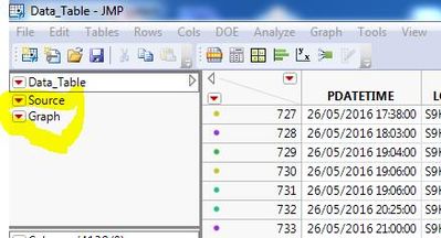
2) In the data table, manually or using script I create a "graph",
Then manually I can for that "graph" - "Save the script to data table" which then saves the graph to the data table, then when the data table is saved and then opened again the script can be easily opened / Ran.
Question is can this be scripted before saving the data table and is the "New script" option the way of doing this ?
Hope this helps.
- Mark as New
- Bookmark
- Subscribe
- Mute
- Subscribe to RSS Feed
- Get Direct Link
- Report Inappropriate Content
Re: How can I create a JSL script for saving a graph to the data table.
Recommended Articles
- © 2026 JMP Statistical Discovery LLC. All Rights Reserved.
- Terms of Use
- Privacy Statement
- Contact Us


