- New to JMP? Let the Data Analysis Director guide you through selecting an analysis task, an analysis goal, and a data type. Available now in the JMP Marketplace!
- See how to install JMP Marketplace extensions to customize and enhance JMP.
- Subscribe to RSS Feed
- Mark Topic as New
- Mark Topic as Read
- Float this Topic for Current User
- Bookmark
- Subscribe
- Mute
- Printer Friendly Page
Discussions
Solve problems, and share tips and tricks with other JMP users.- JMP User Community
- :
- Discussions
- :
- Help with stacked bar graph/overlaying bar graphs
- Mark as New
- Bookmark
- Subscribe
- Mute
- Subscribe to RSS Feed
- Get Direct Link
- Report Inappropriate Content
Help with stacked bar graph/overlaying bar graphs
Does anyone have any advice for modifying graph builders default scripts? I'm trying to build a stacked bar graph of some data but my issue is that jmps "stacked" option sums all of my data together (stacking it all), when I would rather it not sum the data and essentially overlay the different layers into one bar. Here are some pictures to help.
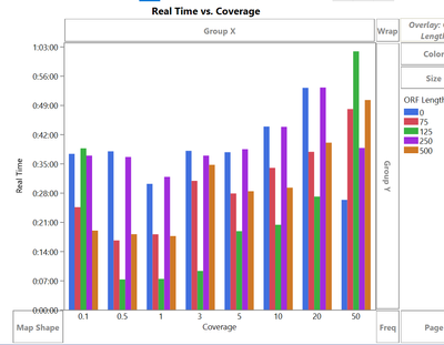
So my starting point is this bar graph, with my different classes represented side-by-side.
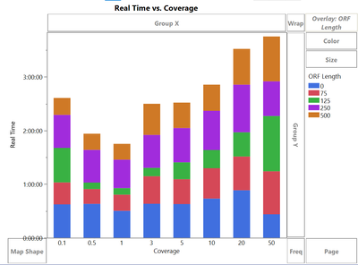
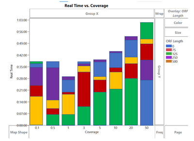
As you can see here my highest value is roughly 1:00:00. I would like to condense each of the coverage categories into one bar, but the default options are not pretty. If I stack them (see below) it sums them all and my highest value becomes 4:00:00 which is not desirable.
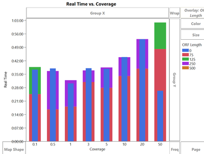
The closest option is nested (below), but frankly this looks absolutely terrible and hurts my eyes.
Is there a way to modify this nested format so all the bars have the same width, and the shortest ORF Length bar is placed as the top layer, so that all ORF Length bars are visible in a single bar.
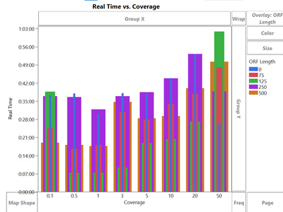
Bullet style (below) is also a similar option. But the problem here is; again not all bars are equal widths, and more importlantly it doesn't reorder how the ORF Length bars are ordered, so many of the shorter bars (ie 500) are hidden behind larger bars.
Anyone have any thoughts or ideas how to fix/clean this up? Attached is the data table if anyone wants to play with it. I'm essentially trying to hybridize the nested and bullet formats. Also when trying to modify the scripts the types are just listed as "stacked", "bullet", etc. Does anyone know where these type modifiers point to so I could manually play with those parts of the scripts?
edit: Here is what I'm trying to do (this is just a manual mockup from powerpoint using rectangles to construct my bars). I'm looking at how long it took a program to execute a command on various datasets (coverage level) with different settings enabled (ORF Length). So every coverage level at every ORF length is an independent run with its own result. Here I'm going for the visual aesthetic of the stacked bar graph, but overlaying NOT stacking the bars. So each color bar accurately depicts the time it took for that individual process.
Accepted Solutions
- Mark as New
- Bookmark
- Subscribe
- Mute
- Subscribe to RSS Feed
- Get Direct Link
- Report Inappropriate Content
Re: Help with stacked bar graph/overlaying bar graphs
To get this kind of view, I would sort the table by group and value, compute the value deltas in a new column, and then stack those delta values. However, you still may have a challenge convincing other viewers that these are overlaid bars instead of regular stacked bars.
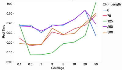
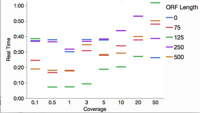
Here are a couple more options: a line chart and the "float" style of bar chart ,which essentially is just showing the tops of your overlaid bars.
- Mark as New
- Bookmark
- Subscribe
- Mute
- Subscribe to RSS Feed
- Get Direct Link
- Report Inappropriate Content
Re: Help with stacked bar graph
I may be completely off base with this, but I don't really understand what you are trying to do. Using time on the Y axis seems to me to call for not using a bar chart at all. I've attached a different version (the second stored script) that could be what you are looking for. If not, then just ignore this.
- Mark as New
- Bookmark
- Subscribe
- Mute
- Subscribe to RSS Feed
- Get Direct Link
- Report Inappropriate Content
Re: Help with stacked bar graph
Thanks Dale for that script, and while it's not what I'm trying to do with this graph I may use it for other things. This may help, here's a quick hack of what I would like to do (just done in powerpoint manually with rectangles for the bars).
I'm looking at the time it took a single program to complete a task with different settings (ORF length) on different datasets (coverage levels). So this format (the fake one above) is really the most useful to me. However, I'm struggling to get jmp to recreate that graph
- Mark as New
- Bookmark
- Subscribe
- Mute
- Subscribe to RSS Feed
- Get Direct Link
- Report Inappropriate Content
Re: Help with stacked bar graph
I struggled to understand what you were trying to achieve at first. But I think I get it now. The bars are completely overlaying the ones behind.
I imagine there wold be some way to recreate this in JMP but I do not think it will be simple. As far as I am aware there is no standard option to do this.
In my opinion there is a problem with the graph that you have proposed in that people will not understand that the bars for other categories are overlayed on top of each other. They will assume that this is classic stacked bar chart. So they will think that 500 is the biggest ORF length category for 0.1 coverage when it is, as I understand it, the smallest category.
But perhaps the graph is for your eyes only. Understanding the audience is important in deciding upon the visualisation to use.
Personally I am not a fan of stacked bars in any case as they make comparisons difficult.
I think you can create a better visualisation of this data that will communicate the data more clearly to the intended audience. I think I would try Run Time on the X-axis, ORF length categories on the Y-axis and Coverage in the Group X or Wrap roles.
Sorry I coudn't help with creating the graph that you want.
Phil
- Mark as New
- Bookmark
- Subscribe
- Mute
- Subscribe to RSS Feed
- Get Direct Link
- Report Inappropriate Content
Re: Help with stacked bar graph/overlaying bar graphs
To get this kind of view, I would sort the table by group and value, compute the value deltas in a new column, and then stack those delta values. However, you still may have a challenge convincing other viewers that these are overlaid bars instead of regular stacked bars.
Here are a couple more options: a line chart and the "float" style of bar chart ,which essentially is just showing the tops of your overlaid bars.
- Mark as New
- Bookmark
- Subscribe
- Mute
- Subscribe to RSS Feed
- Get Direct Link
- Report Inappropriate Content
Re: Help with stacked bar graph/overlaying bar graphs
Did u try using the color option?
You can use color and overlay at the same time, maybe that can help
E.g. overall time is the overlay
and then the individual process goes into color. or vice versa- try em out i do thesame thing to show different abundances of taxonmic levels
also very important- select row order levels as the value order of the columns in the data table that has the order you want
good luck
Recommended Articles
- © 2026 JMP Statistical Discovery LLC. All Rights Reserved.
- Terms of Use
- Privacy Statement
- Contact Us

