- New to JMP? Let the Data Analysis Director guide you through selecting an analysis task, an analysis goal, and a data type. Available now in the JMP Marketplace!
- See how to install JMP Marketplace extensions to customize and enhance JMP.
- Subscribe to RSS Feed
- Mark Topic as New
- Mark Topic as Read
- Float this Topic for Current User
- Bookmark
- Subscribe
- Mute
- Printer Friendly Page
Discussions
Solve problems, and share tips and tricks with other JMP users.- JMP User Community
- :
- Discussions
- :
- Re: Help in plotting the RSM contour plot similar to the output in MINITAB (jmp...
- Mark as New
- Bookmark
- Subscribe
- Mute
- Subscribe to RSS Feed
- Get Direct Link
- Report Inappropriate Content
Help in plotting the RSM contour plot similar to the output in MINITAB (jmp 17 pro)
Hi there!
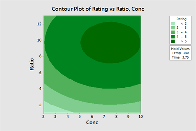
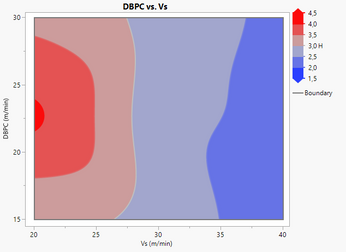
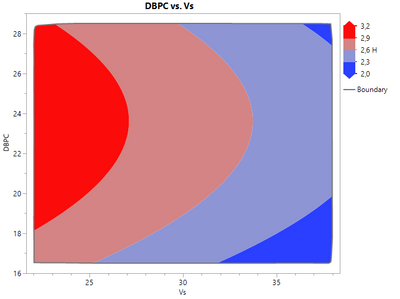
I'm trying to plot a contour graph in JMP similar to the example below, plotted via minitab:
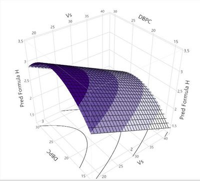
To make the response surface below on JMP, I saved the formula for the predicted response H in a column and plotted the following surface:
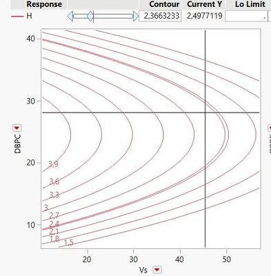
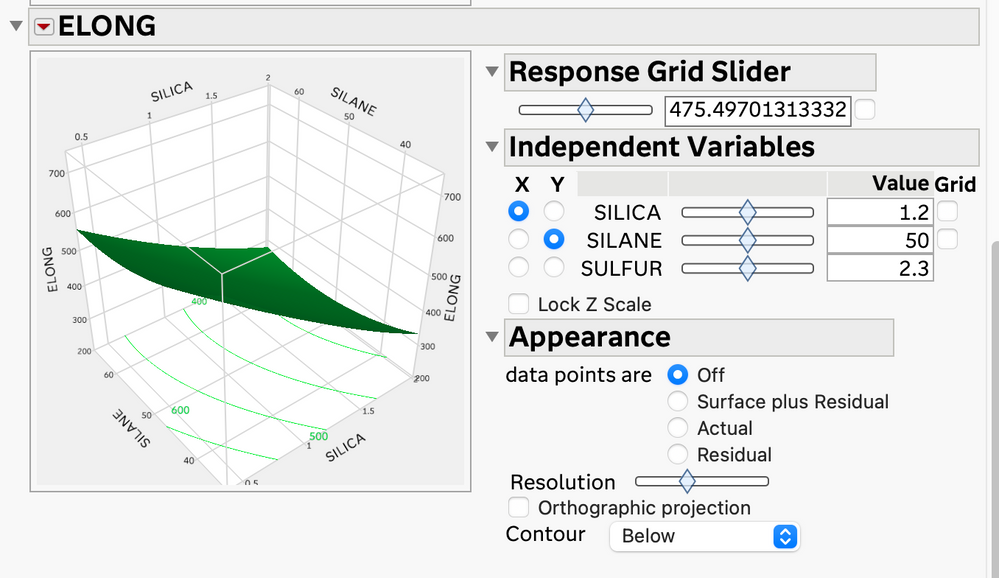
I would like to plot the projection of this response surface similar to the minitab example given, but I can only get the curves in the JMP surface predictor (which doesn't interest me, in this case: I want to plot it similar to the minitab example):
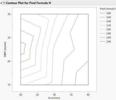
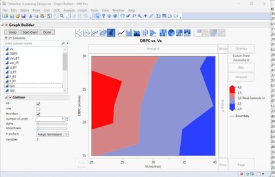
Plotting the contour via JMP's contour profile using the H saved prediction formula, I only get this not-at-all-satisfactory surface:
Any ideas on how to plot this contour similar to the one in mintab? with the curves not being polygonal and broken, with gradient filling and color legend?
Thanks for the time!
- Tags:
- windows
Accepted Solutions
- Mark as New
- Bookmark
- Subscribe
- Mute
- Subscribe to RSS Feed
- Get Direct Link
- Report Inappropriate Content
Re: Help in plotting the RSM contour plot similar to the output in MINITAB (jmp 17 pro)
Unfortunately, I do not see a way to get what you want from within the Fit Model results. Graph Builder, as indicated by @txnelson , has the ability to create the graph that you want. Unfortunately, that is not tied to a model, so you get a contour plot that is created by triangulation. This can lead to the rough appearance when you have a sparse amount of data.
So, what to do? You need a large dataset with the model so that Graph Builder will give you the smooth contours. Here is one way to do that:
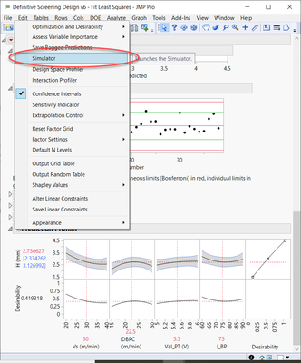
From your Fit Model results, click on the Prediction Profiler red popup menu and choose Simulator (the Simulator is also available from the Contour Profiler menu).
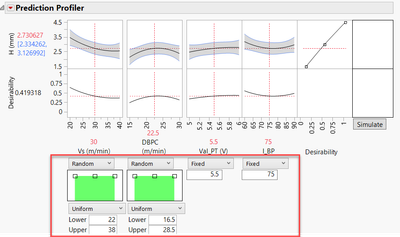
In the dialog below the prediction profiler, change the setting from Fixed to Random > Uniform for the two factors that you want on the contour plot (check to make sure the ranges are appropriate for those factors). The other factors leave at Fixed, but put them at the setting that you wish for them to have.
Choose the number of runs for the simulation. Leaving at the default of 10,000 is probably sufficient. Under the Simulate to Table outline, click on Make Table.
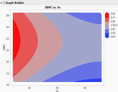
You now will have a new table that you can use to create a contour plot in the fashion that you would like.
- Mark as New
- Bookmark
- Subscribe
- Mute
- Subscribe to RSS Feed
- Get Direct Link
- Report Inappropriate Content
Re: Help in plotting the RSM contour plot similar to the output in MINITAB (jmp 17 pro)
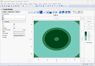
I suggest that you look into the Graph Builder and it's Contour Graphing capability
The above example is using the Cowboy Hat Template sample data.
- Mark as New
- Bookmark
- Subscribe
- Mute
- Subscribe to RSS Feed
- Get Direct Link
- Report Inappropriate Content
Re: Help in plotting the RSM contour plot similar to the output in MINITAB (jmp 17 pro)
I plotted the predicted result of response H by the two factors of the posted surface and it was still bad:
- Mark as New
- Bookmark
- Subscribe
- Mute
- Subscribe to RSS Feed
- Get Direct Link
- Report Inappropriate Content
Re: Help in plotting the RSM contour plot similar to the output in MINITAB (jmp 17 pro)
Hi @ivanpicchi,
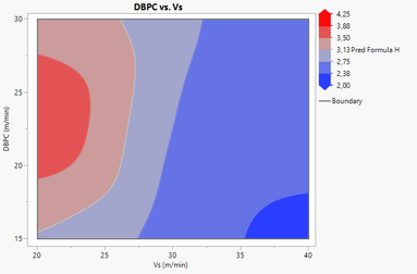
You can adjust the smoothness and number of levels on your contour plot with the Graph Builder by changing the cursor level next to "Smoothness" (to have curvy frontiers instead of broken lines) and adjust the number of levels (on your example by default on 4, but you can increase/decrease this number of levels).
Here are the results with raw data and predicted formula :
More infos on the details of the contour plots from Graph Builder : Contour Plots (jmp.com)
More examples on the Graph Builder capabilities can be found here : Graph Builder contour plots in JMP 15
I hiope this might help you,
"It is not unusual for a well-designed experiment to analyze itself" (Box, Hunter and Hunter)
- Mark as New
- Bookmark
- Subscribe
- Mute
- Subscribe to RSS Feed
- Get Direct Link
- Report Inappropriate Content
Re: Help in plotting the RSM contour plot similar to the output in MINITAB (jmp 17 pro)
I will put the JMP file attached to the post: https://easyupload.io/koocbm
- Mark as New
- Bookmark
- Subscribe
- Mute
- Subscribe to RSS Feed
- Get Direct Link
- Report Inappropriate Content
Re: Help in plotting the RSM contour plot similar to the output in MINITAB (jmp 17 pro)
If you use the Surface Profiler (available under the Profilers red triangle menu in Fit Least Squares, and under Graph > Surface Plot, you can turn on the contours
- Mark as New
- Bookmark
- Subscribe
- Mute
- Subscribe to RSS Feed
- Get Direct Link
- Report Inappropriate Content
Re: Help in plotting the RSM contour plot similar to the output in MINITAB (jmp 17 pro)
Yes, but this was done on the surface I posted. I wanted a 2d graph plotted as an isolated level curve, like the minitab output posted
- Mark as New
- Bookmark
- Subscribe
- Mute
- Subscribe to RSS Feed
- Get Direct Link
- Report Inappropriate Content
Re: Help in plotting the RSM contour plot similar to the output in MINITAB (jmp 17 pro)
Unfortunately, I do not see a way to get what you want from within the Fit Model results. Graph Builder, as indicated by @txnelson , has the ability to create the graph that you want. Unfortunately, that is not tied to a model, so you get a contour plot that is created by triangulation. This can lead to the rough appearance when you have a sparse amount of data.
So, what to do? You need a large dataset with the model so that Graph Builder will give you the smooth contours. Here is one way to do that:
From your Fit Model results, click on the Prediction Profiler red popup menu and choose Simulator (the Simulator is also available from the Contour Profiler menu).
In the dialog below the prediction profiler, change the setting from Fixed to Random > Uniform for the two factors that you want on the contour plot (check to make sure the ranges are appropriate for those factors). The other factors leave at Fixed, but put them at the setting that you wish for them to have.
Choose the number of runs for the simulation. Leaving at the default of 10,000 is probably sufficient. Under the Simulate to Table outline, click on Make Table.
You now will have a new table that you can use to create a contour plot in the fashion that you would like.
- Mark as New
- Bookmark
- Subscribe
- Mute
- Subscribe to RSS Feed
- Get Direct Link
- Report Inappropriate Content
Re: Help in plotting the RSM contour plot similar to the output in MINITAB (jmp 17 pro)
Wonderful, thanks for the tip! One question: why select random and uniform?
- Mark as New
- Bookmark
- Subscribe
- Mute
- Subscribe to RSS Feed
- Get Direct Link
- Report Inappropriate Content
Re: Help in plotting the RSM contour plot similar to the output in MINITAB (jmp 17 pro)
In order for the triangulation to work and draw smooth contours, you need a grid of points. The uniform distribution will do that. Look at the resulting table and I think you will see the result.
Recommended Articles
- © 2026 JMP Statistical Discovery LLC. All Rights Reserved.
- Terms of Use
- Privacy Statement
- Contact Us
