- New to JMP? Let the Data Analysis Director guide you through selecting an analysis task, an analysis goal, and a data type. Available now in the JMP Marketplace!
- See how to install JMP Marketplace extensions to customize and enhance JMP.
- Subscribe to RSS Feed
- Mark Topic as New
- Mark Topic as Read
- Float this Topic for Current User
- Bookmark
- Subscribe
- Mute
- Printer Friendly Page
Discussions
Solve problems, and share tips and tricks with other JMP users.- JMP User Community
- :
- Discussions
- :
- GroupBy in Variability Charts
- Mark as New
- Bookmark
- Subscribe
- Mute
- Subscribe to RSS Feed
- Get Direct Link
- Report Inappropriate Content
GroupBy in Variability Charts
Is there a way to group by in Variability charts?
If i have several samples I want to group by the sample and draw a cell means and bars for each sample.
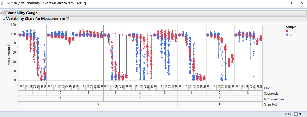
Here's an example that JMP generates:
It's just plotting one cell mean, but I want to draw separate cell means grouped by each sample individually.
Seems like it's impossible to do that right?
This is what I want to be able to do:
*EDIT:
I know I can do something like this using the bivariate chart:
But what if I want to do something like this:
Seems like JMP is only allowing me plot this:
- Mark as New
- Bookmark
- Subscribe
- Mute
- Subscribe to RSS Feed
- Get Direct Link
- Report Inappropriate Content
Re: GroupBy in Variability Charts
Welcome to the community. It would be helpful if you attached your data table (this way we can play around to find what you're looking for.) and let us know what version of JMP you are using. In any case, have you tried Graph Builder? This platform is extremely flexible. If you use the By option in Variability plots, you will get multiple charts. Also, right click is your friend. Often right clicking on the graph or axis provide a list of many possible customizations.
- Mark as New
- Bookmark
- Subscribe
- Mute
- Subscribe to RSS Feed
- Get Direct Link
- Report Inappropriate Content
Re: GroupBy in Variability Charts
Hello Statman.
I'm on jmp 13.2
I don't think graph builder is flexible enough to do what I want.
I've attached a file that contains some example data I'm working with, with all of the details sanitized.
The script for plotting is below:
Variability Chart(
	Y( :Measurement % ),
	X( :StressTest, :StressContition, :Subsample, :Days ),
	Max Iter( 100 ),
	Conv Limit( 0.00000001 ),
	Number Integration Abscissas( 128 ),
	Number Function Evals( 65536 ),
	Analysis Type( "Choose best analysis (EMS REML Bayesian)" ),
	Connect Cell Means( 1 ),
	Std Dev Chart( 0 ),
	Points Jittered( 1 ),
	SendToReport(
		Dispatch(
			{"Variability Chart for Measurement %"},
			"Variability Chart",
			FrameBox,
			{Grid Line Order( 5 ), Reference Line Order( 6 ),
			Row Legend(
				Sample,
				Color( 1 ),
				Color Theme( "JMP Default" ),
				Marker( 0 ),
				Marker Theme( "" ),
				Continuous Scale( 0 ),
				Reverse Scale( 0 ),
				Excluded Rows( 0 )
			)}
		)
	)
)
The graph it's generating is exactly what I'm looking for in terms of the visual aesthetics, except that I want it to be able to draw the range bars and the connected cell means for each sample individually (i.e. for sample 1 & 2).
If it's not possible to do what I want using the variability gauge chart, then how do I replicate the same visual aesthetic of multiple charts side by side with one axis on the left side with all of the same labels on the bottom using something else?
I'm open to any suggestions.
- Mark as New
- Bookmark
- Subscribe
- Mute
- Subscribe to RSS Feed
- Get Direct Link
- Report Inappropriate Content
Re: GroupBy in Variability Charts
One example what could be done in Graph Builder:
- Mark as New
- Bookmark
- Subscribe
- Mute
- Subscribe to RSS Feed
- Get Direct Link
- Report Inappropriate Content
Re: GroupBy in Variability Charts
Still not sure what you mean by range bars? The way you have displayed the data is as individual data points. There are no ranges. If you want the range of one of your components, you need to leave it out of the plot (if you want the range of subsamples, leave it out and select the box plots option for variability charts, see below) If you leave sample out of the variability plot and do the plots by sample, then you can get the cell means for each sample (I added those scripts). Also, the arrangement on your variability plot does not look hierarchically correct? Days can't be nested in sample? But I don't know the points you are trying to make with your plots.
I don't think JMP 13 has the capabilities of graph builder that are available with JMP 16. Here is an example of JMP 16 graph builder output:
Recommended Articles
- © 2026 JMP Statistical Discovery LLC. All Rights Reserved.
- Terms of Use
- Privacy Statement
- Contact Us


