- Discovery Summit 2026: Early User Edition - September 23-24.Register. It's free.
- Graph Builder Toolbar streamlines interactive graphing. Creates shortcuts on Report and GraphBuilder Helpers toolbars. Download and install the extension.
- Subscribe to RSS Feed
- Mark Topic as New
- Mark Topic as Read
- Float this Topic for Current User
- Bookmark
- Subscribe
- Mute
- Printer Friendly Page
Discussions
Solve problems, and share tips and tricks with other JMP users.- User Community
- :
- Discussions
- :
- Graph Builder

- Mark as New
- Bookmark
- Subscribe
- Mute
- Subscribe to RSS Feed
- Get Direct Link
- Report Inappropriate Content
Graph Builder
I use JMP 17.1 and try to make a graph using the attached data by bringing the WLs data to the x-axis.
1. If I only use 1 data row, the right graph is produced, however, if I select 2 (or more) rows, a starge graph appears.
2. If I use columns 400-500 and all rows (and hide and exclude the other columns), the right graph is produced, but if I select all columns, a strange graph appears.
I managed to produce the right graph with 2000 columns and 1122 rows, using different data. I have no idea what is wrong with these data and why these strange graphs are produced. I don't even understand what I am seeing in these strange graphs!
Any suggestions how to solve this issue?


 Community Manager
- Mark as New
- Bookmark
- Subscribe
- Mute
- Subscribe to RSS Feed
- Get Direct Link
- Report Inappropriate Content
Re: Graph Builder
I think the problem is that your data isn't organized appropriately.
I think you're looking for a graph something like this:
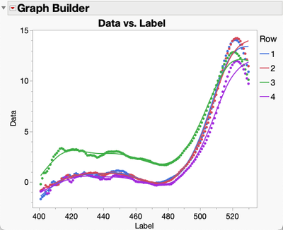
Your data is organized with your X value in the Column names and the Y values in each row. Instead you need XY pairs in rows a column to identify the "Row".
JMP makes it easy to reshape the data this way. Start by adding a new column to you table to hold the "Row" number.
Go to Cols->New Column... and complete the dialog naming the column Row, filling it with Sequence Data and adding the column before the first column.
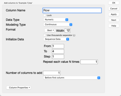
Next you'll want to Unhide and Unexclude all the columns that you've got hidden and excluded.
Then, go to Tables->Stack and you can stack all your 400-900 columns.
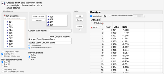
You'll get a table with three columns and 2000 rows.
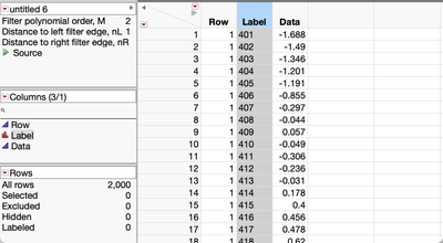
Now you'll need to change the data type of the Label column to Numeric and the Modeling Type to Continuous.
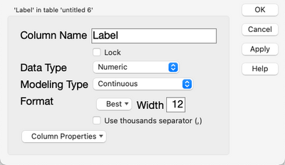
Now you can go to Graph Builder and drag the Label column to the X axis and the Data column to the Y axis and Row to the Overlay role.
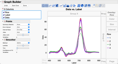
If you want only the range 400-500 you can rescale the axis or use a Local Data Filter on the Label column to exclude Labels greater than 500.
- Mark as New
- Bookmark
- Subscribe
- Mute
- Subscribe to RSS Feed
- Get Direct Link
- Report Inappropriate Content
Re: Graph Builder
Hallo Jeff,
Thanks for your reply, Jeff. Yes, what you describe is a solution to make the graph I wanted, but not the solution to my problem! the thing is, that when I use the data supplied, but only columns 400 - 500, I get the right graph (a part of yours):
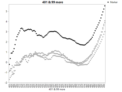
But if i include more columns (e.g. 501-530) then this graph appears:
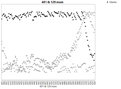
and I don't understand why this is. If - as you say - the data isn't organized appropiately, then why does it work well for 100 columns and not for 130 columns. That is what puzzles me and as I said before, I managed to do so with a different data set with 2000 columns and 1122 rows ?? Any explanation for that, Jeff?


- Mark as New
- Bookmark
- Subscribe
- Mute
- Subscribe to RSS Feed
- Get Direct Link
- Report Inappropriate Content
Re: Graph Builder
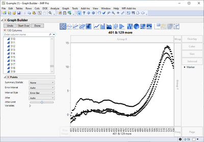
Not sure why but JMP seems to get confused with too many x-axis and then loses Y-axis (and displays only some x-axis)
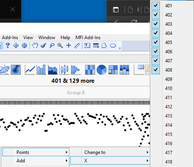
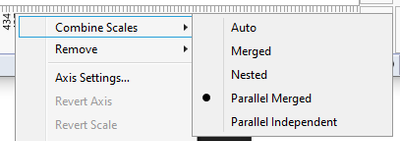
You could try combining the scales if you really want to plot it this way (I would use what Jeff suggested almost every time when working with JMP)
Recommended Articles
- © 2026 JMP Statistical Discovery LLC. All Rights Reserved.
- Terms of Use
- Privacy Statement
- Contact Us