- New to JMP? Let the Data Analysis Director guide you through selecting an analysis task, an analysis goal, and a data type. Available now in the JMP Marketplace!
- See how to install JMP Marketplace extensions to customize and enhance JMP.
- Subscribe to RSS Feed
- Mark Topic as New
- Mark Topic as Read
- Float this Topic for Current User
- Bookmark
- Subscribe
- Mute
- Printer Friendly Page
Discussions
Solve problems, and share tips and tricks with other JMP users.- JMP User Community
- :
- Discussions
- :
- Re: Graph Builder - two variables on one axis, but different graph types?
- Mark as New
- Bookmark
- Subscribe
- Mute
- Subscribe to RSS Feed
- Get Direct Link
- Report Inappropriate Content
Graph Builder - two variables on one axis, but different graph types?
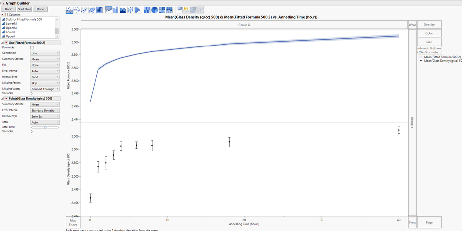
I want these two graphs on the same axis. Two different columns, two different errors.
I want the formula column to be a connected line and use the standard error as a band
I want the density columns to be a mean with std dev error bars
I want them together on the same plot, Is it possible?
Accepted Solutions
- Mark as New
- Bookmark
- Subscribe
- Mute
- Subscribe to RSS Feed
- Get Direct Link
- Report Inappropriate Content
Re: Graph Builder - two variables on one axis, but different graph types?
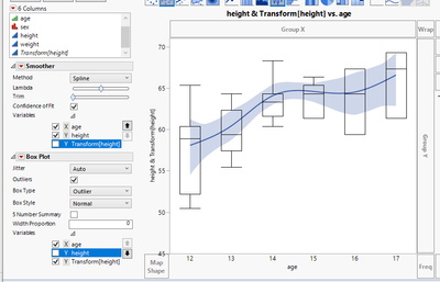
You should be able to do it this way:
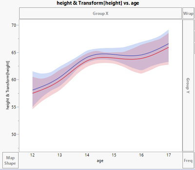
1. First add both columns to same section of Y-axis (select them both at the same time and drag and drop to Y-axis and select the visualization you want.
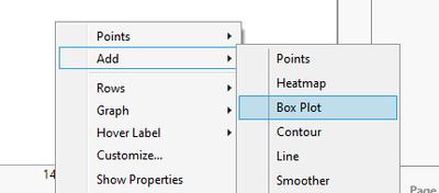
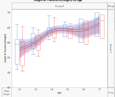
2. Right click on graph and choose add to add the visualization you want (you can also shift click to select the visualization from the top of graph)
3. Then from the left of graph expand Variables menus and uncheck unnecessary columns
- Mark as New
- Bookmark
- Subscribe
- Mute
- Subscribe to RSS Feed
- Get Direct Link
- Report Inappropriate Content
Re: Graph Builder - two variables on one axis, but different graph types?
Thank you, I just watched a JMP Video on graph builder that showed the variable menu. I have never used that before. Thanks!
Recommended Articles
- © 2026 JMP Statistical Discovery LLC. All Rights Reserved.
- Terms of Use
- Privacy Statement
- Contact Us
