- New to JMP? Let the Data Analysis Director guide you through selecting an analysis task, an analysis goal, and a data type. Available now in the JMP Marketplace!
- See how to install JMP Marketplace extensions to customize and enhance JMP.
- Subscribe to RSS Feed
- Mark Topic as New
- Mark Topic as Read
- Float this Topic for Current User
- Bookmark
- Subscribe
- Mute
- Printer Friendly Page
Discussions
Solve problems, and share tips and tricks with other JMP users.- JMP User Community
- :
- Discussions
- :
- Re: Graph Builder: Linear Y axis appears to be incorrect
- Mark as New
- Bookmark
- Subscribe
- Mute
- Subscribe to RSS Feed
- Get Direct Link
- Report Inappropriate Content
Graph Builder: Linear Y axis appears to be incorrect
Hello,
I am fairly new to JMP scripting and having a weird issue in the Graph Builder. I'm just trying to graph this data on linear X and Y axes. The average of the data (I can't post it, but it is fairly noisy; I am using the smoother for this reason) is 0.06 GPM (calculated using the Mean function further up in the script), but the average of the line on the graph is closer to 0.01 GPM, and the line never even approaches 0.06 GPM. I don't think the noise in the data is enough to cause this much of a disconnect.
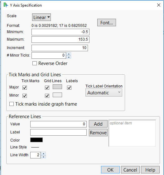
This is happening across a range of scripts that do similar things; in cases where the range of flow rates is higher, the y-axis labels even appear nonlinear, with varying distances between tick marks (but not quite exponential or power-based). An example of this kind of scale, and the y-axis settings, are attached.
Here is my graphing script:
build_graph = dt << Graph Builder(
Show Control Panel( 0 ),
Automatic Recalc( 0 ),
Variables( X( :Timestamp ), Y( :flow rate ) ),
Elements( Smoother( X, Y, Legend( 5 ) ) ),
SendToReport(
Dispatch(
{},
"Timestamp",
ScaleBox,
{Format( "m/y", 7 ), Min( 3611779200 ), Max( 3613248000 ),
Interval( "Week" ), Inc( 0.142857142857143 ), Minor Ticks( 0 )}
),
Dispatch(
{},
"flow rate",
ScaleBox,
{Min( -0.5 ), Max( 153.5 ), Inc( 10 ), Minor Ticks( 0 ),
Show Major Grid( 1 ), Show Minor Grid( 1 )}
)
)
)
I'm running JMP 11.1.1. I've searched these forums and the internet pretty thoroughly and haven't found anyone else having the same problem. I would prefer a scripting answer to the problem, but am happy to troubleshoot however is easiest.
Thank you in advance for your help!

Accepted Solutions
- Mark as New
- Bookmark
- Subscribe
- Mute
- Subscribe to RSS Feed
- Get Direct Link
- Report Inappropriate Content
Re: Graph Builder: Linear Y axis appears to be incorrect
It appears that your Y column (Flow Rate) has a categorical modeling type (either ordinal or nominal) and is therefore getting a categorical axis where your actual values are mapped to a categorical scale.
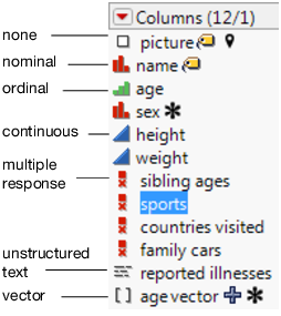
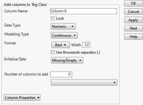
It should be pretty easy to fix by making sure that your Flow Rate column is set to the Continuous modeling type. If you can't change it to Continous it means that the column is also set to the wrong data type. It should be numeric, not character.
- Mark as New
- Bookmark
- Subscribe
- Mute
- Subscribe to RSS Feed
- Get Direct Link
- Report Inappropriate Content
Re: Graph Builder: Linear Y axis appears to be incorrect
Hi Brocolli Liker,
It is difficult to troubleshoot without having an example of the data. Can you send a data set that represents your real data? Also, what is the Data Type and Modeling type for each column used in Graph Builder?
Chris
Data Scientist, Life Sciences - Global Technical Enablement
JMP Statistical Discovery, LLC. - Denver, CO
Tel: +1-919-531-9927 ▪ Mobile: +1-303-378-7419 ▪ E-mail: chris.kirchberg@jmp.com
www.jmp.com
- Mark as New
- Bookmark
- Subscribe
- Mute
- Subscribe to RSS Feed
- Get Direct Link
- Report Inappropriate Content
Re: Graph Builder: Linear Y axis appears to be incorrect
It appears that your Y column (Flow Rate) has a categorical modeling type (either ordinal or nominal) and is therefore getting a categorical axis where your actual values are mapped to a categorical scale.

It should be pretty easy to fix by making sure that your Flow Rate column is set to the Continuous modeling type. If you can't change it to Continous it means that the column is also set to the wrong data type. It should be numeric, not character.

- Mark as New
- Bookmark
- Subscribe
- Mute
- Subscribe to RSS Feed
- Get Direct Link
- Report Inappropriate Content
Re: Graph Builder: Linear Y axis appears to be incorrect
That fixed it! Thank you so much - you made my life SO MUCH EASIER.
All the best,
Rachel
Recommended Articles
- © 2026 JMP Statistical Discovery LLC. All Rights Reserved.
- Terms of Use
- Privacy Statement
- Contact Us

