- New to JMP? Let the Data Analysis Director guide you through selecting an analysis task, an analysis goal, and a data type. Available now in the JMP Marketplace!
- See how to install JMP Marketplace extensions to customize and enhance JMP.
- Subscribe to RSS Feed
- Mark Topic as New
- Mark Topic as Read
- Float this Topic for Current User
- Bookmark
- Subscribe
- Mute
- Printer Friendly Page
Discussions
Solve problems, and share tips and tricks with other JMP users.- JMP User Community
- :
- Discussions
- :
- Graph Builder: How to Center Align Violin Plots with Points and Overlay Switched...
- Mark as New
- Bookmark
- Subscribe
- Mute
- Subscribe to RSS Feed
- Get Direct Link
- Report Inappropriate Content
Graph Builder: How to Center Align Violin Plots with Points and Overlay Switched on?
Hi JMP community,
I just ran into a slightly frustrating issue with Graph Builder:
- X axis 1: LEAD TAG
- X axis 2: SWITCH TO
- Y axis: Log2 Ratio After/before
- Overlay: LEAD TAG
- POINTS: ON
- CONTOUR: ON
- LINE: ON (mean + Std Err)
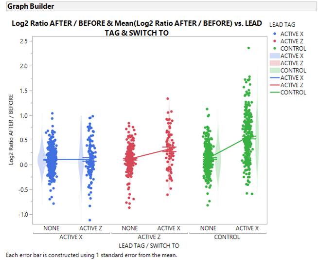
I have almost what I want (see below) but the Violon plots are aligned left for the first group, middle for the second group, and right for the last group. Any trick to get this odd behavior corrected (i.e. all Violin plots aligned to the middle?)
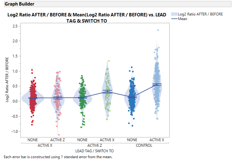
Note: If I do not use LEAD TAG as an Overly variable, I can align the Violin plots correctly but then I have a a problem with the Line: linked across LEAD TAG groups (see below).
Any suggestions would be highly appreciated.
Thanks
TS
Accepted Solutions
- Mark as New
- Bookmark
- Subscribe
- Mute
- Subscribe to RSS Feed
- Get Direct Link
- Report Inappropriate Content
Re: Graph Builder: How to Center Align Violin Plots with Points and Overlay Switched on?
This misalignment of points and other graph builder elements has been documented previously. I think there was agreement that the easiest method was to live without the violin plots being colored, otherwise customize the contour violins. Here is a script for Big Class.
Names Default to Here(1);

dt = Open("$Sample_Data/Big Class.jmp");

gb = dt << Graph Builder(
    show control panel(0),
	Variables( X( :age ), X( :sex, Position( 1 ) ), Y( :height ), Color( :age ) ),
	Elements(
		Points( X( 1 ), X( 2 ), Y, Legend( 6 ) ),
		Contour( X( 1 ), X( 2 ), Y, Legend( 7 ) )
	),
	SendToReport(
		Dispatch( {}, "age", ScaleBox, {Label Row( 2, Show Major Grid( 1 ) )} ),
		Dispatch(
			{},
			"Graph Builder",
			FrameBox,
			{DispatchSeg(
				Poly Seg( "Violin (13>>F)" ),
				{Transparency( 0.4 ), Fill Color( "Medium Dark Red" )}
			), DispatchSeg(
				Poly Seg( "Violin (13>>M)" ),
				{Transparency( 0.4 ), Fill Color( "Medium Dark Red" )}
			), DispatchSeg(
				Poly Seg( "Violin (14>>F)" ),
				{Transparency( 0.4 ), Fill Color( "Medium Dark Green" )}
			), DispatchSeg(
				Poly Seg( "Violin (14>>M)" ),
				{Transparency( 0.4 ), Fill Color( "Medium Dark Green" )}
			), DispatchSeg(
				Poly Seg( "Violin (15>>F)" ),
				{Transparency( 0.4 ), Fill Color( "Medium Dark Purple" )}
			), DispatchSeg(
				Poly Seg( "Violin (15>>M)" ),
				{Transparency( 0.4 ), Fill Color( "Medium Dark Purple" )}
			), DispatchSeg(
				Poly Seg( "Violin (16>>F)" ),
				{Transparency( 0.4 ), Fill Color( "Orange" )}
			), DispatchSeg(
				Poly Seg( "Violin (17>>M)" ),
				{Transparency( 0.4 ), Fill Color( "BlueCyan" )}
			)}
		)
	)
);
Recommended Articles
- © 2026 JMP Statistical Discovery LLC. All Rights Reserved.
- Terms of Use
- Privacy Statement
- Contact Us


