- New to JMP? Let the Data Analysis Director guide you through selecting an analysis task, an analysis goal, and a data type. Available now in the JMP Marketplace!
- See how to install JMP Marketplace extensions to customize and enhance JMP.
- Subscribe to RSS Feed
- Mark Topic as New
- Mark Topic as Read
- Float this Topic for Current User
- Bookmark
- Subscribe
- Mute
- Printer Friendly Page
Discussions
Solve problems, and share tips and tricks with other JMP users.- JMP User Community
- :
- Discussions
- :
- Find nearest neighbor/neighborhood for new entry to hierarchical model
- Mark as New
- Bookmark
- Subscribe
- Mute
- Subscribe to RSS Feed
- Get Direct Link
- Report Inappropriate Content
Find nearest neighbor/neighborhood for new entry to hierarchical model
I have a hierarchical clustering model that I like. I chose the clusters based on a balance of the statistics and domain knowledge, so they are generally much broader than the optimal CCC would suggest (although in some cases narrower). This is because the clusters are being used as a broad heuristic for business decisions, and too many clusters makes it too hard to action in the primary way we need to.
When I have new data come in it is straightforward to determine which of these clusters they fall into. However one of my users really loved the constellation chart (I do too!), and found that it provided some useful qualitative knowledge. So while the smaller sub-clusters weren't picked for the overall quality representation, they are still very useful for looking at visually.
What I want to know is if there is a way to visualize where new data would enter the clustering model, down to a specific sub-branch. Especially within the constellation chart. Only thing I can think of doing is to either
a) Find a Nearest Neighbors algorithm that gets me close to the same structure as the hierarchical clusters
b) Solve a few extra layers of clusters that are much much more granular, going down to the last couple of branches, and then just report the memberships of the close relative clusters to the user.
Neither of these really puts it on the constellation chart, but option b could at least give them a roadmap of where to look.
Any thoughts on how you can visualize new entries into a hierarchical cluster model?
Accepted Solutions
- Mark as New
- Bookmark
- Subscribe
- Mute
- Subscribe to RSS Feed
- Get Direct Link
- Report Inappropriate Content
Re: Find nearest neighbor/neighborhood for new entry to hierarchical model
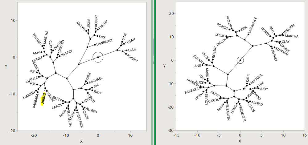
if you add a row you can expect the clustering order to shift about, maybe a lot. The new tree will probably not look like the old tree with the new node inserted at the point you identify. Big Class, clustered by height and weight, shows this when James is added/removed:

- Mark as New
- Bookmark
- Subscribe
- Mute
- Subscribe to RSS Feed
- Get Direct Link
- Report Inappropriate Content
Re: Find nearest neighbor/neighborhood for new entry to hierarchical model
Take a look at the SaveClusterTree red triangle option and see if that does what you need. If not, maybe Circular Dendrogram might answer some of your questions. I think that code might have been simpler if I looked at the SaveClusterTree table. Oh well.
- Mark as New
- Bookmark
- Subscribe
- Mute
- Subscribe to RSS Feed
- Get Direct Link
- Report Inappropriate Content
Re: Find nearest neighbor/neighborhood for new entry to hierarchical model
if you add a row you can expect the clustering order to shift about, maybe a lot. The new tree will probably not look like the old tree with the new node inserted at the point you identify. Big Class, clustered by height and weight, shows this when James is added/removed:

Recommended Articles
- © 2026 JMP Statistical Discovery LLC. All Rights Reserved.
- Terms of Use
- Privacy Statement
- Contact Us
