- New to JMP? Let the Data Analysis Director guide you through selecting an analysis task, an analysis goal, and a data type. Available now in the JMP Marketplace!
- See how to install JMP Marketplace extensions to customize and enhance JMP.
- Subscribe to RSS Feed
- Mark Topic as New
- Mark Topic as Read
- Float this Topic for Current User
- Bookmark
- Subscribe
- Mute
- Printer Friendly Page
Discussions
Solve problems, and share tips and tricks with other JMP users.- JMP User Community
- :
- Discussions
- :
- Extracting peak readings from a data set
- Mark as New
- Bookmark
- Subscribe
- Mute
- Subscribe to RSS Feed
- Get Direct Link
- Report Inappropriate Content
Extracting peak readings from a data set
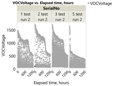
I am currently running a longevity test with four units which are responding to an application of gas periodically (although the intervals between the gas applications are not consistent!). I have plotted the data into the graph below:
Does anyone know of a way in which I can filter the peak readings so I can show a trend line and proceed with further analysis? Most of the data points are nearing the minimum readings of each unit, therefore any line of fit for the data set appear right at the bottom of the graph:
I am able to do this manually, however as this needs to be repeated throughout the test it can get quite tedious. Thanks in advance!
Accepted Solutions
- Mark as New
- Bookmark
- Subscribe
- Mute
- Subscribe to RSS Feed
- Get Direct Link
- Report Inappropriate Content
Re: Extracting peak readings from a data set
Hi @AvgLlama27 ,
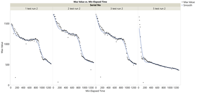
I got some good success with the script attached - I don't think you could easily do this with a formula column. The script below works by:
1) Taking 'Slices' of a set width (number of rows) per serial number - in the example below it samples 600 rows
2) Find the maximum value for that 'slice'
3) Store the maximum value alongside the first and last 'elapsed time' and 'time stamp' values for the first and last row.
You will have to adapt the 'windowsize' variable and mess around to find a good fit, but a quick go at 600 rows worked well.
Before
After
Cheers,
Ben
// Get the current data table
dt = Current Data Table();

Windowsize = 600; //Set this to the 'width' you want to evaluate

// Initialize an empty table to store the results
dt_summary = New Table( "Summary Table",
    New Column( "Serial No", Character ),
    New Column( "Batch No", Numeric ),
    New Column( "Max Value", Numeric ),
    New Column( "Min Elapsed Time", Numeric ),
    New Column( "Max Elapsed Time", Numeric ),
    New Column( "Start Timestamp", "Numeric", "Nominal", Format("m/d/y h:m:s", 23, 0) ),
    New Column( "End Timestamp", "Numeric", "Nominal", Format("m/d/y h:m:s", 23, 0) )
);

// Iterate over unique "Serial No"/identifier column
serials = Associative Array( dt:SerialNo ) << Get Keys();//removes duplicate values

//Run a loop to pull out the max row values for each 'window'
For( i = 1, i <= N Items( serials ), i++,
    serial = serials[i];

    // Get rows for the current Serial No
    rows = dt << Get Rows Where( dt:SerialNo == serial );

    // Loop through every [windowsize] rows
    For( j = 1, j <= N Items( rows ), j += windowsize,
        // Determine the range of rows for the current batch
        batch_rows = rows[j :: Min( j + (windowsize-1), N Items( rows ) )];

        // Get the max value for this batch
        max_val = Max( dt:VOCVoltage[batch_rows] );

        // Get the range of 'Elapsed Time'
        min_elapsed_time = Min( dt:"Elapsed Time,hours"n[batch_rows] );
        max_elapsed_time = Max( dt:"Elapsed Time,hours"n[batch_rows] );

        // Get the start and end 'Timestamp'
        start_timestamp = dt:Timestamp[batch_rows[1]];
        end_timestamp = dt:Timestamp[batch_rows[N Items( batch_rows )]];

        // Add a row to the summary table
        dt_summary << Add Rows( 1 );
        dt_summary:Serial No[N Row( dt_summary )] = serial;
        dt_summary:Batch No[N Row( dt_summary )] = Ceiling( j / windowsize );
        dt_summary:Max Value[N Row( dt_summary )] = max_val;
        dt_summary:Min Elapsed Time[N Row( dt_summary )] = min_elapsed_time;
        dt_summary:Max Elapsed Time[N Row( dt_summary )] = max_elapsed_time;
        dt_summary:Start Timestamp[N Row( dt_summary )] = start_timestamp ;
        dt_summary:End Timestamp[N Row( dt_summary )] = end_timestamp ;
    );
);

// Show the summary table
dt_summary << Show Window;
- Mark as New
- Bookmark
- Subscribe
- Mute
- Subscribe to RSS Feed
- Get Direct Link
- Report Inappropriate Content
Re: Extracting peak readings from a data set
What trend lines are you hoping to pick out? Obviously you have a lot of noise in the data, but I can see potentially some areas 'in the noise' that resembles a trend line. If you just want to pull out the maximum value (i.e. the top line) you could extract the max value per time? Another option could be to look at a Moving Average (https://community.jmp.com/t5/Discussions/Moving-Average/td-p/87647)
- Mark as New
- Bookmark
- Subscribe
- Mute
- Subscribe to RSS Feed
- Get Direct Link
- Report Inappropriate Content
Re: Extracting peak readings from a data set
Hi Ben, the points I'm after are the ones nearing the top of each graph. I'm looking to take the maximum response from each unit as the gas is applied so that I can model the degradation over time. Ideally looking something like this:
That could work! Is there an easy way to "extract the max value per time" in a formula column?
- Mark as New
- Bookmark
- Subscribe
- Mute
- Subscribe to RSS Feed
- Get Direct Link
- Report Inappropriate Content
Re: Extracting peak readings from a data set
Hi @AvgLlama27 ,
Could you provide an example of your dataset to look at?
Thanks,
Ben
- Mark as New
- Bookmark
- Subscribe
- Mute
- Subscribe to RSS Feed
- Get Direct Link
- Report Inappropriate Content
Re: Extracting peak readings from a data set
- Mark as New
- Bookmark
- Subscribe
- Mute
- Subscribe to RSS Feed
- Get Direct Link
- Report Inappropriate Content
Re: Extracting peak readings from a data set
Hi @AvgLlama27 ,
I got some good success with the script attached - I don't think you could easily do this with a formula column. The script below works by:
1) Taking 'Slices' of a set width (number of rows) per serial number - in the example below it samples 600 rows
2) Find the maximum value for that 'slice'
3) Store the maximum value alongside the first and last 'elapsed time' and 'time stamp' values for the first and last row.
You will have to adapt the 'windowsize' variable and mess around to find a good fit, but a quick go at 600 rows worked well.
Before
After
Cheers,
Ben
// Get the current data table
dt = Current Data Table();

Windowsize = 600; //Set this to the 'width' you want to evaluate

// Initialize an empty table to store the results
dt_summary = New Table( "Summary Table",
    New Column( "Serial No", Character ),
    New Column( "Batch No", Numeric ),
    New Column( "Max Value", Numeric ),
    New Column( "Min Elapsed Time", Numeric ),
    New Column( "Max Elapsed Time", Numeric ),
    New Column( "Start Timestamp", "Numeric", "Nominal", Format("m/d/y h:m:s", 23, 0) ),
    New Column( "End Timestamp", "Numeric", "Nominal", Format("m/d/y h:m:s", 23, 0) )
);

// Iterate over unique "Serial No"/identifier column
serials = Associative Array( dt:SerialNo ) << Get Keys();//removes duplicate values

//Run a loop to pull out the max row values for each 'window'
For( i = 1, i <= N Items( serials ), i++,
    serial = serials[i];

    // Get rows for the current Serial No
    rows = dt << Get Rows Where( dt:SerialNo == serial );

    // Loop through every [windowsize] rows
    For( j = 1, j <= N Items( rows ), j += windowsize,
        // Determine the range of rows for the current batch
        batch_rows = rows[j :: Min( j + (windowsize-1), N Items( rows ) )];

        // Get the max value for this batch
        max_val = Max( dt:VOCVoltage[batch_rows] );

        // Get the range of 'Elapsed Time'
        min_elapsed_time = Min( dt:"Elapsed Time,hours"n[batch_rows] );
        max_elapsed_time = Max( dt:"Elapsed Time,hours"n[batch_rows] );

        // Get the start and end 'Timestamp'
        start_timestamp = dt:Timestamp[batch_rows[1]];
        end_timestamp = dt:Timestamp[batch_rows[N Items( batch_rows )]];

        // Add a row to the summary table
        dt_summary << Add Rows( 1 );
        dt_summary:Serial No[N Row( dt_summary )] = serial;
        dt_summary:Batch No[N Row( dt_summary )] = Ceiling( j / windowsize );
        dt_summary:Max Value[N Row( dt_summary )] = max_val;
        dt_summary:Min Elapsed Time[N Row( dt_summary )] = min_elapsed_time;
        dt_summary:Max Elapsed Time[N Row( dt_summary )] = max_elapsed_time;
        dt_summary:Start Timestamp[N Row( dt_summary )] = start_timestamp ;
        dt_summary:End Timestamp[N Row( dt_summary )] = end_timestamp ;
    );
);

// Show the summary table
dt_summary << Show Window;
- Mark as New
- Bookmark
- Subscribe
- Mute
- Subscribe to RSS Feed
- Get Direct Link
- Report Inappropriate Content
Re: Extracting peak readings from a data set
Recommended Articles
- © 2026 JMP Statistical Discovery LLC. All Rights Reserved.
- Terms of Use
- Privacy Statement
- Contact Us


