- New to JMP? Let the Data Analysis Director guide you through selecting an analysis task, an analysis goal, and a data type. Available now in the JMP Marketplace!
- See how to install JMP Marketplace extensions to customize and enhance JMP.
- Subscribe to RSS Feed
- Mark Topic as New
- Mark Topic as Read
- Float this Topic for Current User
- Bookmark
- Subscribe
- Mute
- Printer Friendly Page
Discussions
Solve problems, and share tips and tricks with other JMP users.- JMP User Community
- :
- Discussions
- :
- Extracting and editing JMP graphic output: Multiple Correspondence or Factor Pl...
- Mark as New
- Bookmark
- Subscribe
- Mute
- Subscribe to RSS Feed
- Get Direct Link
- Report Inappropriate Content
Extracting and editing JMP graphic output: Multiple Correspondence or Factor Plots
I have been working with that wonder of ungovernable data, the Twitter feed. One of the unavoidable hypotheses about it is that users respond to other users, not necessarily to discrete content or events in the outside world. Predicting the content of tweets about coronovirus in Hawaii from incidence levels was not impossible, but R-squares less than .02 are not very convincing.
Running an ill-thought-out MCA on the user identifiers tweets entities mentions, tweets enitites hastags, users descriptions and user names presented a very much more dramatic picture--attached.
Unfortunately, I cannot use this in any kind of presentation, because I cannot disentangle the labels. Smaller type and shorter titles will not really do the job. How can I get into the file that generates the figure and extract the X, Y coordinates, and the label text? If I can do that, I could edit the label text, shorten words, and suppress near-duplicates so the picture can be interpreted. It is clear that the sources come from around the country--and the blue numerals indicate that incidence levels are associated with some of the Twitter entries (irrespective of the content of the text--the association is with the entry itself!)
I would really like some insight into the technology. It would appear that MCA is in fact a device for analysis of potentially sparse data that does not require the generation of n-user x n-user matrices. I hope I am right in this supposition.
Accepted Solutions
- Mark as New
- Bookmark
- Subscribe
- Mute
- Subscribe to RSS Feed
- Get Direct Link
- Report Inappropriate Content
Re: Extracting and editing JMP graphic output: Multiple Correspondence or Factor Plots
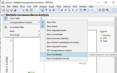
ou can get the coordinates and labels in a data table by going to the red triangle and selecting
Correspondence Analysis=>Save Coordinates
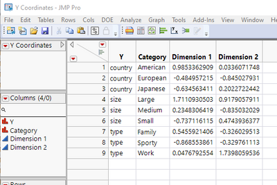
It creates a data table with the coordinates and the labels
Recommended Articles
- © 2026 JMP Statistical Discovery LLC. All Rights Reserved.
- Terms of Use
- Privacy Statement
- Contact Us


