- New to JMP? Let the Data Analysis Director guide you through selecting an analysis task, an analysis goal, and a data type. Available now in the JMP Marketplace!
- See how to install JMP Marketplace extensions to customize and enhance JMP.
- Subscribe to RSS Feed
- Mark Topic as New
- Mark Topic as Read
- Float this Topic for Current User
- Bookmark
- Subscribe
- Mute
- Printer Friendly Page
Discussions
Solve problems, and share tips and tricks with other JMP users.- JMP User Community
- :
- Discussions
- :
- Re: Exclude rows option also hides rows from analysis in Fit Model, Life Distrib...
- Mark as New
- Bookmark
- Subscribe
- Mute
- Subscribe to RSS Feed
- Get Direct Link
- Report Inappropriate Content
Exclude rows option also hides rows from analysis in Fit Model, Life Distribution and Fit Life by X platforms
Hi All,
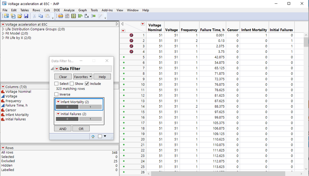
I am trying to Exclude rows from analysis in Fit Model, Life Distribution and Fit Life by X platforms.
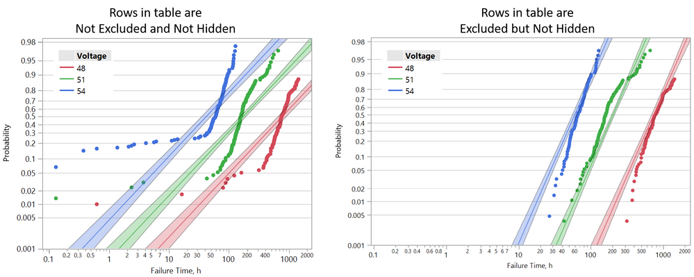
In all platforms mentioned above excluded row are also appear to be hidden in graphs, while in table these rows are only excluded.
Question: Why excluded rows are also become hidden in Fit Model, Life Distribution and Fit Life by X platforms?
For more details see screenshots below and attached JMP file.
- Mark as New
- Bookmark
- Subscribe
- Mute
- Subscribe to RSS Feed
- Get Direct Link
- Report Inappropriate Content
Re: Exclude rows option also hides rows from analysis in Fit Model, Life Distribution and Fit Life by X platforms
The described convention only applies to "raw data points", which can be plotted, no matter they are excluded from analysis or not, as long as not hidden.
Here in Fit Life by X etc., the markers are not "raw data points", they are non-parametric estimate of distribution function. They are computed with and corresponding to the observations that are included in the analysis.
- Mark as New
- Bookmark
- Subscribe
- Mute
- Subscribe to RSS Feed
- Get Direct Link
- Report Inappropriate Content
Re: Exclude rows option also hides rows from analysis in Fit Model, Life Distribution and Fit Life by X platforms
Despite the original question, the analysis of the data is rather interesting. I think marking either Infant Mortality and/or Initial Failures as right censored observations should be the desired approach, rather than "exclude". If I guess correctly, you are trying to analyze a "competing mode" data from an accelerated life test, and you are interested in the relationship between the failure distribution and voltage, due to "expected" failure mode under regular conditions. However, Infant Mortality and Initial Failures are two different failure modes that you are not interested in. I believe the correct way of handling uninterested failure modes in this example is to treat them right censored, i.e. the "potential" failure time due the interested mode is after the recorded failure time due to other modes. So you need to create another time column, whose values equal "Failure Time, h" if Infant Mortality and/or (depend on whether they are both abnormal failure modes) Initial Failures equal zeros, missing if those equal ones. Then put both "Failure Time, h" and the new time column into Y.
- Mark as New
- Bookmark
- Subscribe
- Mute
- Subscribe to RSS Feed
- Get Direct Link
- Report Inappropriate Content
Re: Exclude rows option also hides rows from analysis in Fit Model, Life Distribution and Fit Life by X platforms
Dear peng_liu,
Thank you for reply.
What I am trying to do is make Inverse Power model from voltage accelerated tests.
For this purpose I am using Regression model with Log-Logistic distribution via Fit Life by X or Parametric Survival Fit model platforms in JMP. From Fit Life by X report I get power η specified in Inverse Power model equation above.
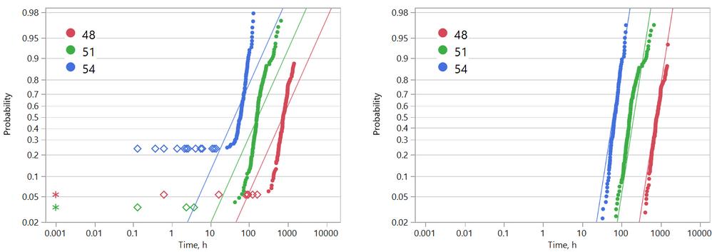
The problem is that fitting is poor when infant and initial failures are not excluded from model (see Figure 1 below).
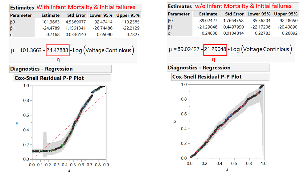
As result it can be seen from Figure 2 that:
- values of η and σ are significantly differ between Inverse Power models estimated with and w/o initial failures
- Fitting with initial failures is poorly predicts Inverse Power model (see Cox-Snell Residual P-P Plot)
What I am trying to do is
- fit Inverse Power model model w/o infant mortality and initial failures
- and in same time keep showing infant mortality and initial failures on Fit Life by X graph
Note: The infant mortality (asterisk) and initial failures (rhomb) in left graph of Figure 1 are right-censored in JMP table
Figure 1
Figure 2
- Mark as New
- Bookmark
- Subscribe
- Mute
- Subscribe to RSS Feed
- Get Direct Link
- Report Inappropriate Content
Re: Exclude rows option also hides rows from analysis in Fit Model, Life Distribution and Fit Life by X platforms
There are two extra things need attention here when we convert infant mortality and initial failures into right censored observations. If data only have failures and right censored observations, there are two formats:
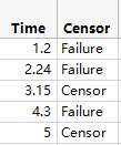
The first is the Time-and-Censor-Indicator column format like the following. Most reliability platforms accept text values in the Censor column now. The zero-one coding, though, is still accepted by default.
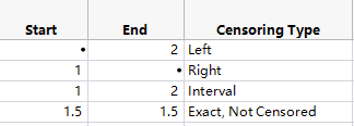
The second is the Time-Interval column format like the following. Here platforms will expect two time columns Start and End, no indicator column any more, and figure out appropriate censoring types depending on the missing value patterns in the cells. Here, for example, the second row has a missing value in End, and that row indicates a right censored observation.
Now come back to this specific case, in which we want to mark infant mortality and initial failures as right censored. The data also has some "censored" observations already, which are actually "right censored" due to suspension. Therefore, we would like to mark all three types of observation right censored: infant mortality, initial failure, and originally right censored.
I attach both approaches to illustrate. First, the "time censor format.jmp". I keep "Time to Failure, h" untouched, but create a new column "Effective Censor" with this formula:
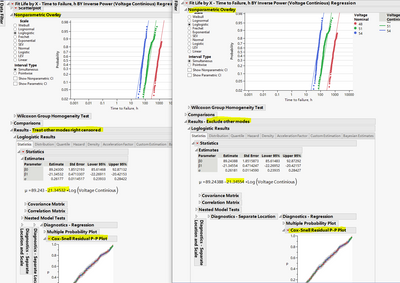
Then I use "Time to Failure, h" and "Effective Censor" as my time and censor indicator columns to analyze the data. The following is the screenshot of the comparison between "treating other modes right censored" and "excluding other modes". The scripts are in the table. The numbers are close, but I believe that we should treat other modes right censored here.
Now the other format: "interval format.jmp". The table defines "Start Period of Time, h" and "End Period of Time,h" as follows. This is "Start Period of Time, h"
And this is "Eng Period of Time, h"
Now I only use "Start Period of Time, h" and "End Period of Time,h" for the analysis. And reports should replicate what are in the previous screenshot. The scripts are in the table.
Last, let me explain what are those dots in the Nonparametric Overlay. They are non-parametric estimates of failure distributions at different voltage levels. The estimates use included data points and are associated with them. A point is not drawn because (1) the corresponding observation is not included in the analysis, or (2) the at the time of the corresponding observation, the probability estimate cannot be determined. Reason (1) is what I explained earlier. For reason (2), see, for example, the first row in "time censor format.jmp", time = 0.001, infant mortality = 1. We treat it as right censored. And we don't see any dots around 0.001 in the corresponding plot. Because we cannot put a definite probability estimate at time = 0.001. All we can tell is that the probability associated to Voltage=51 at time=0.001 should be smaller than the lowest point of the green dots, which is around 0.02.
- Mark as New
- Bookmark
- Subscribe
- Mute
- Subscribe to RSS Feed
- Get Direct Link
- Report Inappropriate Content
Re: Exclude rows option also hides rows from analysis in Fit Model, Life Distribution and Fit Life by X platforms
Hi peng_liu,
Sorry for delayed response, I saw your reply only recently.
In any case thank you for detailed explanation and attached examples.
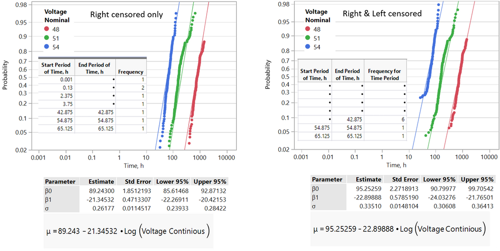
I believe that interval format with right and left censored data is the best one see graphs below.
Graph with right and left censored data present points at probabilities where they are actually start contribute to fit.
Obtained parameters of fit are slightly differs between two variants, but no more than 1%.
Recommended Articles
- © 2026 JMP Statistical Discovery LLC. All Rights Reserved.
- Terms of Use
- Privacy Statement
- Contact Us
