- New to JMP? Let the Data Analysis Director guide you through selecting an analysis task, an analysis goal, and a data type. Available now in the JMP Marketplace!
- See how to install JMP Marketplace extensions to customize and enhance JMP.
- Subscribe to RSS Feed
- Mark Topic as New
- Mark Topic as Read
- Float this Topic for Current User
- Bookmark
- Subscribe
- Mute
- Printer Friendly Page
Discussions
Solve problems, and share tips and tricks with other JMP users.- JMP User Community
- :
- Discussions
- :
- Error bars for non-normal data
- Mark as New
- Bookmark
- Subscribe
- Mute
- Subscribe to RSS Feed
- Get Direct Link
- Report Inappropriate Content
Error bars for non-normal data
Hello JMP community,
I wanted to hear what statisticians believe is the best way to depict error bars for skewed data?
I have a non-normal distribution of measurements (mg of drug taken per a day across ~50 people across 3 days) and I have 3 groups of people. I'd like to make a line graph (not box plot) but I'm not sure what to put as the error bars. The main data points would be the median (not mean) amount of drug taken between the 3 groups of people at the 3 time points. Time would be the x-axis, mg of drug the y-axis.
Any suggestions on what's most statistically appropriate?
Thank you
- Mark as New
- Bookmark
- Subscribe
- Mute
- Subscribe to RSS Feed
- Get Direct Link
- Report Inappropriate Content
Re: Error bars for non-normal data
Sounds like you have a time series which may appear as a skewed distribution when the time component is collapsed. Why not look at the data with a control chart? IR in JMP. Or you could subgroup by groups of people, Or IR by Group)
- Mark as New
- Bookmark
- Subscribe
- Mute
- Subscribe to RSS Feed
- Get Direct Link
- Report Inappropriate Content
Re: Error bars for non-normal data
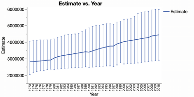
The Distribution platform has a feature called Custom Quantiles. Not only will it give you any quantile you specify, it will also give you confidence intervals for it. So you can launch Distribution and your graphs X variable as the BY variable in Distribution. The broadcast the Custom Quantile command and then right-click on the result and choose Make Into Combined Data Table to get all the results into a new table. From there you can plot those in Graph Builder by putting the Upper and Lower columns into the Interval role.
Something like this should do it:
Open("$SAMPLE_DATA/CrimeData.jmp" );
platform = Distribution(
	Continuous Distribution(
		Column( :Population ),
		Custom Quantiles( 0.95, [0.5] )
	),
	By( :Year )
);
Wait( 0 );
Report( platform[1] )[Outline Box( "Population" )][Outline Box( "Custom Quantiles" )
][Outline Box( "Quantiles" )][Table Box( 1 )] << Make Combined Data Table;

wait(0);
Graph Builder(
	Size( 564, 440 ),
	Show Control Panel( 0 ),
	Variables(
		X( :Year ),
		Y( :Estimate ),
		Interval( :Lower 95% ),
		Interval( :Upper 95% )
	),
	Elements( Line( X, Y, Legend( 7 ) ) )
);
Recommended Articles
- © 2026 JMP Statistical Discovery LLC. All Rights Reserved.
- Terms of Use
- Privacy Statement
- Contact Us


