- Subscribe to RSS Feed
- Mark Topic as New
- Mark Topic as Read
- Float this Topic for Current User
- Bookmark
- Subscribe
- Mute
- Printer Friendly Page
Discussions
Solve problems, and share tips and tricks with other JMP users.- JMP User Community
- :
- Discussions
- :
- Re: Dynamic Change of Y-Axis settings with data filter
- Mark as New
- Bookmark
- Subscribe
- Mute
- Subscribe to RSS Feed
- Get Direct Link
- Report Inappropriate Content
Dynamic Change of Y-Axis settings with data filter
Hi,
This is Balaji & basically i'm a quality engineer.
Here is my situation:
I have a raw dimensional data [In Stack format] for different dimensions from different plant & from different machines [1 plant will have multiple machines]
I have made some box plot through graph builder to compare the process spread b/w diff. plants & diff. machines.
In order to visualise the Specification limits along with process spread, i used decorate spec limits through axis settings.
Since the raw data involves multiple dimesions, i can not create muliple axis setting settings.
Is it possible to change the axis settings dynamically through data filter option of dimension column? [i.e] based on the selection of dimension, Spec limits should be changed in the plot.
Also it'd would be more helpful, if you share any other options to compare the data through box plot along with spec limits.
Thanks in advance.
- Mark as New
- Bookmark
- Subscribe
- Mute
- Subscribe to RSS Feed
- Get Direct Link
- Report Inappropriate Content
Re: Dynamic Change of Y-Axis settings with data filter
What you need to do, is to turn the Automatic Recalc on for the chart you want changed.
Under the red triangle, select
Redo==>Automatic Recalc
You also need to make sure that you have selected the "Include" option in the Data Filter
- Mark as New
- Bookmark
- Subscribe
- Mute
- Subscribe to RSS Feed
- Get Direct Link
- Report Inappropriate Content
Re: Dynamic Change of Y-Axis settings with data filter
Thanks for your reply.
Here i am explaining more in detailed, for better understanding of my requirement about axis settings dynamic change through local data filter.
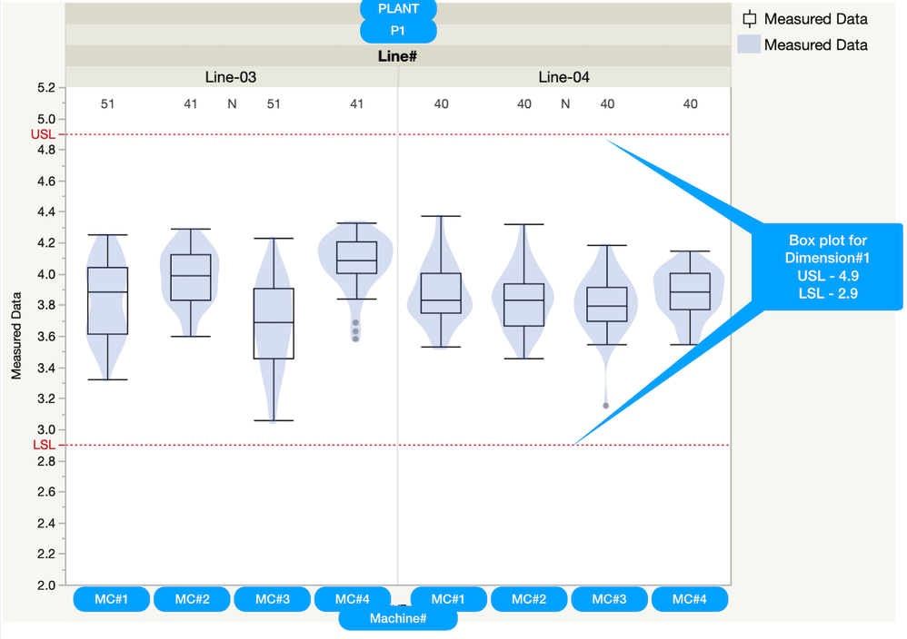
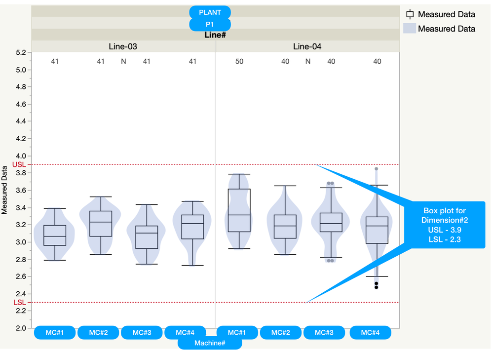
Below is the ideal graph output that i needed for 2 dimensions, say Dim#1 & Dim#2
Dim#1: [When i filter Dim#1 through local data filter, Dim#1 box plots with USL & LSL limits shown. These limits has been defined in axis settings -> Reference lines manually]
Dim#2: Similarly when i filter Dim#2, Dim#2 box plots with USL & LSL limits shown. These limits also has been defined in axis settings -> Reference lines manually]
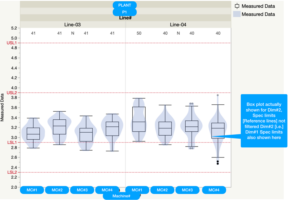
Below one is the reality: I have set Spec limits for both Dim#1 & #2 through axis settings -> Reference lines. When i try to visualise Dim#2 box plot, i am seeing both Dim#1 & #2 Spec limits, which will create a confusion.
Actually i am trying to visualise single Dimension's box plot along with respective spec limits alone. meaning, i'd like to remove other dimensions spec limits.
Can it be done through any script? or Do we have any other option apart from this graph builder to visualise the line wise/machine wise box plot comparison along with spec limits?
Recommended Articles
- © 2026 JMP Statistical Discovery LLC. All Rights Reserved.
- Terms of Use
- Privacy Statement
- Contact Us


