- Subscribe to RSS Feed
- Mark Topic as New
- Mark Topic as Read
- Float this Topic for Current User
- Bookmark
- Subscribe
- Mute
- Printer Friendly Page
Discussions
Solve problems, and share tips and tricks with other JMP users.- JMP User Community
- :
- Discussions
- :
- Darshan Hiranandani : How can I enable line connections between data points in t...
- Mark as New
- Bookmark
- Subscribe
- Mute
- Subscribe to RSS Feed
- Get Direct Link
- Report Inappropriate Content
Darshan Hiranandani : How can I enable line connections between data points in the graph builder tool?
Hi everyone,
I'm Darshan Hiranandani, I'm using a graph builder tool and I'm trying to enable line connections between data points for better visualization. Could anyone share how to do this or any tips on using the tool effectively?
Regards
Darshan Hiranandani
- Mark as New
- Bookmark
- Subscribe
- Mute
- Subscribe to RSS Feed
- Get Direct Link
- Report Inappropriate Content
Re: Darshan Hiranandani : How can I enable line connections between data points in the graph builder tool?
Hi @darshanhira23,
Welcome in the Community !
I can suggest to read the Essential Graphing part related to Graph Builder to see the different visualization options : Element Types and Options
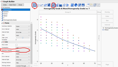
If you plot your data points, pressing SHIFT + clicking on the "Line" icon enable to superimpose these two graphical options :
You can have lines for several ID/formulations... if you add a new ID variable in the "Overlay" panel. Note that by default the line is a mean summary line, but you can change it into median, min/max, ...
Hope this answer will help you,
"It is not unusual for a well-designed experiment to analyze itself" (Box, Hunter and Hunter)
- Mark as New
- Bookmark
- Subscribe
- Mute
- Subscribe to RSS Feed
- Get Direct Link
- Report Inappropriate Content
Re: Darshan Hiranandani : How can I enable line connections between data points in the graph builder tool?
Using the Big Class sample data table and wanting to draw a line graph with the line going through each data point.
The X axis, Weight, needs to be sorted in ascending order, so before opening Graph Builder order the data table by ascending weight.
Then open Graph Builder and drag Height to the Y axis and Weight to the X axis.
click on the Line icon
Which changes the display to
However, the line graph is graphing the mean values. Th change to each data point select the Row Order box
Recommended Articles
- © 2026 JMP Statistical Discovery LLC. All Rights Reserved.
- Terms of Use
- Privacy Statement
- Contact Us


