- JMP User Community
- :
- Discussions
- :
- Correlation for binary data in different columns
- Subscribe to RSS Feed
- Mark Topic as New
- Mark Topic as Read
- Float this Topic for Current User
- Bookmark
- Subscribe
- Printer Friendly Page
- Mark as New
- Bookmark
- Subscribe
- Mute
- Subscribe to RSS Feed
- Get Direct Link
- Report Inappropriate Content
Correlation for binary data in different columns
Hi
So I have a very large dataset full of 1's and 0's for each column. I am trying to see if there is any correlation between some of the particular columns.
I am trying to correlate data on inside an area vs. outside of the area to see if there are any significant differences between people inside and outside these areas. And I am doing it for many different areas. It is a survey with yes and no answers, so the columns would look something like this with "no" as 0 and "yes" as 1.
Inside area Outside area
0 0
0 0
0 1
0 1
1 1
1 1
1 1
etc. etc.
I am not sure how to go about this. I have tried the "Fit Y by X" option with column 1 as Y, Response and column 2 as X, Factor but the result don't really look right.
Can anyone help with this?
Thanks
- Mark as New
- Bookmark
- Subscribe
- Mute
- Subscribe to RSS Feed
- Get Direct Link
- Report Inappropriate Content
Re: Correlation for binary data in different columns
Correlation measures the degree of linear association between two continuous variables.
Since the values are only 0 and 1, I would recommend using the nominal modeling type for these columns rather than continuous. You can still use Fit Y by X. The mosaic plot will give a good graphic depicting the relationship between Inside and Outside. I would then use the "Agreement Statistic" which measures the degree of agreement between Inside and Outside. This is similar to a correlation coefficient, but is for categorical data. You will also have a test for the null hypothesis of kappa=0.
- Mark as New
- Bookmark
- Subscribe
- Mute
- Subscribe to RSS Feed
- Get Direct Link
- Report Inappropriate Content
Re: Correlation for binary data in different columns
I agree with Dan the Fit Y by X Contingency analysis with the Mosaic plot and Kappa statistic provide more information. It is especially useful for more than 2 levels, and provides additional statstics.
As an FYI, if the two columns of 0s and 1s are continuous, use the multivariate platform and select the CI of Correlation, This is the Kappa statistic for this simple 2 level case. Hopefully, this provides some insight into the Kappa statistic.


- Mark as New
- Bookmark
- Subscribe
- Mute
- Subscribe to RSS Feed
- Get Direct Link
- Report Inappropriate Content
Re: Correlation for binary data in different columns
Thank you guys for answering the question!
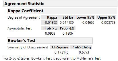
So I have done the Fit Y by X and looked at the agreement statistic and it looks like this:
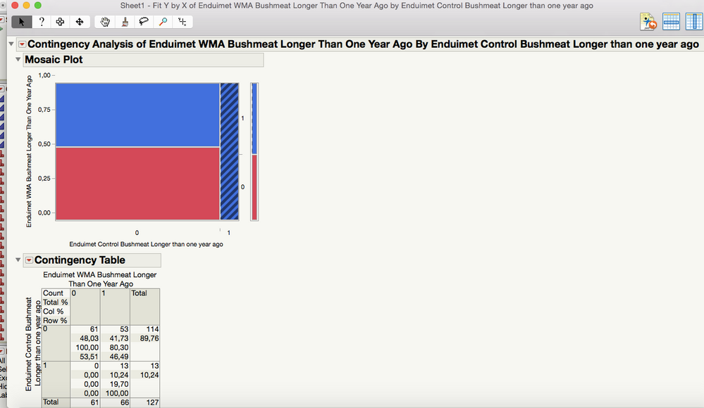
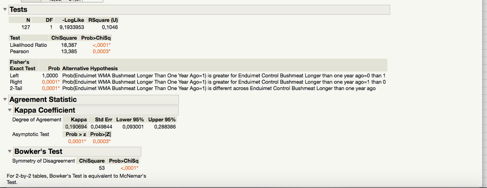
I think there is an issue with total number of answers. In Column 1 there are 127 answers (0's and 1's) and in Column 2 there are 158 answers. However when doing the above analysis it only compares for 127 in total, as can be seen in the screenshot. Is there any way to bypass this, because I do not really see if there is any relevant information to be obtained from this as it is now (P-values look a little suspect).
I really appreciate the help!
- Mark as New
- Bookmark
- Subscribe
- Mute
- Subscribe to RSS Feed
- Get Direct Link
- Report Inappropriate Content
Re: Correlation for binary data in different columns
I will try again with the screenshots! Here you go:
- Mark as New
- Bookmark
- Subscribe
- Mute
- Subscribe to RSS Feed
- Get Direct Link
- Report Inappropriate Content
Re: Correlation for binary data in different columns
Your follow-up question has me concerned.
For correlations (or the agreement statistic) you have observations that are matched. I thought that the inside measurement for row number 1 of your dataset was for person #1 (l will use the name "Fred"). "Fred" also provided the value in row number 1 for your outside measurement. One way to think about this is: Could I reorder all of the values in one column and still have the data make sense? If the answer is that reordering one columns would destroy the dataset validity, then the columns are matched. If the answer is that the reordering is fine, then the data are not matched and you have two independent samples.
If your samples ARE matched, then how did you end up with more observations for one column than the other?
If the samples are NOT matched, then the analysis advice that you have been given so far is not correct. You are looking to see if the two independent samples are different from each other. You will need to restructure you data table to perform that analysis, which will be equivalent to a two-sample proportion test which answers the question: is the proportion of 1's for population 1 different from the proportion of 1's for population 2?
Respond if you really have the two independent samples information. If you do, then the details can be given on how to structure your data and get that test.
- Mark as New
- Bookmark
- Subscribe
- Mute
- Subscribe to RSS Feed
- Get Direct Link
- Report Inappropriate Content
Re: Correlation for binary data in different columns
Ok, so yes this is two independent samples. I can try to explain what it is all about briefly.
The "areas" that I mention are protected areas in Tanzania with villages inside of them. The goal is to compare answers from villagers inside each of these areas with answers from villagers living immediately outside of these protected areas. This means that the people giving answers in Column 1 (inside) are different from the people giving answers in Column 2 (outside). This also explains why there are more observations in one column than the other, as there are a different number of people in each village.
I hope that this makes sense. If not let me know and I will try again.
Thanks
- Mark as New
- Bookmark
- Subscribe
- Mute
- Subscribe to RSS Feed
- Get Direct Link
- Report Inappropriate Content
Re: Correlation for binary data in different columns
Your data has many questions you may wish to ask, but to compare the proportion of "1's" of the "Inside Area" to the proportion of "1's" of the "Outside Area", do the following:
Stack the Inside Area and Outside Area columns using Table > Stack. Let's call this column Response which will be filled with 1s and 0s. You will also get a Label column. Let me call that Area. That will have the original column variable names, but I will just shorten to "Inside Area" and "Outside Area". Notice that this stacking puts the data in a form ready for analysis: each column is a single variable, each row is an observation. The number of rows of the data table will be the number of people who responded. The Response column contains all of the data on the question you asked.
Both the Area column and the Response column should have the nominal modeling type. Now you still go to Fit Y by X. The Response column is the Y, the Area column is the X.
For this example, you get a 2x2 table. I would then look at the Fisher's Exact Test, 2-tail. This test has the null hypothesis that the proportion of 1's is the same across Area. A small p-value would reject that null hypothesis and be an indication that the proportion of 1's is different between the two areas.
- Mark as New
- Bookmark
- Subscribe
- Mute
- Subscribe to RSS Feed
- Get Direct Link
- Report Inappropriate Content
Re: Correlation for binary data in different columns
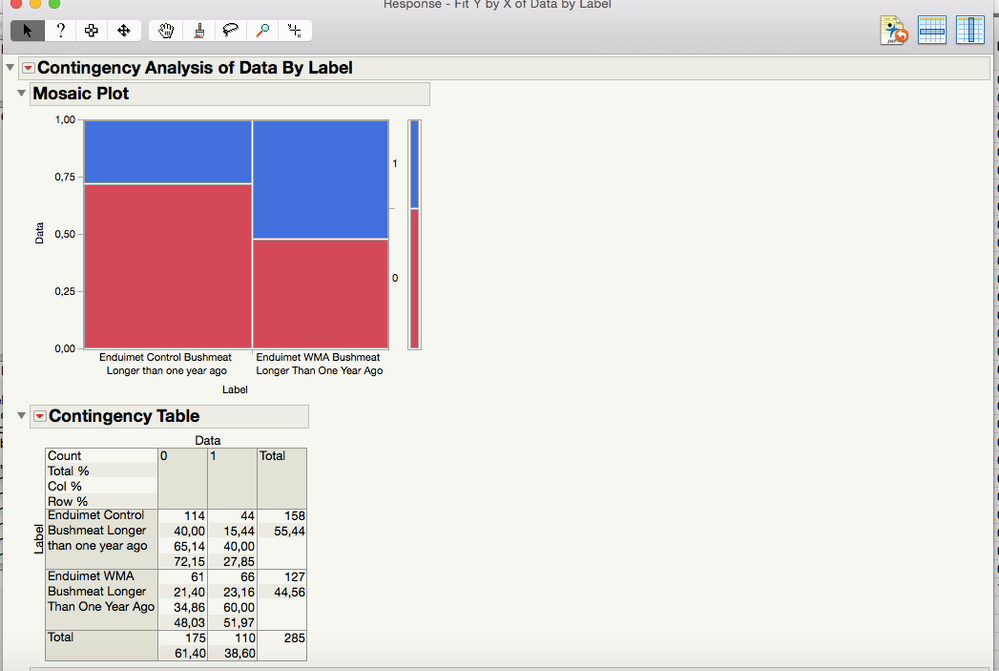
Alright, so I have done what you have explained here and this is what I get:
All of the data is now included, which is great, but I still think that the P-value looks very suspect? If this is right then there does not need to be much difference between the areas in order for the p-value to be very significant.
What are your thoughts on this?
- Mark as New
- Bookmark
- Subscribe
- Mute
- Subscribe to RSS Feed
- Get Direct Link
- Report Inappropriate Content
Re: Correlation for binary data in different columns
Actually, based on your data in the picture, I would expect to have a low p-value. The low p-value says that the proportion of 1's is not the same for the two groups. The control group has 27.85% 1s. The other group has 51.97% 1s. That is a pretty sizable difference in my opinion (an increase of almost 25 percentage points). Especially with sample sizes in the 125 to 160 range. That large of a difference is probably not due to chance.
Look at the mosaic plot. The blue bar is representing the response of 1, and it is much larger for the one group. Just out of curiosity, how big of a difference did you think you would need to see for it to be declared statistically significant?
- © 2024 JMP Statistical Discovery LLC. All Rights Reserved.
- Terms of Use
- Privacy Statement
- Contact Us


