- New to JMP? Let the Data Analysis Director guide you through selecting an analysis task, an analysis goal, and a data type. Available now in the JMP Marketplace!
- See how to install JMP Marketplace extensions to customize and enhance JMP.
- Subscribe to RSS Feed
- Mark Topic as New
- Mark Topic as Read
- Float this Topic for Current User
- Bookmark
- Subscribe
- Mute
- Printer Friendly Page
Discussions
Solve problems, and share tips and tricks with other JMP users.- JMP User Community
- :
- Discussions
- :
- Controlling format of output PowerPoint slides generated from exporting from JMP
- Mark as New
- Bookmark
- Subscribe
- Mute
- Subscribe to RSS Feed
- Get Direct Link
- Report Inappropriate Content
Controlling format of output PowerPoint slides generated from exporting from JMP
Hello JMP Community,
I believe the theme of the question I'm about to ask has been addressed in a few previous posts, but the ambiguity in the specifics of the context of the askers (including the versions of JMP they used) makes it difficult to decisively tell if the proposed solutions apply to my situation or not. This, along with how involved most of the proposed solutions seemed to be and the lack of a clear feedback (from the askers) on their effectiveness, was not very encouraging to invest the time in trying them out. So I'll try to explain my situation visually as much as possible so that others can determine the relevance of this question (and hence of the proposed solutions) to them.
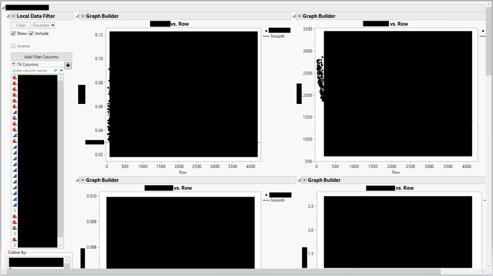
I have developed an add-in that produces a report as shown below (details have been redacted):
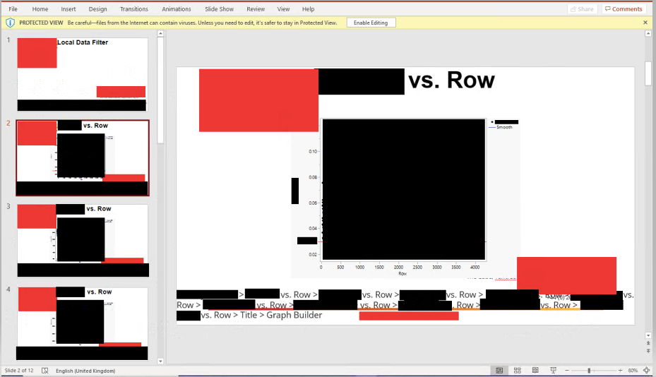
As you can see, I have a 'Local Data Filter' and 'Colour by:' boxes on the left. However, the part relevant to this question are the graphs on the right. Currently when I export the plot to PowerPoint I get the following output (information exported from JMP are redacted in black, and that which is part of the organisation's template in red):
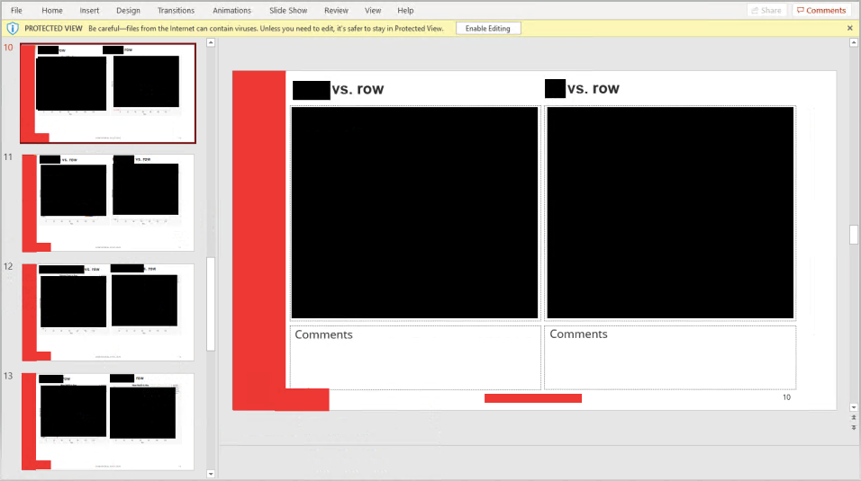
However, I would like the output to be as follows:
In the latter output - created by copy-pasting from the report - I have two graphs per slide, situated in a particular position in a particular template and with no superfluous details as appears in the bottom of each slide of the former output. This question could be generalised to the following: how can I have more control on the format of the output of the Export (to PowerPoint) functionality in JMP?
I am using JMP 15.1.0.
Thank you in advance!
Ahmed
- Mark as New
- Bookmark
- Subscribe
- Mute
- Subscribe to RSS Feed
- Get Direct Link
- Report Inappropriate Content
Re: Controlling format of output PowerPoint slides generated from exporting from JMP
There are a couple of ways to do this. You could of course combine the figures in one window using a horizontal list box or some other dashboard-application builder-like approach.
Then this is this slightly more brute force method that takes advantage of some features that are built into PowerPoint
If you just use JMP to generate figures (.emf for example) then Insert and Link them in your power point slide, using the layout features in ppt to align and edit sizes for each slide, then you can end up with exactly what you're looking for.
So why use inset and link when putting the .emf figures into ppt? If you save the ppt file and Jmp figures to the same folder, then you can over write the jmp figures, and then re-open your ppt file. When you re-open ppt goes and picks up the linked files, by name. And poof, your ppt deck has new figures.
Of course this is going to take a little bit to set up the first time, but dang, after that you're golden.
Cheers,
B
Recommended Articles
- © 2026 JMP Statistical Discovery LLC. All Rights Reserved.
- Terms of Use
- Privacy Statement
- Contact Us


