- JMP will suspend normal business operations for our Winter Holiday beginning on Wednesday, Dec. 24, 2025, at 5:00 p.m. ET (2:00 p.m. ET for JMP Accounts Receivable).
Regular business hours will resume at 9:00 a.m. EST on Friday, Jan. 2, 2026. - We’re retiring the File Exchange at the end of this year. The JMP Marketplace is now your destination for add-ins and extensions.
- Subscribe to RSS Feed
- Mark Topic as New
- Mark Topic as Read
- Float this Topic for Current User
- Bookmark
- Subscribe
- Mute
- Printer Friendly Page
Discussions
Solve problems, and share tips and tricks with other JMP users.- JMP User Community
- :
- Discussions
- :
- Control Legend Layout / Length
- Mark as New
- Bookmark
- Subscribe
- Mute
- Subscribe to RSS Feed
- Get Direct Link
- Report Inappropriate Content
Control Legend Layout / Length
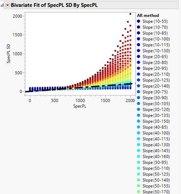
When making a graph - I see it mostly in Fit Y by X but it does happen in others, when I add a row legend to a graph, JMP will create very long lists of legends when there are many categories.
Can we control the number of columns the legend comes out in? I would like JMP to dynamically match it to the height of the graph so that the legend isn't ever taller than the graph itself. I sometimes have 20+ categories in my legend and I haven't found a way to get a useful legend to show that isn't super long. This makes the report look less than great and is also a pain when you want to copy the graph somewhere else.
Attached is an image of an example of what I see and also an example of what a Fit Curve plot shows, which is a nicer layout with many categories. If there isn't any way to do this, that I've missed, I'll put it on the Wish List :)
Thanks!
- Mark as New
- Bookmark
- Subscribe
- Mute
- Subscribe to RSS Feed
- Get Direct Link
- Report Inappropriate Content
Re: Control Legend Layout / Length
- Mark as New
- Bookmark
- Subscribe
- Mute
- Subscribe to RSS Feed
- Get Direct Link
- Report Inappropriate Content
Re: Control Legend Layout / Length
@txnelson I will look into that, thanks! It could certainly help with this graph, but there are others where I need Fit Y by X because I also use some of the statistical portions of the platform. Which is why I think this would be a good 'standard' for JMP to do when handling legends in general.
- Mark as New
- Bookmark
- Subscribe
- Mute
- Subscribe to RSS Feed
- Get Direct Link
- Report Inappropriate Content
Re: Control Legend Layout / Length
Also, at times, I will close the graph in Fit Y by X and use Graph Builder's image to display the results.
- Mark as New
- Bookmark
- Subscribe
- Mute
- Subscribe to RSS Feed
- Get Direct Link
- Report Inappropriate Content
Re: Control Legend Layout / Length
Also a good suggestion ... for the 'big picture' of this example, it may be possible but a little messier - but it could still work.
Beyond that, it's a good general suggestion for the happy medium between statistics and display :)
Thanks!
Recommended Articles
- © 2025 JMP Statistical Discovery LLC. All Rights Reserved.
- Terms of Use
- Privacy Statement
- Contact Us


