- Learn how to build custom Python data connectors and further customize JMP’s Data Connector Framework with the Python Data Connector Demo, available now in the JMP Marketplace!
- Learn some foundational elements of JMP Scripting Language (JSL) and how to extend point & click automation into repeatable, shareable routines. Register. June 26, 2 p.m. US Eastern Time.
- Subscribe to RSS Feed
- Mark Topic as New
- Mark Topic as Read
- Float this Topic for Current User
- Bookmark
- Subscribe
- Mute
- Printer Friendly Page
Discussions
Solve problems, and share tips and tricks with other JMP users.- JMP User Community
- :
- Discussions
- :
- Control Chart Builder with source data from multiple columns

- Mark as New
- Bookmark
- Subscribe
- Mute
- Subscribe to RSS Feed
- Get Direct Link
- Report Inappropriate Content
Control Chart Builder with source data from multiple columns
I like the visualization provided by the Control Chart Builder. In particular I like the stacked Xbar-R plots in one figure, the built-in distribution with normal distribution fit overlay, and automatic control limits calculated overlaid on the charts. Unfortunately, many different data sources I'm working with aren't entered in full to our JMP tables. Mean, range and standard devivation are calculated at the source and only these final values are entered into our tables due to limitations in automation at the moment.
I would like to use this data in building the control charts so that I can have a full Xbar-R or Xbar-S chart with the data from these source columns. I've not had luck figuring out a way to do this - I can only get it to plot as an individual measurement with a moving range. Is there a way that I can point it to the mean and range/standard deviation data columns to construct the charts from these sources? Or will I have to write a custom script to mimic these plots?
I am somewhat familiar with JSL and could work through a script for this but it seems like it would be far more involved especially given the need to support many different data sources. Being able to assemble the charts in the builder would be more user friendly for everyone on the team to work with.
Thanks,
Steve

- Mark as New
- Bookmark
- Subscribe
- Mute
- Subscribe to RSS Feed
- Get Direct Link
- Report Inappropriate Content
Re: Control Chart Builder with source data from multiple columns
Hi @sbiedrzycki,
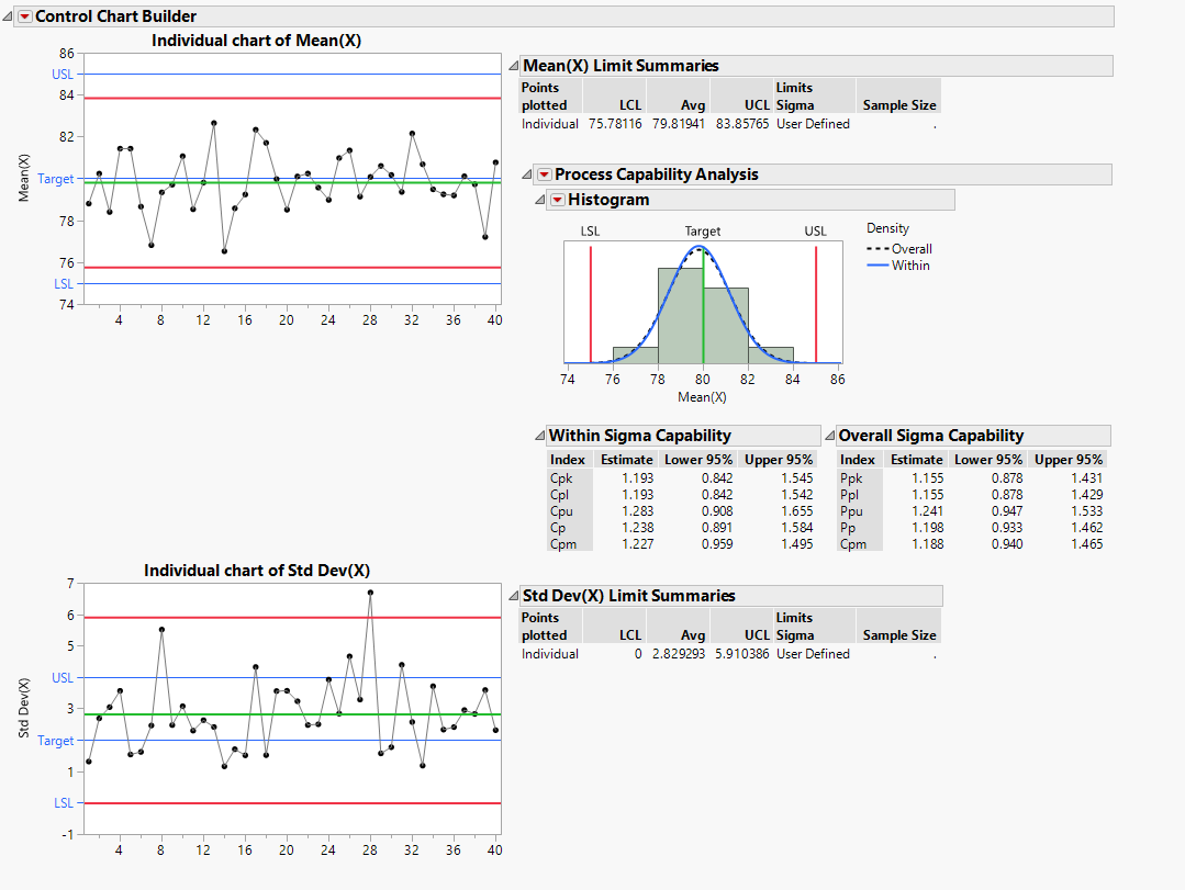
That's an interesting question. I don't think that is an existing capability, but you can probably twist JMP's arm into doing what you want if you know how to compute the control limits yourself. I imagine you have the means and standard deviations in separate columns. You could do separate individuals charts on the means and standard deviations with custom control limits that you input into a control limits column property. You just need to make sure to set the control limits for an individuals chart for both the mean and the standard deviation column.
Here's an example where I generated some individuals in groups of 5. I created the control chart on the right with that data. Then I did a summary to compute the mean and standard deviation for each subgroup. In the summary table I input the correct control limits (again, you'll need to know the formulas to compute these on your own). I was able to then create the control chart shown on the left from this table. The charts are effectively the same.

I'm attaching the summary table so you can see how I input the control limits in column properties. In Control Chart Builder, you'll need to remove the moving range chart (right-click in the mR chart area > Remove, not "Remove Graph"). To add the individuals chart for the standard deviation column, select it and press "New Y Chart".
- Mark as New
- Bookmark
- Subscribe
- Mute
- Subscribe to RSS Feed
- Get Direct Link
- Report Inappropriate Content
Re: Control Chart Builder with source data from multiple columns
That's better than I was able to get through trial and error. I wasn't able to figure out how you constructed the plot though. Was that through the chart builder directly or did you do it by writing the JSL yourself? I'm just wondering if I'm missing something or is there hidden functionality that is only accessible through directly writing JSL.
I'm not able to get it to add the capability analysis to the charts however. Neither ticking the menu option in the window nor modifying the JSL script to have Show Capability marked as 1 has any effect. Nothing is added to the plot even with dummy spec limits filled in for the column properties.
I can only get it if I go through the builder and pull in the data directly... but that goes back to my original problem being unable to link the Std Dev. column for the lower plot.

- Mark as New
- Bookmark
- Subscribe
- Mute
- Subscribe to RSS Feed
- Get Direct Link
- Report Inappropriate Content
Re: Control Chart Builder with source data from multiple columns
Hi @sbiedrzycki,
Here's a video of how I made the plot. No JSL required:
To get the capability analysis, you would need to add the spec-limits as another column property. Just note that capability will be computed with respect to your subgroup averages, not individuals.
- Mark as New
- Bookmark
- Subscribe
- Mute
- Subscribe to RSS Feed
- Get Direct Link
- Report Inappropriate Content
Re: Control Chart Builder with source data from multiple columns
Oh ok! I didn't realize I could remove the graph like that. It took a bit of wrestling with the column properties but I was able to get the capability analysis. I'm close. I would still like to figure out how I could merge those two graphs to waste less screen space. I'll probably play around with the raw script a bit to see if that might be possible with direct manipulation of what I have so far.
Recommended Articles
- © 2026 JMP Statistical Discovery LLC. All Rights Reserved.
- Terms of Use
- Privacy Statement
- Contact Us