- New to JMP? Let the Data Analysis Director guide you through selecting an analysis task, an analysis goal, and a data type. Available now in the JMP Marketplace!
- See how to install JMP Marketplace extensions to customize and enhance JMP.
- Subscribe to RSS Feed
- Mark Topic as New
- Mark Topic as Read
- Float this Topic for Current User
- Bookmark
- Subscribe
- Mute
- Printer Friendly Page
Discussions
Solve problems, and share tips and tricks with other JMP users.- JMP User Community
- :
- Discussions
- :
- Re: Cluster correlations analysis in JMP?
- Mark as New
- Bookmark
- Subscribe
- Mute
- Subscribe to RSS Feed
- Get Direct Link
- Report Inappropriate Content
Cluster correlations analysis in JMP?
Hi Everyone,
I just whatched one of @jules you tube videos, displaying how to make different heatmap correlation plots using jmp.
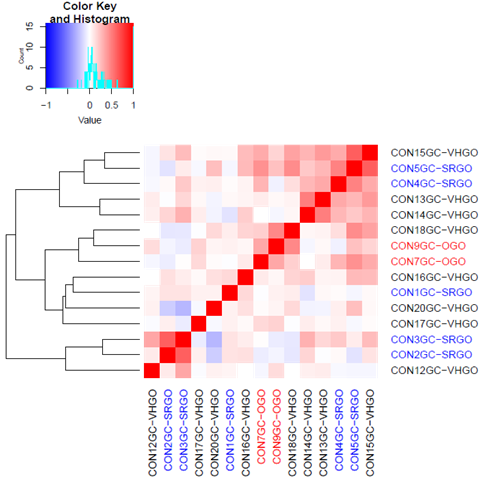
I am trying to analyze one of my data sets by taking different correlation values, spearman p, pearson, and kendall's t, then clustering the data using different techniques, ward, average, complete linkage etc. The end result is to produce something similar to the photo below made in R studio.
I know there is a cluster off of correlation feature in multivarate, but does anyone know how do you adjust the cluster techque as well as the correlation values used in the cluster analysis?
Analysis produced in R studio
Thanks for your help
Kyle
Accepted Solutions
- Mark as New
- Bookmark
- Subscribe
- Mute
- Subscribe to RSS Feed
- Get Direct Link
- Report Inappropriate Content
Re: Cluster correlations analysis in JMP?
Hi @Kyle,
The correlation heat map in Multivariate is based on the Pearson correlation only. If you want to make a heat map of correlations using another statistic (like Tau, or Rho) you'll need to generate a table of correlations like I showed in the video you watched. To do that more quickly you could use an add-in I wrote to automate the process: https://community.jmp.com/t5/JMP-Add-Ins/Correlate-Y-by-X-Add-In/ta-p/23628/
As for changing the clustering technique, you can set the method used when you launch Hierarchical Clustering from Analyze > Clustering in the options section on the lower left side of the launch window. Once you've generated the cluster report, you can request Two-Way clustering from the Red Triangle, which will cluster the variables used in your analysis. Assembling all the pieces together to make the plot you attached will be a somewhat manual process -- my recommendation would be to save each element as an image from JMP and then assemble them in a graphics program (or even Powerpoint).
I hope this helps get you started!
- Mark as New
- Bookmark
- Subscribe
- Mute
- Subscribe to RSS Feed
- Get Direct Link
- Report Inappropriate Content
Re: Cluster correlations analysis in JMP?
Thanks,
The addin is very helpful as well
- Mark as New
- Bookmark
- Subscribe
- Mute
- Subscribe to RSS Feed
- Get Direct Link
- Report Inappropriate Content
Re: Cluster correlations analysis in JMP?
Hi Julian,
I have the same issue as Kyle (had). I do see the cluster on correlations in the Mulitvariate output, but I would need a dendrogram with that which I could not find yet. Could you please point me to the option, as to how to generate the dendrogram of the correlations, and which input data format should be used? Thank you for your consideration. Andreas
- Mark as New
- Bookmark
- Subscribe
- Mute
- Subscribe to RSS Feed
- Get Direct Link
- Report Inappropriate Content
Re: Cluster correlations analysis in JMP?
Hi @AS,
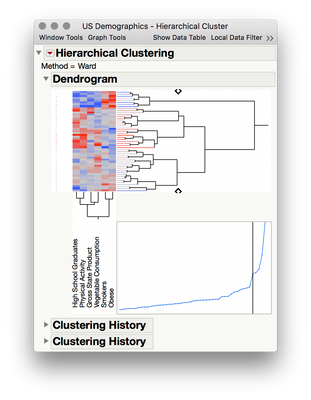
You can produce a dendrogram for the variables using Analyse > Clustering > Hierarchical Cluster. Once you select your variables and produce the report, to the Red Triangle > Two Way Cluster. This will then cluster the variables, rather than the rows.
I should note that this isn't exactly the same as clustering on correlations, though it's getting at the same thing. Like a correlation, this is a way of understanding which variables are similar in terms of their values across rows. In the example above using the US Demographics example dataset, the two-way clustering report shows that the variables of Obese and Smokers are similar -- meaning that the profile across states is similar for those variables... which is similar to saying the variables are correlated across states but hierarchical clustering isn't statistically equivalent to calculating and plotting similarity in terms of correlation.
- Mark as New
- Bookmark
- Subscribe
- Mute
- Subscribe to RSS Feed
- Get Direct Link
- Report Inappropriate Content
Re: Cluster correlations analysis in JMP?
Thanks, Julian. I have tried your add in as well, but unfortunately the window with the matrix representation of the correlations only shows up briefly and then disappears again. I need to look into this. Can't wait to get this running, your addin seems to be very useful. I guess I would hen make a table of the correlation matix and use that as input to the "clustering" functionality.
Cheers.
Recommended Articles
- © 2026 JMP Statistical Discovery LLC. All Rights Reserved.
- Terms of Use
- Privacy Statement
- Contact Us


