- New to JMP? Let the Data Analysis Director guide you through selecting an analysis task, an analysis goal, and a data type. Available now in the JMP Marketplace!
- See how to install JMP Marketplace extensions to customize and enhance JMP.
- Subscribe to RSS Feed
- Mark Topic as New
- Mark Topic as Read
- Float this Topic for Current User
- Bookmark
- Subscribe
- Mute
- Printer Friendly Page
Discussions
Solve problems, and share tips and tricks with other JMP users.- JMP User Community
- :
- Discussions
- :
- Changing color of shading in histograms (when values are selected in data table)
- Mark as New
- Bookmark
- Subscribe
- Mute
- Subscribe to RSS Feed
- Get Direct Link
- Report Inappropriate Content
Changing color of shading in histograms (when values are selected in data table)
When I create a histogram and then select certain values in my in data table, the values are shaded in the histogram. I want this shading, but, by default, the shading appears as a light gray, with darker gray diagonal lines. I would rather the shading be in one solid color that I could change if necessary. Is it possible to make that change? I can see how I can change the colors of the bars in the histogram, but making that change has no impact on the shading that appears when data values are highlighted, and I can't figure out if I have any control over the way the highlighted data values are shaded. If it's possible to change the defaults, can someone provide directions?
Thank you!
Accepted Solutions
- Mark as New
- Bookmark
- Subscribe
- Mute
- Subscribe to RSS Feed
- Get Direct Link
- Report Inappropriate Content
Re: Changing color of shading in histograms (when values are selected in data table)
- Mark as New
- Bookmark
- Subscribe
- Mute
- Subscribe to RSS Feed
- Get Direct Link
- Report Inappropriate Content
Re: Changing color of shading in histograms (when values are selected in data table)
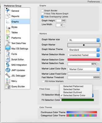
Have you tried to change the Preferences>Graphs>Filled Areas?
- Mark as New
- Bookmark
- Subscribe
- Mute
- Subscribe to RSS Feed
- Get Direct Link
- Report Inappropriate Content
Re: Changing color of shading in histograms (when values are selected in data table)
Yes, this worked!!!! Thank you so much, Lou.
Recommended Articles
- © 2026 JMP Statistical Discovery LLC. All Rights Reserved.
- Terms of Use
- Privacy Statement
- Contact Us


