- New to JMP? Let the Data Analysis Director guide you through selecting an analysis task, an analysis goal, and a data type. Available now in the JMP Marketplace!
- See how to install JMP Marketplace extensions to customize and enhance JMP.
- Subscribe to RSS Feed
- Mark Topic as New
- Mark Topic as Read
- Float this Topic for Current User
- Bookmark
- Subscribe
- Mute
- Printer Friendly Page
Discussions
Solve problems, and share tips and tricks with other JMP users.- JMP User Community
- :
- Discussions
- :
- Categorical heatmap?
- Mark as New
- Bookmark
- Subscribe
- Mute
- Subscribe to RSS Feed
- Get Direct Link
- Report Inappropriate Content
Categorical heatmap?
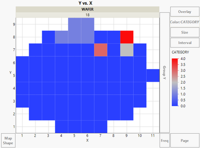
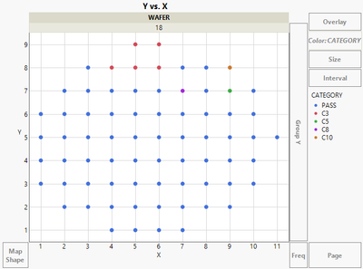
I'm trying to find a way to combine the two wafer maps below. In other words, I need the X/Y coordinates to actually appear as rectangular die areas on a wafer, like in the heatmap below (not as points), AND have the legend to be discreet and maybe customized colors like in the point map below (not as a continuous gradient from 0-4). Is there any way to combine these features? TIA!
Heatmap:
Point map:
- Mark as New
- Bookmark
- Subscribe
- Mute
- Subscribe to RSS Feed
- Get Direct Link
- Report Inappropriate Content
Re: Categorical heatmap?
Only thing that comes quickly to my mind without seeing any data you are using, is to change the summary statistic of color to None
You can see that there can be some overlap depending on your axis increments (changing X and Y to nominal might help)
- Mark as New
- Bookmark
- Subscribe
- Mute
- Subscribe to RSS Feed
- Get Direct Link
- Report Inappropriate Content
Re: Categorical heatmap?
Thanks for the reply. When I right-click on Color I don't have that option though for summary statistics... Also under Heatmap I don't have Bin Shape option as you have in your screen shot. I wonder if these are features on a newer version? I have JMP Pro 14.3.0, which version do you have?
- Mark as New
- Bookmark
- Subscribe
- Mute
- Subscribe to RSS Feed
- Get Direct Link
- Report Inappropriate Content
Re: Categorical heatmap?
Those images were from JMP Pro 17.2.0 and same features can be found from JMP16.2.0. I don't have anymore access to JMP versions older than JMP16 so I'm not sure how this could be done in JMP14.3. One thing you could try, is to change X and Y columns to Nominal (or Ordinal) and maybe JMP uses different "default" statistic.
- Mark as New
- Bookmark
- Subscribe
- Mute
- Subscribe to RSS Feed
- Get Direct Link
- Report Inappropriate Content
Re: Categorical heatmap?
Interesting that there are numeric values in Point Plot - compared to the Strings in the Heatmap Plot.
- Mark as New
- Bookmark
- Subscribe
- Mute
- Subscribe to RSS Feed
- Get Direct Link
- Report Inappropriate Content
Re: Categorical heatmap?
Certainly, you can achieve this by using Matplotlib in Python. Create a heatmap with customized colors and define color boundaries to represent X/Y coordinates as rectangular die areas. I am a coastal resident and recently, I read an essay by WritingUniverse on the subject of hurricanes. I was immediately struck by its power and beauty. You can also read the article on https://writinguniverse.com/free-essay-examples/hurricane/ As a native coastal resident, I have seen hurricanes up close and personal. I recall the fear and apprehension that accompanies the arrival of a storm. I recall the howling of the wind and the pounding of the rain on the windows. I recall the relief I felt when the storm subsided. In this essay, WritingUniverse captures all of these emotions perfectly. I would highly recommend this essay to anyone who wishes to learn more about hurricanes or who has personally experienced one.
Recommended Articles
- © 2026 JMP Statistical Discovery LLC. All Rights Reserved.
- Terms of Use
- Privacy Statement
- Contact Us


