- New to JMP? Let the Data Analysis Director guide you through selecting an analysis task, an analysis goal, and a data type. Available now in the JMP Marketplace!
- See how to install JMP Marketplace extensions to customize and enhance JMP.
- Subscribe to RSS Feed
- Mark Topic as New
- Mark Topic as Read
- Float this Topic for Current User
- Bookmark
- Subscribe
- Mute
- Printer Friendly Page
Discussions
Solve problems, and share tips and tricks with other JMP users.- JMP User Community
- :
- Discussions
- :
- Can JMP draw this pattern?
- Mark as New
- Bookmark
- Subscribe
- Mute
- Subscribe to RSS Feed
- Get Direct Link
- Report Inappropriate Content
Can JMP draw this pattern?
Hello!
Draw a horizontal bar chart of height data,
Graph the data on weight.
Superimpose two graphs on one graph.
- Tags:
- windows
Accepted Solutions
- Mark as New
- Bookmark
- Subscribe
- Mute
- Subscribe to RSS Feed
- Get Direct Link
- Report Inappropriate Content
Re: Can JMP draw this pattern?
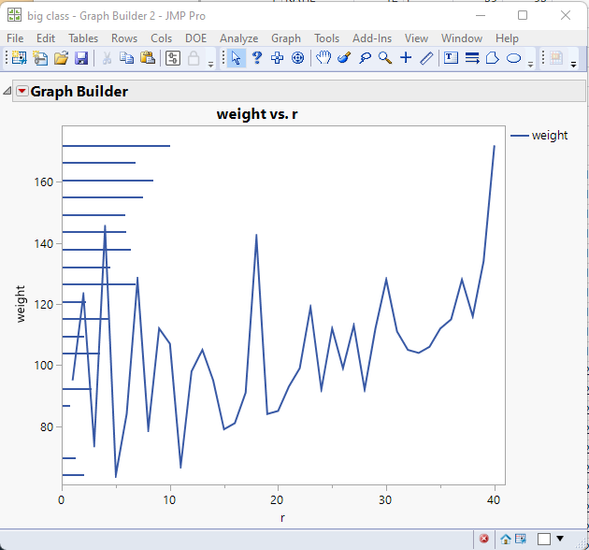
Here is my attempt. It creates the needle chart transforming the Height and R values to match the range of the Weight and .25% of the r axis. The a FrameBox copy is done from one graph to the other;
names default to here(1);
// Open Data Table: big class.jmp
// → Data Table( "big class" )
dt = Open( "$SAMPLE_DATA/big class.jmp" );

dt << new column("r", set each value(Row()));

gb1 = dt << Graph Builder(invisible,
	Size( 528, 454 ),
	Show Control Panel( 0 ),
	Variables(
		X( Transform Column( "r 2", Formula( :r * 0.25 ) ) ),
		Y(
			Transform Column(
				"height 2",
				Formula(
					If( Row() == 1,
						ytargetmax = Col Max( :weight );
						ytargetmin = Col Min( :weight );
						ytargetp = (ytargetmax - ytargetmin) / 100;
						ymax = Col Max( :height );
						ymin = Col Min( :height );
						yrange = ymax - ymin;
					);
					yp = ((:height - ymin) / yrange) * 100;
					ytargetmin + ytargetp * yp;
				)
			)
		)
	),
	Elements(
		Bar( X, Y, Legend( 5 ), Bar Style( "Needle" ), Response Axis( "X" ) )
	)
);

gb2 = dt << Graph Builder(
	Size( 528, 454 ),
	Show Control Panel( 0 ),
	Variables( X( :r ), Y( :weight ) ),
	Elements( Line( X, Y, Legend( 5 ) ) ),
	SendToReport(
		Dispatch(
			{},
			"weight",
			ScaleBox,
			{Min( 60.8877083333333 ), Max( 178.48 ), Inc( 20 ), Minor Ticks( 0 )}
		)
	)
);


report(gb1)[framebox(1)]<<copy frame contents;
report(gb2)[framebox(1)]<< paste frame contents;

gb1<<close window;
- Mark as New
- Bookmark
- Subscribe
- Mute
- Subscribe to RSS Feed
- Get Direct Link
- Report Inappropriate Content
Re: Can JMP draw this pattern?
Yes. Graph Builder can easily do this.
- I added a transform column set to the Row() and used it for the X axis
- I dragged Height and weight to the Y axis
- Moved Weight to the right side axis
- Then I went into the axis settings for each axis and removed all tick marks and labels.
Documentation on Graph Builder is in the Essential Graphing document
- Mark as New
- Bookmark
- Subscribe
- Mute
- Subscribe to RSS Feed
- Get Direct Link
- Report Inappropriate Content
Re: Can JMP draw this pattern?
I'm not exactly sure what type of graph you want to plot. You have two different Y-axis on same axis and x-axis which scales to some other values for other data.
You can for example plot something like this where you move other X-axis to other side:
- Mark as New
- Bookmark
- Subscribe
- Mute
- Subscribe to RSS Feed
- Get Direct Link
- Report Inappropriate Content
Re: Can JMP draw this pattern?
Thank Jarmo!
That's exactly what I want.I want the red graph to be shorter on the X-axis.
Hope to get specific aspects, Thanks!
This kind of graph is easy to draw with Excel, and two data are made into different graphs respectively.Then set the background of one to transparent and overlay it on top of the other.
- Mark as New
- Bookmark
- Subscribe
- Mute
- Subscribe to RSS Feed
- Get Direct Link
- Report Inappropriate Content
Re: Can JMP draw this pattern?
excel
- Mark as New
- Bookmark
- Subscribe
- Mute
- Subscribe to RSS Feed
- Get Direct Link
- Report Inappropriate Content
Re: Can JMP draw this pattern?
I know this isn't exactly what you asked for before but I frequently draw graphs similar to this, maybe this recording will give you some ideas on how to make something like what you are looking for:
- Mark as New
- Bookmark
- Subscribe
- Mute
- Subscribe to RSS Feed
- Get Direct Link
- Report Inappropriate Content
Re: Can JMP draw this pattern?
Thank you very much!
I learned this method through videos and saw how adding rows can be done this way.
- Mark as New
- Bookmark
- Subscribe
- Mute
- Subscribe to RSS Feed
- Get Direct Link
- Report Inappropriate Content
Re: Can JMP draw this pattern?
- Mark as New
- Bookmark
- Subscribe
- Mute
- Subscribe to RSS Feed
- Get Direct Link
- Report Inappropriate Content
Re: Can JMP draw this pattern?
Here is my attempt. It creates the needle chart transforming the Height and R values to match the range of the Weight and .25% of the r axis. The a FrameBox copy is done from one graph to the other;
names default to here(1);
// Open Data Table: big class.jmp
// → Data Table( "big class" )
dt = Open( "$SAMPLE_DATA/big class.jmp" );

dt << new column("r", set each value(Row()));

gb1 = dt << Graph Builder(invisible,
	Size( 528, 454 ),
	Show Control Panel( 0 ),
	Variables(
		X( Transform Column( "r 2", Formula( :r * 0.25 ) ) ),
		Y(
			Transform Column(
				"height 2",
				Formula(
					If( Row() == 1,
						ytargetmax = Col Max( :weight );
						ytargetmin = Col Min( :weight );
						ytargetp = (ytargetmax - ytargetmin) / 100;
						ymax = Col Max( :height );
						ymin = Col Min( :height );
						yrange = ymax - ymin;
					);
					yp = ((:height - ymin) / yrange) * 100;
					ytargetmin + ytargetp * yp;
				)
			)
		)
	),
	Elements(
		Bar( X, Y, Legend( 5 ), Bar Style( "Needle" ), Response Axis( "X" ) )
	)
);

gb2 = dt << Graph Builder(
	Size( 528, 454 ),
	Show Control Panel( 0 ),
	Variables( X( :r ), Y( :weight ) ),
	Elements( Line( X, Y, Legend( 5 ) ) ),
	SendToReport(
		Dispatch(
			{},
			"weight",
			ScaleBox,
			{Min( 60.8877083333333 ), Max( 178.48 ), Inc( 20 ), Minor Ticks( 0 )}
		)
	)
);


report(gb1)[framebox(1)]<<copy frame contents;
report(gb2)[framebox(1)]<< paste frame contents;

gb1<<close window;
- Mark as New
- Bookmark
- Subscribe
- Mute
- Subscribe to RSS Feed
- Get Direct Link
- Report Inappropriate Content
Re: Can JMP draw this pattern?
Thank Jim!
This is exactly what I want.How do I change the color of GB1 (bar chart) to red?I still haven't learned.
- Mark as New
- Bookmark
- Subscribe
- Mute
- Subscribe to RSS Feed
- Get Direct Link
- Report Inappropriate Content
Re: Can JMP draw this pattern?
The lines are combined with the line chart, which means whatever the line color is, the needles will be the same.
Recommended Articles
- © 2026 JMP Statistical Discovery LLC. All Rights Reserved.
- Terms of Use
- Privacy Statement
- Contact Us


