- New to JMP? Let the Data Analysis Director guide you through selecting an analysis task, an analysis goal, and a data type. Available now in the JMP Marketplace!
- See how to install JMP Marketplace extensions to customize and enhance JMP.
- Subscribe to RSS Feed
- Mark Topic as New
- Mark Topic as Read
- Float this Topic for Current User
- Bookmark
- Subscribe
- Mute
- Printer Friendly Page
Discussions
Solve problems, and share tips and tricks with other JMP users.- JMP User Community
- :
- Discussions
- :
- Re: Box Plot Axis Problem
- Mark as New
- Bookmark
- Subscribe
- Mute
- Subscribe to RSS Feed
- Get Direct Link
- Report Inappropriate Content
Box Plot Axis Problem
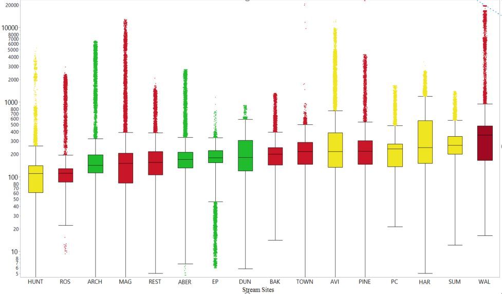
I've long used JMP to make box plots to show the distributin of data for a number of field sites on the same axis. I recently upgraded to JMP 14 and now the axis look different than they have in the past. Specifically, I'm running into an issue where the axis seems homogenized regardless of where the actual outliers are. For instance, in the old format if the outlier was 20000 then it would plot 4x higher than an outlier for a different site with a max outlier of 5000. To minimize these, we use a log axis and it looks something like this:
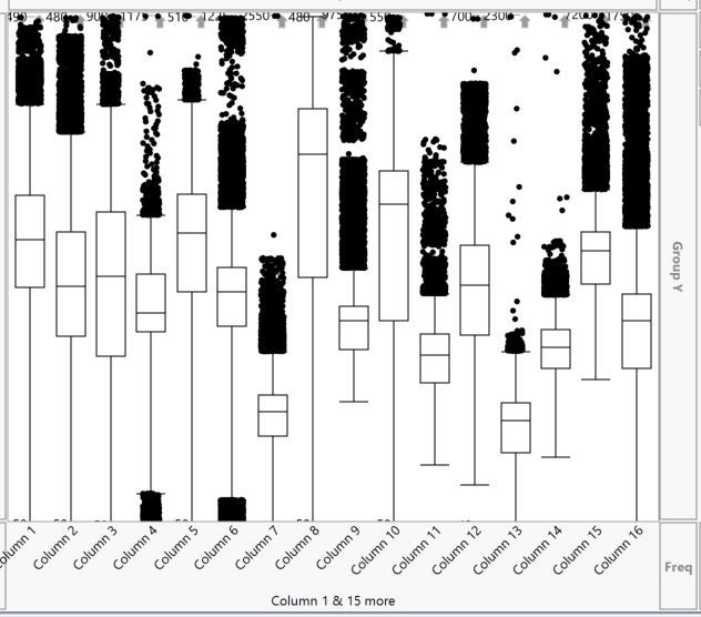
However, in the new version, the top of the y-axis is the same for every dataset even if they are very different. Instead, the outermost datapoint simply has a label on it. It goes without saying that this signifficantly impacts where the median would appear to be. Further, since all the sites don't have the same axis, there aren't actually labels on the y-axis which makes the whole thing somewhat pointless. Here is what that looks like:
Things I've tried without sucess:
1) changing modeling type from continuous to ordinal
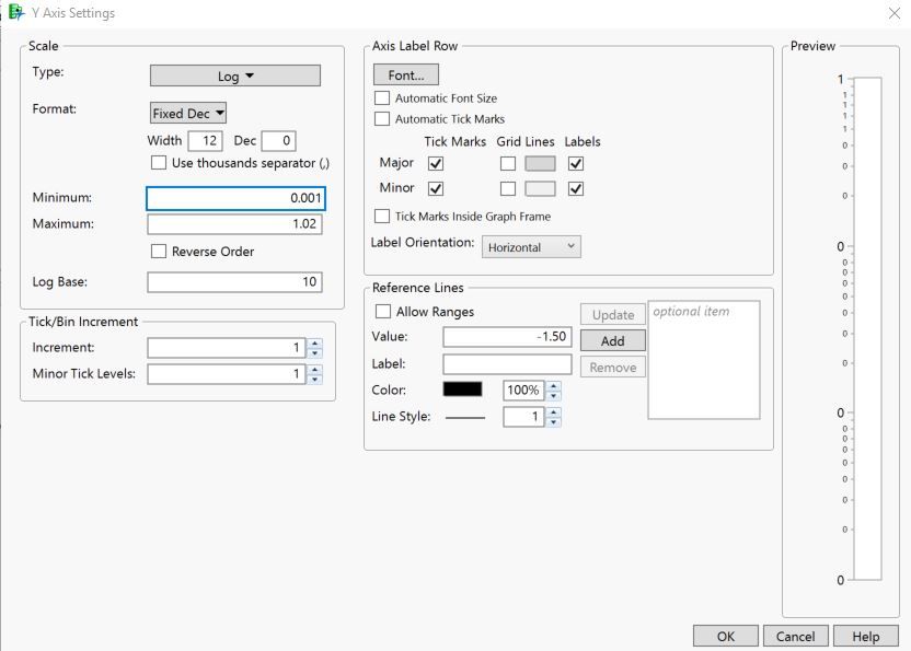
2) editing all sorts of axis settings. In fact, the one that I understand the least is the fact that the maxium on th scale is set to 1.02 even though there is a ton of data above that number. That seems to indicate that the axis is auto-scaled but I can't figure out how to change it. Well, I can change it but it doesn't seem to help. Here is what the settings look like:
Thanks for any and all help!
Brad
Accepted Solutions
- Mark as New
- Bookmark
- Subscribe
- Mute
- Subscribe to RSS Feed
- Get Direct Link
- Report Inappropriate Content
Re: Box Plot Axis Problem
Please try what I suggested. Tables > Stack. Select the 16 data columns and click Stack. Enter the name of the data in the Data Column. Enter Site for the Label Column.
Now you should be able to use the data column for Y and the label column for X. The scaling issue should not occur.
- Mark as New
- Bookmark
- Subscribe
- Mute
- Subscribe to RSS Feed
- Get Direct Link
- Report Inappropriate Content
Re: Box Plot Axis Problem
The first example has a single column with many levels. It is a single Y. In the second example, you plotted 16 columns on the X axis. Try stacking the 16 columns and use the new lable column in the X role as before.
- Mark as New
- Bookmark
- Subscribe
- Mute
- Subscribe to RSS Feed
- Get Direct Link
- Report Inappropriate Content
Re: Box Plot Axis Problem
I somewhat see what you mean but the first one was always from multiple columns as well. I just didn't bother to rename the columns in the second one because I've been rebuilding it so often to see if I could get it to work. This data has always been organized with a column for each site and there isn't an easy way to reformat it because it doesn't have a column that identifies which site each datapoint is related to.
- Mark as New
- Bookmark
- Subscribe
- Mute
- Subscribe to RSS Feed
- Get Direct Link
- Report Inappropriate Content
Re: Box Plot Axis Problem
Please try what I suggested. Tables > Stack. Select the 16 data columns and click Stack. Enter the name of the data in the Data Column. Enter Site for the Label Column.
Now you should be able to use the data column for Y and the label column for X. The scaling issue should not occur.
- Mark as New
- Bookmark
- Subscribe
- Mute
- Subscribe to RSS Feed
- Get Direct Link
- Report Inappropriate Content
Re: Box Plot Axis Problem
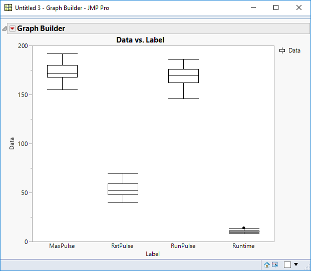
I am using Big Class as the example. Here is the result when I stack four numeric data columns:
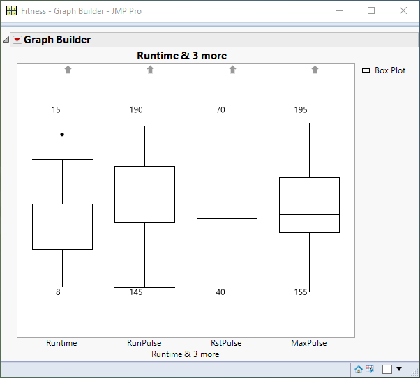
Here is the same data plotted as the original separate (un-stacked) columns:
Can you see the parallels between these results and the two of your own posted at the beginning?
- Mark as New
- Bookmark
- Subscribe
- Mute
- Subscribe to RSS Feed
- Get Direct Link
- Report Inappropriate Content
Re: Box Plot Axis Problem
Thanks for the detailed steps. I'll give it a try.
- Mark as New
- Bookmark
- Subscribe
- Mute
- Subscribe to RSS Feed
- Get Direct Link
- Report Inappropriate Content
Re: Box Plot Axis Problem
Thanks for your help. That seems to work well. I'm a bit confused as to why it has changed through time becaues it used to work the other way (I've certainly never used the stack feature). Nonetheless, I'm happy to have a solution.
Thanks,
Brad
- Mark as New
- Bookmark
- Subscribe
- Mute
- Subscribe to RSS Feed
- Get Direct Link
- Report Inappropriate Content
Re: Box Plot Axis Problem
I also have this problem, but with a very large dataset, with >2k columns. It is not practical for me to stack the columns every time I want to create a plot, I would be there for 1 week just to create 1 report.
I work in semiconductor manufacturing and so have huge amounts of data, with many results requiring this type of box plotting
Is there another way to autoscale all the box plots to the same scale?
If not, I will have to move away from JMP for my analysis.
- Mark as New
- Bookmark
- Subscribe
- Mute
- Subscribe to RSS Feed
- Get Direct Link
- Report Inappropriate Content
Re: Box Plot Axis Problem
I am also having this problem. Stacking the data is not a solution for my dataset. Where is the option to revert to a common axis for the dataset. I have right clicked everywhere. Looked at all the settings. This is an automatic scaling feature and I am unable to edit the script to get it to stop. I am using JMP 16.1.
- Mark as New
- Bookmark
- Subscribe
- Mute
- Subscribe to RSS Feed
- Get Direct Link
- Report Inappropriate Content
Re: Box Plot Axis Problem
Hi Chris, try to add two "fake" data rows which equal the desired upper and lower limit of the Y axis and then hide them in your final plot. This will force all the data columns to have the same upper and lower limit range and should solve your problem.
Recommended Articles
- © 2026 JMP Statistical Discovery LLC. All Rights Reserved.
- Terms of Use
- Privacy Statement
- Contact Us
