- New to JMP? Join us Sept. 23-24 for the Early User Edition of Discovery Summit, tailor-made for new users. Register now for free!
- Your voice matters! Tell us how you prefer to receive JMP updates, so we can tailor our communication to your needs. Take short survey.
- See how to access JMP Marketplace - and - find, create & share add-ins to extend your JMP. Watch video.
- Subscribe to RSS Feed
- Mark Topic as New
- Mark Topic as Read
- Float this Topic for Current User
- Bookmark
- Subscribe
- Mute
- Printer Friendly Page
Discussions
Solve problems, and share tips and tricks with other JMP users.- JMP User Community
- :
- Discussions
- :
- Bivariate plot spline un-selected faded

- Mark as New
- Bookmark
- Subscribe
- Mute
- Subscribe to RSS Feed
- Get Direct Link
- Report Inappropriate Content
Bivariate plot spline un-selected faded
Is there a way to make all un-selected splines faded? in a bivariate plot!
The default is same as pre-selection.
Thanks
- Mark as New
- Bookmark
- Subscribe
- Mute
- Subscribe to RSS Feed
- Get Direct Link
- Report Inappropriate Content
Re: Bivariate plot spline un-selected faded
You'll have to do this manually -- JMP does not give an automatic handle to this. I use Spline Coef() and Spline Eval() to generate the spline points, then use a graphics script to draw the lines and add a handle to the legend box.

- Mark as New
- Bookmark
- Subscribe
- Mute
- Subscribe to RSS Feed
- Get Direct Link
- Report Inappropriate Content
Re: Bivariate plot spline un-selected faded
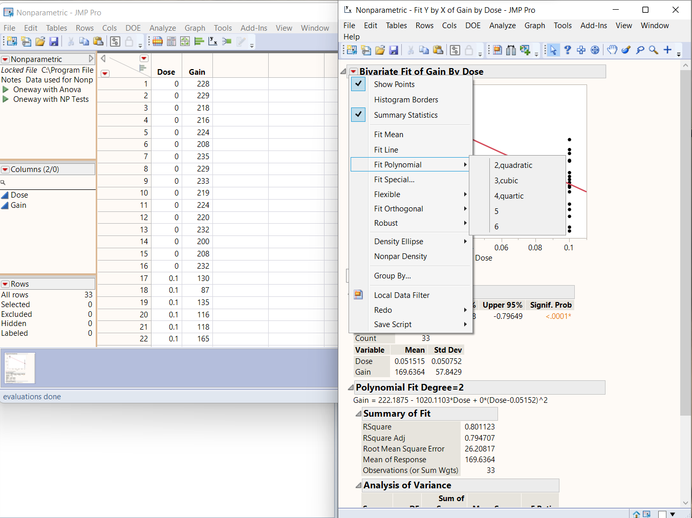
go to analyze > fit y by x > then input y and x variables in contextual
then follow the next photo

- Mark as New
- Bookmark
- Subscribe
- Mute
- Subscribe to RSS Feed
- Get Direct Link
- Report Inappropriate Content
Re: Bivariate plot spline un-selected faded
Do you have a set up like this example, where the Group by menu command sets up groups of data before using the Fit Flexible command?

If so, then I do mot know what you mean by selected or un-selected splines. There is no way to select one of the fitted groups.
- Mark as New
- Bookmark
- Subscribe
- Mute
- Subscribe to RSS Feed
- Get Direct Link
- Report Inappropriate Content
Re: Bivariate plot spline un-selected faded
I believe that it is a pretty common situation when looking at a large number of trendlines (perhaps you have 50 tools all running the same process and are comparing defectivity vs. tool) that you'd want to be able to highlight a specific trend. The natural way of doing this is by selecting the trend in the legend, but this only emphasizes the points, not the lines. I've created a custom script that does this and I believe this is what the OP is asking about. Below is a comparison of my solution vs. a standard Row Legend behavior on some fake data.
The second plot here (the default behavior) is mostly useless w/re to comparing anything about the trendlines


JMP provides all the tool necessary to do this -- Spline Eval, Spline Coef, and handlers to the TableBox object to re-draw the lines when the legend selection is updated, but it can be a bit of a chore to setup initially.
- Mark as New
- Bookmark
- Subscribe
- Mute
- Subscribe to RSS Feed
- Get Direct Link
- Report Inappropriate Content
Re: Bivariate plot spline un-selected faded
Recommended Articles
- © 2026 JMP Statistical Discovery LLC. All Rights Reserved.
- Terms of Use
- Privacy Statement
- Contact Us