- New to JMP? Let the Data Analysis Director guide you through selecting an analysis task, an analysis goal, and a data type. Available now in the JMP Marketplace!
- See how to install JMP Marketplace extensions to customize and enhance JMP.
- Subscribe to RSS Feed
- Mark Topic as New
- Mark Topic as Read
- Float this Topic for Current User
- Bookmark
- Subscribe
- Mute
- Printer Friendly Page
Discussions
Solve problems, and share tips and tricks with other JMP users.- JMP User Community
- :
- Discussions
- :
- Re: Adding line to split data on graph builder
- Mark as New
- Bookmark
- Subscribe
- Mute
- Subscribe to RSS Feed
- Get Direct Link
- Report Inappropriate Content
Adding line to split data on graph builder
Hi,
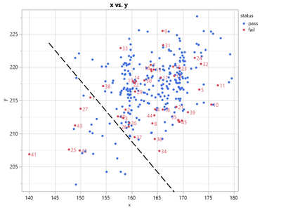
I have the following data set below where red data points are some fails that I would like to screen out. Right now the way I am doing this is roughly calculating a trend line (see image below) and finding its equation. Then I create a new column and use JMP formula to basically check if data point is below line and if it is it updates the new column with a 1 and if it is above it marks new column as a 0. This is a pretty manual process and I was wondering if there was a way you could draw a line in graph builder the would autogenerate its equation and select all units below the line and if possible also create a new column?
Accepted Solutions
- Mark as New
- Bookmark
- Subscribe
- Mute
- Subscribe to RSS Feed
- Get Direct Link
- Report Inappropriate Content
Re: Adding line to split data on graph builder
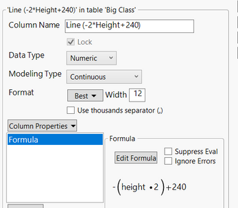
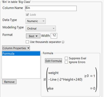
I created a column "Line" with a line function, created another column "Bin":
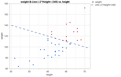
the graph shown below:
- Mark as New
- Bookmark
- Subscribe
- Mute
- Subscribe to RSS Feed
- Get Direct Link
- Report Inappropriate Content
Re: Adding line to split data on graph builder
Is this a typical distribution of your "Pass" and "Fail" data? If it is, it might be quite difficult to identify a rational process to separate the two populations because these broadly overlap (i.e. no apparent trend in distribution above and below your "decision" line). If it is not representative, could you provide a more contrasted example that could guide a possible approach?
Best,
TS
- Mark as New
- Bookmark
- Subscribe
- Mute
- Subscribe to RSS Feed
- Get Direct Link
- Report Inappropriate Content
Re: Adding line to split data on graph builder
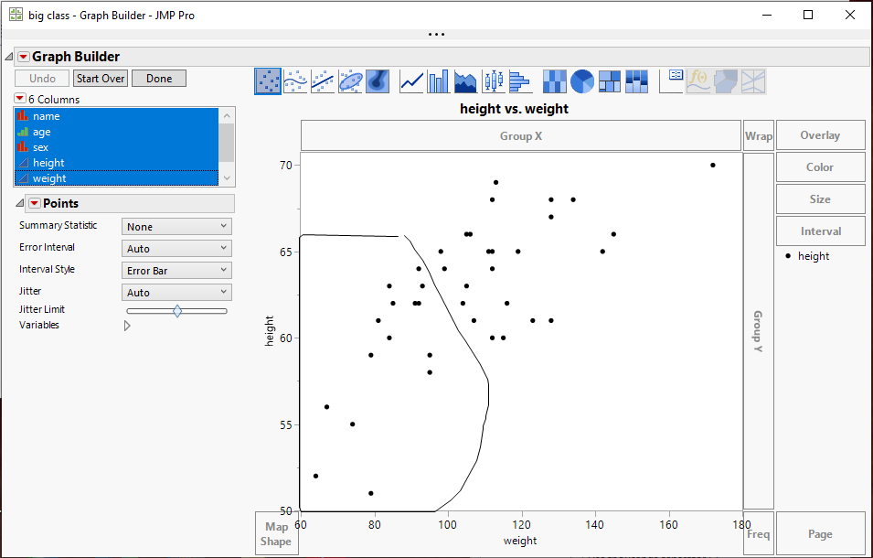
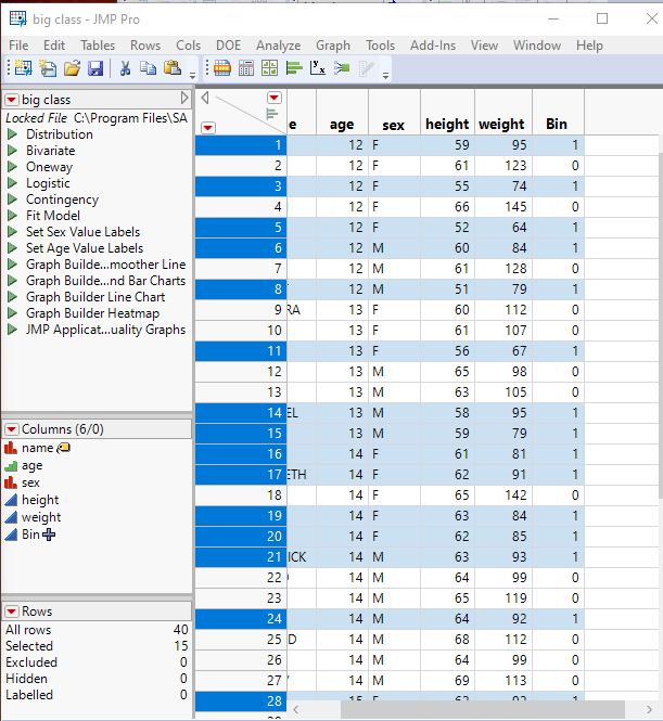
Here is how I would do it
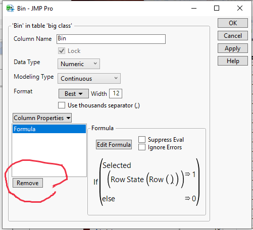
- Create a new binning column and specify the following formula
If( Selected( Row State( Row() ) ), 1, 0 ) - Go to your graph and then select from the tool bar, the lasso tool
- Use the lasso selection tool to capture all of the data points you want declare as bad data points
- Note that all of the rows in the data table that are associated with the selected point, are selected and the value in the new bin column has been set to 1.
- Now right click on the Header for the bin column and select Col Info
- In the Col Info window, click on the Remove button to delete the formula, thus turning the bin values into static values
- Mark as New
- Bookmark
- Subscribe
- Mute
- Subscribe to RSS Feed
- Get Direct Link
- Report Inappropriate Content
Re: Adding line to split data on graph builder
BTW, since Selected() is a Boolean function, the If() function is superfluous. This expression is all that you need for the column formula:
Selected( Row State( Row() ) )- Mark as New
- Bookmark
- Subscribe
- Mute
- Subscribe to RSS Feed
- Get Direct Link
- Report Inappropriate Content
Re: Adding line to split data on graph builder
I created a column "Line" with a line function, created another column "Bin":
the graph shown below:
- Mark as New
- Bookmark
- Subscribe
- Mute
- Subscribe to RSS Feed
- Get Direct Link
- Report Inappropriate Content
Re: Adding line to split data on graph builder
- Mark as New
- Bookmark
- Subscribe
- Mute
- Subscribe to RSS Feed
- Get Direct Link
- Report Inappropriate Content
Re: Adding line to split data on graph builder
I did not draw a slashed line.....I thought you were just using that for selection, not display.
- Mark as New
- Bookmark
- Subscribe
- Mute
- Subscribe to RSS Feed
- Get Direct Link
- Report Inappropriate Content
Re: Adding line to split data on graph builder
Sorry for confusion, I wanted a line for both selection and display.
- Mark as New
- Bookmark
- Subscribe
- Mute
- Subscribe to RSS Feed
- Get Direct Link
- Report Inappropriate Content
Re: Adding line to split data on graph builder
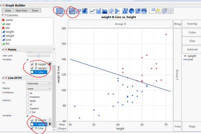
To plot the line, put both columns "weight" and "Line" on the Y axis. Then select both Scatter plot and fit line plot from the tool bar, uncheck Y Line under the "Point" and Y weight under "Line of Fit" on the left option bars. Please see screen shot below. thanks. ZF
- Mark as New
- Bookmark
- Subscribe
- Mute
- Subscribe to RSS Feed
- Get Direct Link
- Report Inappropriate Content
Re: Adding line to split data on graph builder
I was not aware of this functionality in Graph Builder thanks! I was able to add the line and simplify my workflow for this
Recommended Articles
- © 2026 JMP Statistical Discovery LLC. All Rights Reserved.
- Terms of Use
- Privacy Statement
- Contact Us
