- JMP will suspend normal business operations for our Winter Holiday beginning on Wednesday, Dec. 24, 2025, at 5:00 p.m. ET (2:00 p.m. ET for JMP Accounts Receivable).
Regular business hours will resume at 9:00 a.m. EST on Friday, Jan. 2, 2026. - We’re retiring the File Exchange at the end of this year. The JMP Marketplace is now your destination for add-ins and extensions.
- Subscribe to RSS Feed
- Mark Topic as New
- Mark Topic as Read
- Float this Topic for Current User
- Bookmark
- Subscribe
- Mute
- Printer Friendly Page
Discussions
Solve problems, and share tips and tricks with other JMP users.- JMP User Community
- :
- Discussions
- :
- Add reference line to Y-group axis
- Mark as New
- Bookmark
- Subscribe
- Mute
- Subscribe to RSS Feed
- Get Direct Link
- Report Inappropriate Content
Add reference line to Y-group axis
Hello,
I am using graph builder (JMP 17) and have almost what I need. But I need to add a reference line.
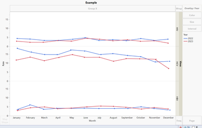
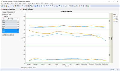
This first image ('example') is what I currently have (I need all 3 viruses in 1 graph with lines and dots for the rates for both years).
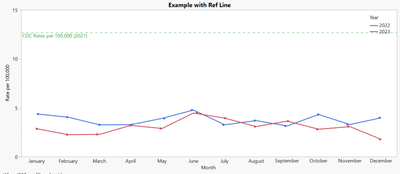
BUT, I need to add a reference line for each virus so that it looks like 'example with ref line' (below).
I don't know if it is possible. But essentially, I am trying to get a reference line to show up for each one my y-groups. I can use JSL if someone has something that will work using scripts.
- Tags:
- windows
- Mark as New
- Bookmark
- Subscribe
- Mute
- Subscribe to RSS Feed
- Get Direct Link
- Report Inappropriate Content
Re: Add reference line to Y-group axis
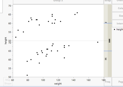
Not sure anymore what lines we are plotting here
Names Default To Here(1);

dt = open("$SAMPLE_DATA/Big Class.jmp");

gb = dt << Graph Builder(
	Variables(X(:weight), Y(:height), Group Y(:sex)),
	Elements(Points(X, Y, Legend(11)))
);

fbs = Report(gb) << XPath("//FrameBox");

lines = {60, 65};

For Each({fb, idx}, fbs,
	fb << Add Line Annotation(Line({478, (192 / (70.76 - 50)) * (70.76 - lines[idx])}, {478 + 42, (192 / (70.76 - 50)) * (70.76 - lines[idx])}), Color("Blue"));
);
- Mark as New
- Bookmark
- Subscribe
- Mute
- Subscribe to RSS Feed
- Get Direct Link
- Report Inappropriate Content
Re: Add reference line to Y-group axis
Attached is the data file. I only need 2022 and 2023 in the final graph.
This is what it should like (but instead of gray lines, they are green, and actually in there instead of just drawn in manually at a guess). The line for HIV is 12.7, HCV is 1.6, and HBV is 0.6.
- Mark as New
- Bookmark
- Subscribe
- Mute
- Subscribe to RSS Feed
- Get Direct Link
- Report Inappropriate Content
Re: Add reference line to Y-group axis
I still think it would be better to create new column into your data table with the values and use separate line chart, but here is graphic script version
Names Default To Here(1);

dt = Open("$DOWNLOADS/Stacked Combined CSV files.jmp");

gb = dt << Run Script("PPTA Overall Infection Rates All");

fbs = Report(gb) << XPath("//FrameBox");
lines = {12.7, 1.6, 0.6}; // These must be in correct order (using associative array could be better idea

For Each({fb, idx}, fbs,
	Eval(EvalExpr(
		fb << Add Graphics Script(
			Pen Color("Green");
			H Line(Expr(lines[idx]));
		);
	));
);
- Mark as New
- Bookmark
- Subscribe
- Mute
- Subscribe to RSS Feed
- Get Direct Link
- Report Inappropriate Content
Re: Add reference line to Y-group axis
I will try this. I don't want to add columns to the existing file.
- Mark as New
- Bookmark
- Subscribe
- Mute
- Subscribe to RSS Feed
- Get Direct Link
- Report Inappropriate Content
Re: Add reference line to Y-group axis
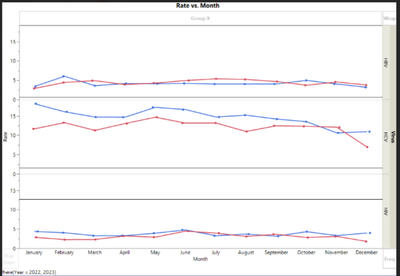
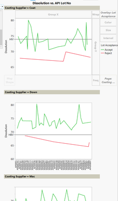
...and you could do a slightly different version of that by using the "Page" function. That allows you to specify individual Ref lines per Virus. However the visual is not so nice, since it creates 3 different graphs basically:
Best
Florian
- « Previous
-
- 1
- 2
- Next »
Recommended Articles
- © 2025 JMP Statistical Discovery LLC. All Rights Reserved.
- Terms of Use
- Privacy Statement
- Contact Us
