- New to JMP? Let the Data Analysis Director guide you through selecting an analysis task, an analysis goal, and a data type. Available now in the JMP Marketplace!
- See how to install JMP Marketplace extensions to customize and enhance JMP.
- Subscribe to RSS Feed
- Mark Topic as New
- Mark Topic as Read
- Float this Topic for Current User
- Bookmark
- Subscribe
- Mute
- Printer Friendly Page
Discussions
Solve problems, and share tips and tricks with other JMP users.- JMP User Community
- :
- Discussions
- :
- Re: Add Boxplot of all grouping variables together
- Mark as New
- Bookmark
- Subscribe
- Mute
- Subscribe to RSS Feed
- Get Direct Link
- Report Inappropriate Content
Add Boxplot of all grouping variables together
Hi all, I need to make boxplots groupped by a column value, but I need to also ADD a boxplot of all this groups together (as in no-grouping). Do somebody knows a nice solution for this?
I was trying some scripting with either graph builder or oneway but I haven't been succesfull.
Thanks!
Accepted Solutions
- Mark as New
- Bookmark
- Subscribe
- Mute
- Subscribe to RSS Feed
- Get Direct Link
- Report Inappropriate Content
Re: Add Boxplot of all grouping variables together
One method is to create a stacked data table, stacking your variables and creating a placeholder column called Aggregate.
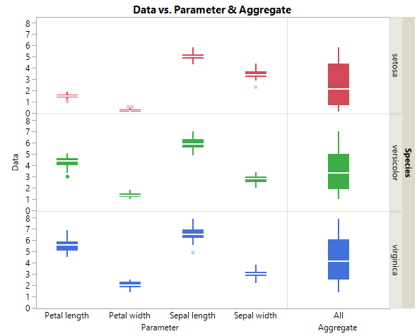
The Iris sample data table is not the best example, but here goes. The variables Petal Length and Width and Sepal Length and Width are stacked. An Aggregate column is created with value "All" then GraphBuilder can be deployed with one Y-variable the stacked data; and two X-variables, the (1)Group/variable names and the (2)Aggregate column.
Names Default to Here(1);

dt = open("$Sample_Data/Iris.jmp");

dt_stack = dt   << Stack(
	columns( :Sepal length, :Sepal width, :Petal length, :Petal width ),
	Source Label Column( "Parameter" ),
	Stacked Data Column( "Data" ),
	Copy formula( 0 ),
	Output Table Name("Iris Stacked")
);

//New column values are All
dt_stack << New Column("Aggregate", Character, <<set each value("All"));

gb_stack = dt_stack << Graph Builder(
	Size( 558, 464 ),
	Show Control Panel( 0 ),
	Variables(
		X( :Parameter ),
		X( :Aggregate ),
		Y( :Data ),
		Group Y( :Species ),
		Color( :Species )
	),
	Relative Sizes( "X", [222 90] ),
	Elements(
		Position( 1, 1 ),
		Box Plot( X, Y, Legend( 18 ), Box Style( "Solid" ) )
	),
	Elements(
		Position( 2, 1 ),
		Box Plot( X, Y, Legend( 17 ), Box Style( "Solid" ) )
	),
	SendToReport(
		Dispatch(
			{},
			"400",
			LegendBox,
			{Legend Position( {18, [3, -3, 4, 5, -3], 17, [0, -3, 1, 2, -3]} ),
			Position( {3, -3, 4, 5, -3, 0, -3, 1, 2, -3} )}
		)
	)
);
I added two features, the relative spacing of X, and for the heck of it because it makes sense for this data set, I used Species as a Y Grouping factor and Color. See below. Good Luck.
- Mark as New
- Bookmark
- Subscribe
- Mute
- Subscribe to RSS Feed
- Get Direct Link
- Report Inappropriate Content
Re: Add Boxplot of all grouping variables together
Thank you very much, it perfectly solves my problem. I had the table already stacked properly to make the box plot, but the new column with ALL does the trick perfectly.
Kudos!
- Mark as New
- Bookmark
- Subscribe
- Mute
- Subscribe to RSS Feed
- Get Direct Link
- Report Inappropriate Content
Re: Add Boxplot of all grouping variables together
I am looking for how to interactively do the changing of the Relative Sizes as you have done in your solution above. I have tried, but failed to find the key
- Mark as New
- Bookmark
- Subscribe
- Mute
- Subscribe to RSS Feed
- Get Direct Link
- Report Inappropriate Content
Re: Add Boxplot of all grouping variables together
first convert the raw data to stack method, and then go to graph builder. scroll data to Y-axis and label to X-axis then use local filter.
hope now you can ready to do the data.
else send me the raw data I will script the data and send you back..
- Mark as New
- Bookmark
- Subscribe
- Mute
- Subscribe to RSS Feed
- Get Direct Link
- Report Inappropriate Content
Re: Add Boxplot of all grouping variables together
Hi Jim,
Several years ago while writing, I had the same issue. I have forgotten which JMP guru told me the key
Hold the ALT key down. Now this is tricky, with your mouse in the axis area to the right of the axis of concern wait until the diagonal arrow down left to right appears now drag to the right to expand or the left to narrow. Xann Greg calls is an axis hotspot. Note the icon is a horizontal when selecting an area between two side-by-side X axes. You can also do relative sizing in the Y axes.
I find the selection of the hot spot, tricky.
The script 6_GraphBuilder.jsl lines 236-250 states
//Broken Time X axis
//2X's, 1Y with :Group variable, there will be two elements (X's) side-by-side
//By adding graph spacing the X axis appears to be a split time axis

/* Example provided by JMP Community
    - The order of the 2Xs is important. Weeks, then Years. Or if looking at
      historical data , Past and Present
    - Besides Graph Spacing, Relative Size to emphasize weeks is a shorter time span
      enhances the story being told. Note to implement relative X-axis sizes hold the
      ALT key + mouse down and drag the axis.  Once you run this example, try the Alt key.
    - The graph title is removed here as well.
*/
/*
https://community.jmp.com/t5/JMP-Blog/How-to-create-an-axis-break-in-JMP/ba-p/30611
*/
- Mark as New
- Bookmark
- Subscribe
- Mute
- Subscribe to RSS Feed
- Get Direct Link
- Report Inappropriate Content
Re: Add Boxplot of all grouping variables together
- Mark as New
- Bookmark
- Subscribe
- Mute
- Subscribe to RSS Feed
- Get Direct Link
- Report Inappropriate Content
Re: Add Boxplot of all grouping variables together
@Raj ,
I am confused by your request. The script that I proposed as a solution to @teoten original request is posted in the JSL portion of my first post and it uses Iris.jmp, a JMP sample data table. I believe that your post was sent almost at the same time. The proposed solution is similar to yours:
- Stack the Y variables
- Create a column that I called Aggregate that has the constant value "All".
- Then either via the GraphBuilder UI or from the posted script use the stacked column for Y and use 2 X variables. The first X is the grouping column created when stacking the data whose value is the column names and the other X variable to the right of side is Aggregate.
See my first response in this discussion. My second post was a response to @txnelson who asked how to create relative sizing for the 2 X variables using the UI, more space for the grouping X and less for the Aggregate. The answer is to hold down the ALT key then look for a hot spot in the X axis (between the two X variables) and drag your mouse for the desired size.
Jim, @txnelson is a super duper Super User, so I added more details about where I found this method. I am concerned that might have confused you. I can post the entire script 6_GraphBuilder.jsl and related files. However, it is a script that has multiple examples and from chapter 6 of a JSL book and has code that might be more confusing than enlightening.
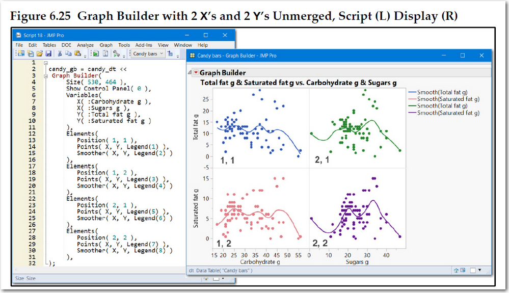
Below is a figure from the book that shows a script using Candy Bars.jmp, a JMP sample data table. It shows a GraphBuilder with 4 panels, 4 graphs made from 2 Y's and 2 X's. It depicts how position determines the layout. This can be done via the UI by dragging 1 Y and 1 X to the respective axes. The drag andother X to the right of first X and another Y to just below the first Y. Hope that helps.
So please provide more details about what you are looking for. I don't think I used any Excel files for this script.
- Mark as New
- Bookmark
- Subscribe
- Mute
- Subscribe to RSS Feed
- Get Direct Link
- Report Inappropriate Content
Re: Add Boxplot of all grouping variables together
Recommended Articles
- © 2026 JMP Statistical Discovery LLC. All Rights Reserved.
- Terms of Use
- Privacy Statement
- Contact Us


