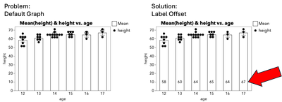
Graph builder can display value labels on bar graphs, unfortunately, if data is also plotted on the bar graph, the labels are completely obscured.

Fortunately it is relatively easy to manually reposition the labels. Getting alignment correct is a wee bit tricky, and doing this more than once is relatively frustrating. Even editing the graph script to get alignments correct is tedious after the second or third iteration of a graph. With a little JSL magic we can find the frames and bar segments and automatically adjust the label off sets.
In the script below an example data table is opened, and then a graph script is run, followed by some formatting instructions.
To use this script, either substitute in your data table reference or uncomment the "dt=current data table();" line to let the script run agains the current table. The graph builder script is an example, you use RTM>Save Script> to Clipboard to get your graph builder script and then paste it in place of the example.
names default to here(1);
//paste your data table reference here, or just use the current data table.
dt=Open( "$SAMPLE_DATA/Big Class.jmp" );
//dt=current data table();

obj=dt<<
//Paste your graph builder script here
Graph Builder(
	Size( 518, 470 ),
	Show Control Panel( 0 ),
	Variables( X( :age ), Y( :height ) ),
	Elements(
		Bar(X,Y,Legend( 4 ),
			Error Interval( "Standard Error" ),
			Label( "Label by Value" )),
		Points( X, Y, Legend( 5 ) )),
	SendToReport(
		Dispatch( {}, "400", ScaleBox,
			{Legend Model(4,
				Properties(0,{Fill Color( 0 ), Fill Pattern( "none" )},Item ID( "Mean", 1 )))}))
);
// End of graph builder script.

//Make a reference for the bar chart segments
fbi= N Items( (obj << xpath( "//FrameBox" )) );
for (ii=1, ii<=fbi, ii++,
frame = Report( obj )[FrameBox( ii )];
seg = (frame << Find Seg( "Bar Seg" ));

//Get variable used for the X axis
vars=obj<< Get Variables();
xx=vars[1];xx[1];
//Find the number of bars (or levels used to make bars)
Summarize( levels = By( eval(xx[1])));
Eval List( levels );
//Build an expression to change the offset
qq=expr(set label offset());
for (i=0, i<=nitems(levels)*fbi, i++,	//Note there is a multipler, *fbi. This assumes each level is the same for each frame. Its kind of sloppy, might need to just replace it with a fixed value.
	rr={};
	insert into (rr, i); 	//This is the Bar number, starts with zero
	insert into (rr,i); 	//This is the x offset, which is the same as the bar number
	insert into(rr, 10);	//This is the Y offset
	insert into (qq, (rr));

);
//Make magic happen
eval(substitute(expr(seg<<qq), expr(qq), name expr(qq)));
);//end of ii for next loop
In a previous blog post I described the steps and included an automation script for adding error bars with annotations to "Dynamite" plots, bar charts with an interval line. https://community.jmp.com/t5/Byron-Wingerd-s-Blog/One-Way-ANOVA-Figure-for-Scientists/ba-p/265156