The Plot Thickens
- JMP User Community
- :
- Blogs
- :
- The Plot Thickens
- :
- Measles Heat Map Remakes
- Subscribe to RSS Feed
- Mark as New
- Mark as Read
- Bookmark
- Subscribe
- Printer Friendly Page
- Report Inappropriate Content
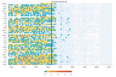
The Wall Street Journal recently published a nice, interactive graphic piece called "Battling Infectious Diseases in the 20th Century: The Impact of Vaccines" which contains a series of graphs showing the incidence of selected infectious diseased by state and year. Here's the one for measles.
My first impression was, "Wow, it looks like the country had the measles and the vaccine cleared it up." To the extent that a visualization should communicate a point, this one succeeds at showing the broad impact of the vaccine. However, the more I looked at it, a few details bothered me.
- There's a lot of detail needed to make a single point (poor data/ink ratio).
- The rainbow-like color scheme makes it hard to quickly compare values. That is, there's no perceptual ordering of blue, green and yellow.
- The color gradient goes to 4000 but the data only goes up to 3000.
- Half the state names are missing.
- The states are ordered by their postal codes but displayed with standard abbreviations, which is why Alaska is before Alabama, for instance.
- The data stops at 2002, before the current upswing that puts vaccinations in the news in the first place.
Robert Allison, "How to make infectious diseases look better," and Andy Kirk,"Is it the visualisation or the data we like," have also taken critical looks at the visualization if you want to read more. I was more interested in getting the data are try other ways of visualizing it in JMP.
Getting the Data
I downloaded CSV files from Project Tycho, which was more trouble than I wanted. Each state's data was in two separate files and the site requires a log-in, so I couldn't conveniently script the downloads. 102 manual downloads later I had the raw data files.
After getting the data, I encountered two surprises:
- The data is weekly instead of yearly.
- There's missing data throughout -- not just where the WSJ graph indicates.
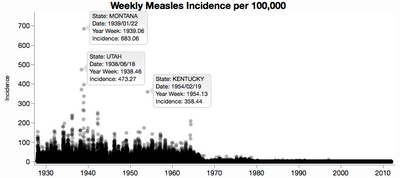
I like to make a few nonce graphs to make sure the data looks reasonable. Here's one of all the weekly incidence rates. Even though I cranked down the transparency, it's still not enough to tell that most of the data is under 10 cases per week per 100,000 persons. You can see the outliers though, and I labeled a few of them. I don't know the subject well enough to know if those outliers are real or not.
Handling Missing Data
Before I could start making real graphs, I needed a plan for dealing with the missing data. The WSJ graph essentially treats all missing values as 0, unless the whole year is missing -- then they show the year as a slightly different color (white instead of light blue). I decided to take a different but still artificial approach. I figured the missing data in the early years is likely unknown, but in the later years it seems more likely that the data is really 0 and just not reported because the disease was so rare. So I maintain missingness up to some year (1975) and treat missing values as 0 after that date. That will at least avoid the splotchiness on the right side of the graph.
Recreating the Original
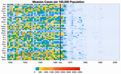
Before I explore too far I decided to try and reproduce the WSJ graph as it is in JMP. I had to
- summarize the data into years
- join the data with another data table of state abbreviations
- create a custom color theme
- create a heat map in Graph Builder
- add a reference line for the vaccination introduction date
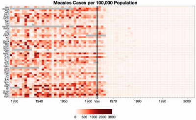
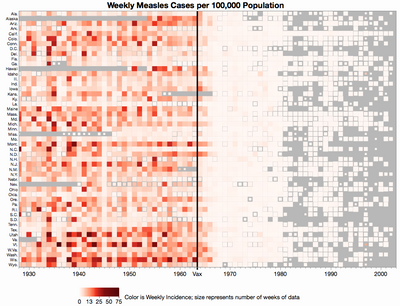
The result is pretty close. The state ordering is slightly different because I didn't bother sorting the states by postal code instead of the displayed abbreviation, the colors are slightly different only because I didn't copy the colors carefully, and of course the missing data treatment changes some missing years to 0.
After recreating the color theme, I could see some of the logic in it. Rainbow color themes are normally bad for continuous values because different hues are perceived categorically instead of continuously. The WSJ color scheme is essentially three different schemes:
- a continuous yellow-orange-red scheme for "high" levels
- a solid green for "moderate" levels
- a continuous white-blue scheme for "low" levels
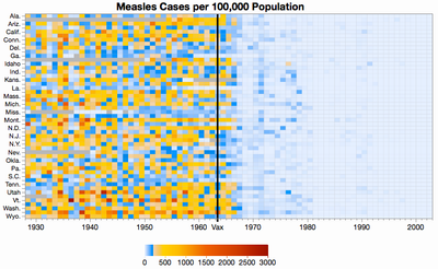
I think the greens are what bothers my perception most, so I thought I would try the same idea without the green.
We still have to pick some arbitrary cut-off, but I like it better without the green because their less categories to sort out. This coloring also limits the range to 3000.
Changing the Colors
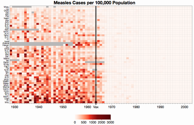
How about a truly continuous color theme? Robert Allison uses a white-to-red scheme, which seems reasonable. The problem with a single continuous range is that the data is skewed, so a linear color application would only highlight differences on one end of the scale. We can get around that by using a piece-wise linear scale and by customizing the color theme.
Strangely, given the diminished range of colors, the nationwide dip in 1945 is easier to see.
We might also try ordering the states by average incidence instead of alphabetically. This makes it easier to see that the states aren't as uniformly affected as it seemed.
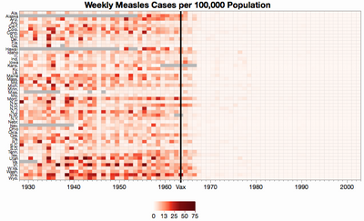
So far, I've been showing the yearly incidence rates, like the WSJ original. However, given the amount of missing data, it makes sense to show weekly averages like Allison does so that we only average the data that we have. Showing the yearly rates is like treating the missing weeks' values as 0. Here is same graph of the weekly rates.
The differences are subtle. One example is Georgia in 1934 where only 27 weeks had data and those weeks' values were quite high. In the original, Georgia in 1934 looked only average because it got watered down by all the introduced zeros, but here it looks high. The truth is probably in between -- it's unlikely the missing values we either 0 or the same as the non-missing values.
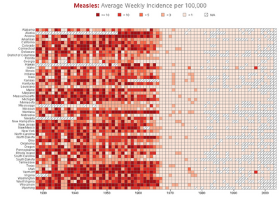
The strict missing-is-missing approach is not without its own pitfalls. For comparison here is Allison's version showing weekly averages. Note the apparent spike in measles in Vermont in 1997. That's really just one week of data. All the other weeks' data is missing. So it looks like a bad year, but maybe it was only a bad week.
I don't know the best way to address the variable amount of missing data. I tried making the squares shrink when their data was missing. It's a truer representation, but I'm not sure the extra complexity is worth it. Besides, you can barely tell the size difference most of the time.
Exploring Other Views
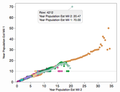
My original thought was to make a nationwide bar chart over time. This proved to be more complicated than I thought because I needed yearly population values in order to properly aggregate the state incidence rates. The raw data only includes counts and rates per 100,000. I figured I could estimate state populations from count divided by the rate (method 1), but that fails when the rate are 0 or very small. My other approach (method 2) was to interpolate from a few historical population values I found. After trying both, I compared them with a plot:
That horizontal line at 10 (million) is from years with a count of 1 and a rate of 0.01. The rates are only provided to two decimal places. Similar issues cause the outlier at 70: that year in Texas contained several weeks with a count of 1 and a rate of 0.00. I ended up using a formula that mixed both estimates, but only considering the computed ratio then the rate wasn't very small.
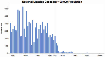
Here is the national incidence rate bar chart, which makes the original point pretty well and makes it easier to see the year-to-year variation, including the quiet 1945.
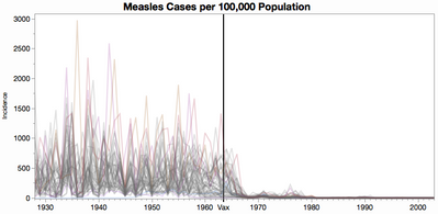
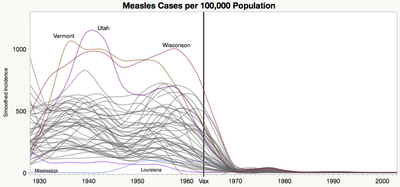
I'm not fond of spiky line graphs, but here's one to provide context for the next graph. Each line is a state.
I prefer the less-is-more philosophy that smoothers bring. You lose the range in this case, but you get a better sense of the general trend and of a few outlier states.
Closing Thoughts
For this study, I'm sharing scripts of all processing and graphing steps I took, in the spirit of reproducible research. Having the scripts also made it easy to try out different missing value strategies. The attached ZIP file contains the source CSV files (worth the price of admission alone) plus my JSL scripts and final JMP data table, which itself contains scripts for the graphs. Run the script called "Measles Study" to recreate the files. You can change the "Missing is zero after" variable to some other year besides 1975 to try a different missing value cut-off, or none at all.
Though it took a bit of work to get this far, I can see more work to be done for a better analysis. For instance, there is a seasonal pattern to the cases which might be used to impute some of the missing values. It might be interesting to look for clusters of states or outbreak patterns. Visually, maybe range bands would be better that lines. I'd like to explore Andy Kirk's idea of trying the color schemes on data without such a sharp drop-off. How about using national data after 2002? ...
However, I have to stop somewhere. Besides, with all the data attached perhaps dear reader will continue the exploration.
You must be a registered user to add a comment. If you've already registered, sign in. Otherwise, register and sign in.
- © 2026 JMP Statistical Discovery LLC. All Rights Reserved.
- Terms of Use
- Privacy Statement
- Contact Us

