- New to JMP? Let the Data Analysis Director guide you through selecting an analysis task, an analysis goal, and a data type. Available now in the JMP Marketplace!
- See how to install JMP Marketplace extensions to customize and enhance JMP.
Scott Wise's Blog
- JMP User Community
- :
- Blogs
- :
- Scott Wise
- :
- Visualizing the Effects of Global Sea Level Rise (Graph Exploration)
- Subscribe to RSS Feed
- Mark as New
- Mark as Read
- Bookmark
- Subscribe
- Printer Friendly Page
- Report Inappropriate Content
Of the many consequences of the gradual warming of our planet is the contribution to a rise in our average global sea levels. Even slight rises in sea levels each year can spur higher risks of extreme coastal flooding around the world. With a high percentage of humans living in and around coastal urban centers, communicating this very real risk is all the more important if we hope to all change our behaviors now to save the planet for the future. However, in our data rich times we may be unmoved by even good data visualizations that are hoping to spur us into more responsible action. Therefore, what we really need is a novel way that will register with the viewer and make a long-lasting impact.
A great example of a new way of visualizing the impact of the global sea rise is presented in the excellent Climate Science and Information website create by NOAA (National Oceanic and Atmospheric Administration). While many of the visualizations presented are what you would normally expect, there is a surprisingly impactful feature built into their section on Sea Level Rise mapping. If you type in your favorite coastal area of choice (mine was Savannah, GA), you can zoom first into a standard coastal mapping where a side filter allows you to see the encroachment of increasing water levels in MHHW feet (Mean Higher High Water) on a geographic map. But included in the map are location pins that let you bring up a two-dimensional picture of a landmark in that location. Then by increasing the MHHW filter, you can see the impact of the water level increase overlaying directly on the picture! Therefore, when I saw the potential flooding impact possible from a 10-foot MHHW increase right on popular River Street in downtown Savannah, it really got my full attention!
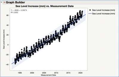
To explore this using JMP Graph Builder, I wanted to first take the best data available showing the definitive rise in global sea levels. Then I wanted to replicate the same type of interactive flood filtering in the two-dimensional pictures like in the above website. The best place to start is with the excellent public data source provided by the University of Colorado. This data shows the increase in sea level in millimeters since 1992 using scientific tidal gauge and GPS data. A simple JMP Graph Builder with Points and Fitted Line elements paints a very clear picture of the increasing trend in average global sea levels. However, while this chart is alarming on a high level, it may not have as much of a local impact that would spur us to action.
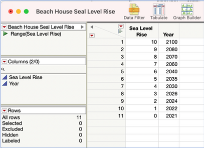
Now let’s tackle making the impactful interactive filtered picture. We created a new JMP data table called Beach House Sea Level Rise. After studying the data on the climate.gov website, the worst projections seem to show a real possibility of a maximum 10-foot MHHW flood impact if trends continue to progress into the future. Therefore, we created a range of accelerating sea level rise in feet going from a baseline in 2021 all the way to the 10-foot impact by 2100 (so a little less than 80 years out).
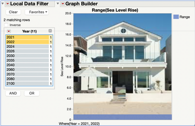
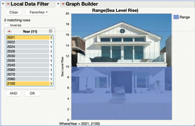
Then all that remained was to find a picture of a typical two-level beach front house viewed from the shore. Then we opened the JMP Graph Builder and "dragged & dropped" in the picture directly into the middle of the Graph Builder area. After sizing the picture appropriately, we put the Sea Level Rise on the Y axis and adjusted the scale and picture to go from 0 to 20 feet in scale. The Graph Builder element we selected is Area and in the additional controls we selected an Area Style of Overlaid and the Summary Statistic of Range. Next, we opened up a Local Data Filter under the Graph Builder red triangle options and selected Year for the filter topic. Then we selected from the list both the starting point of 2021 and the next year of 2022. This creates a filled in rectangular range shape colored in blue from 0 to 1 feet on top of the picture (default color is blue, but this can be changed to other colors in the Range legend). Note this range shape has a default transparency of .75 so we can see a little bit of the picture in the background (the level of transparency can be increased or decreased as well in the Range legend).
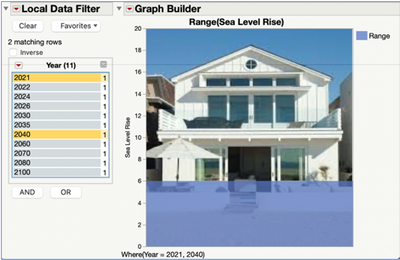
Now if we change the selection to go between 2021 and 2040, we can see the compelling effects of a seal level rise definitely starting to cause major flooding into the first floor or our house. A look out to 2080 shows that our entire first floor may be flooded if we reach this maximum worst case of a 10-foot increase in sea level rise!
This is for sure a very compelling way to see a local impact of this pretty big global problem of rising sea rise levels due to global warming. See the attached JMP files and saved scripts if you want to explore these visualization methods for yourself.
While we cannot easily prevent all future global sea level rise effects, it is not too late for us to individually help mitigate the effects by following the steps outlined in this list posted on the website Clean Ocean Action.org:
- Calculate and reduce your carbon footprint.
- Protect natural wetlands.
- Let it soak in (reduce paved surfaces).
- Plant more plants and save trees.
- Reduce your energy usage.
- Obey “no-wake” zones when boating.
- Reduce reliance on gas vehicles.
- Protect sand dunes.
- Know your flood zone risks.
- Push for a Climate Action Plans.
Then maybe we won’t have to feel like the subject of the classic Steve Ray Vaughan and Double Trouble song "Texas Flood", who laments “Yeah flood water keep a rollin’, man it’s about to drive poor me insane.”
- © 2026 JMP Statistical Discovery LLC. All Rights Reserved.
- Terms of Use
- Privacy Statement
- Contact Us

You must be a registered user to add a comment. If you've already registered, sign in. Otherwise, register and sign in.