When I create a design, the first place I typically look to evaluate the design is the Color Map On Correlations. Hopefully, I see a lot of blue, implying orthogonality between different terms. The Color Map On Correlations contains both the model terms and alias terms. If you have taken a design of experiments/linear regression class, you may be familiar with the idea that correlation among predictors inflates the standard error of the estimates. However, the majority of the familiar design diagnostics relate to the model terms. What about if we have missed some terms in our model? Not surprisingly, if we are missing terms in the model, these terms can still affect our results. Fortunately, we do have a way to assess this for those terms specified in the list of alias terms.
What effect do missing terms have on the model estimates?
We will dig into the technical details below, but the takeaway message is that active terms not in the model can bias the estimates of terms in the model. If a missing term is specified in the list of alias terms, the Alias Matrix gives us a means of quantifying that bias. The rows of the Alias Matrix correspond to each of the model effects, while the columns represent the different alias terms and how they influence the expected value of the effect estimate for each of those model effects.
If you have taken a class involving linear regression, the following model probably looks familiar:

where Y is the vector of responses,  the vector of model coefficients, and
  the vector of random errors, which we assume to be centered around zero. We call X the model matrix, where the rows represent the runs of the experiment and the columns correspond to the settings for the model terms based upon the settings for the factors in the design. In Custom Design, you can have the model matrix saved to the data table by selecting “Save X Matrix” under the red triangle. To estimate the vector of model coefficients, the least squares estimate (the Standard Least Squares option you find under Fit Model) is

Assuming the model is correct,  is an unbiased estimate of
  . That is,

the expected value of  is
is  .
.
But what about if our model is missing some terms? These may show up after analyzing the data, but ideally we could think about this in the design phase. This is where the Alias Matrix comes into play. The set of these terms that are not in our model but may affect the response are called the alias terms. Let Z correspond to the model matrix for the set of alias terms, with the vector of corresponding effects  . That is, Z has the same interpretation as X, but for terms we are not estimating. Now, assume the model is actually

but we still fit the model using X. After doing some linear algebra, we find

We call  the Alias Matrix. If all the entries of
  are 0, meaning none of the alias terms specified affect the response, then
  is still unbiased. If the elements
  are not negligible, then we want the entries of A to be as small as possible.
The rows of A correspond to the effects in the model, while the columns correspond to the alias terms. An element in A tells you to what extent the model effect (row label) may be biased by an active alias term (column label).
Can you give an example?
The following figures are the Color Map On Correlations and the Alias Matrix for a four-factor, 12-run design for a model to estimate the main effects and using the two-factor interactions as alias terms.
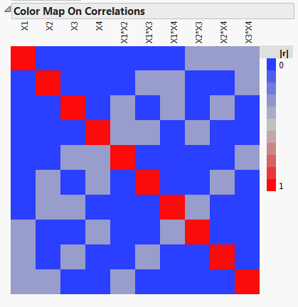
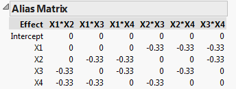
We see that the main effects are orthogonal, so the design is D-optimal, and the confidence intervals for estimating the main effects are as small as possible. The Alias Matrix demonstrates that the two-factor interactions can bias the estimates of the main effects. For example, we see that the main effect for X1 is biased by the two-factor interactions X2*X3, X2*X4, and X3*X4, by -1/3 of their effect. If in reality, the main effect for X1,  , and the two-factor interaction for X2*X3,
 , the estimate of
  given by
  has expected value:

That is, the expected value of the estimator for X1 is now a biased estimate. In this example, the expected value for the main effect of X1 is 0, which would indicate that X1 does not affect the response.
The bias can go in the other direction as well. If  , then the expected value of
  is 2, twice as big as its true value. So, depending on the direction of the aliasing term, you could miss an active main effect or mistakenly think a negligible main effect is active.
Is it really as bad as all that?
In general, main effects are more likely to be significant than interactions, and tend to have a larger magnitude when they are. However, as you increase the number of factors, the number of possible interactions increases quickly. If bias from the many two-factor interactions is a real concern, and you do not have the resources to add these terms to your model, you do have a choice – Alias Optimal designs.
My next blog post will discuss Alias Optimal designs and show their advantage over D-optimal designs for bias reduction.
