In magical tales like the Harry Potter series, wizards can just point at something with their wand, speak an incantation, and magic happens. We do something very similar when we point the cursor at something on our screens, and without even an incantation or a click, magic happens. That is our world of tooltips or hover windows.
Identify points
Graphs of points in JMP are incredibly valuable in seeing the distribution of points over two dimensions. But when you see a point that is far apart from the rest of the data – an outlier – you want to identify that point. By hovering the cursor over the point, a hover window appears showing which point that is, plus you can click to select the point in the table to investigate further. From the time JMP was first released, hovering your cursor over a point in a graph has brought up a small text window identifying a point. In the first version of JMP, it just showed the row number. But we’ve continued to add information and functionality with subsequent versions: the row number and any column values given the “Label” attribute; the values corresponding to the coordinates; the ability to “pin” the hover label to the graph persistently; label columns that allow images in the hover label window; an option to use the images as markers. But with JMP 15 there is much more.
What’s new
JMP 15 introduces far more powerful hover windows – graphlets. They are built in to a number of platforms where points represent many values and can be used in a customization setting for almost any graph, providing drill-down features.
Process Screening
In Process Screening, you can see the health of many processes in one Process Performance Plot. In Figure 1, one process is healthy, the others are incapable, and Thickness 4 is unstable as well. To find out more about the instability, hover over that point and a hover window appears, showing a small graph of the process. Hovering is a lot easier than selecting the point and requesting a quick graph or control chart of that process.
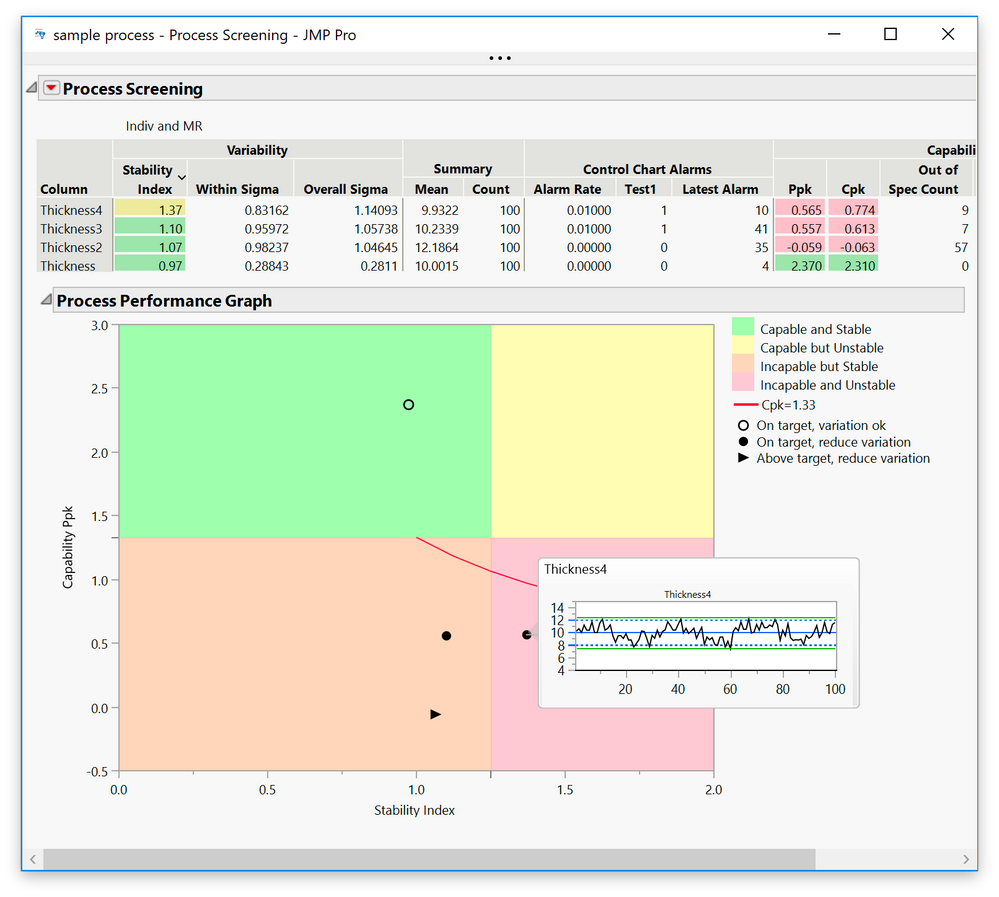 Figure 1: Process Screening
Functional Data Explorer
The Functional Data Explorer characterizes many trajectories using functional principal components. Figure 2 is a score plot of the temperature functions of 16 US weather stations. To determine what’s going on with the score space, points in the four areas have their hover windows pinned. The first component on the X axis is basically how extreme the winter is, while the second component, with less than 5% of the variation, involves the shape of the seasons.
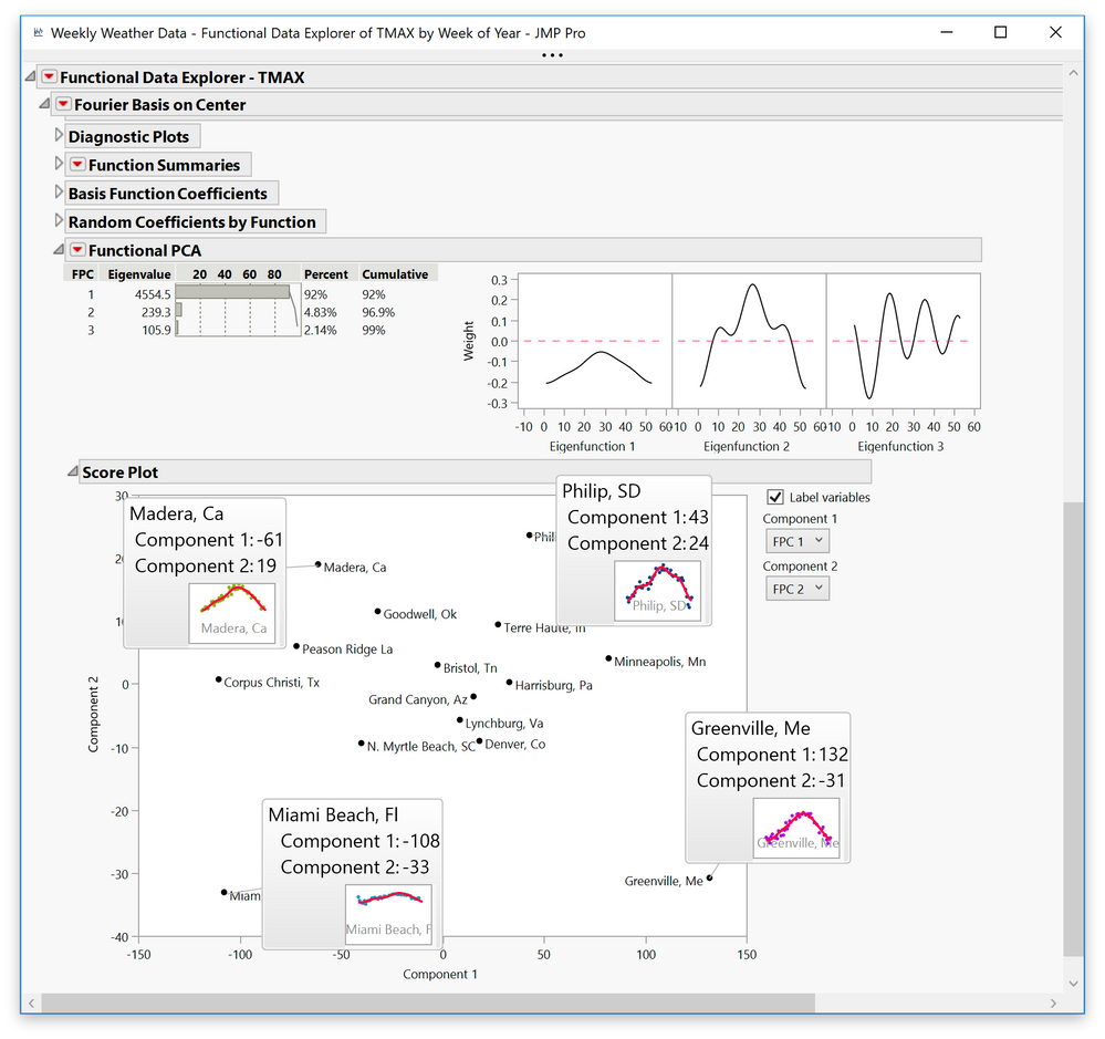 Figure 2: Functional Data Explorer
Multivariate Control Chart
In the new Model Driven Multivariate Control Chart (Figure 3), the fact that a point is far out doesn’t explain which process is involved in it being extreme. By hovering over the point, the individual differences are shown – in this case, Process 6 is implicated. 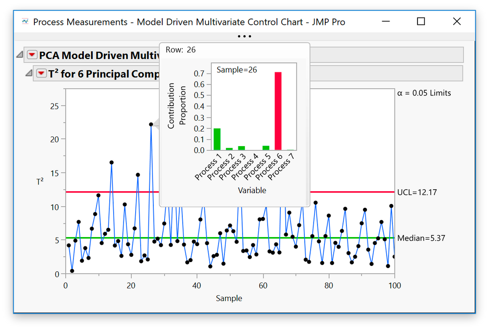 Figure 3: Model Driven Multivariate Control Chart
Custom graphlets
Figure 4 shows the mean violent crime rate for each state over years, but it doesn’t show the trajectory. To see that, I made a separate Graph Builder showing the violent rate by year. Next I copied script to clipboard, then went to the original graph and right-clicked on Paste Graphlet. Now when I hover over a point, it makes the graph of that state by year, in this case detailing Virginia. 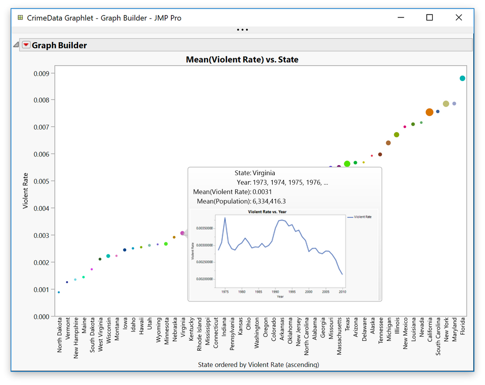 Figure 4: Custom graphlets
Further customization
Once you make a graphlet, you can customize its features in a Hover Label Editor. The Graphlet panel seen in Figure 5 shows the script that is run on the subset represented in the point. Gridlet provides control over which elements are shown in the hover window. Textlet allows you to customize the text, including the markups to stylize the text.
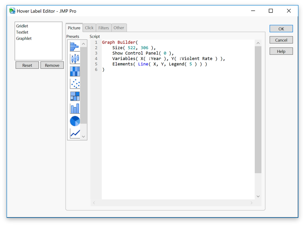 Figure 5: Graphlet Hover Label Editor
Conclusion
Good software can make things so easy that it seems like all you have to do is point a wand (or cursor) at something, and magic happens.
If you want to see JMP 15 and JMP Pro 15 in action, the JMP R&D leadership team and I gave this presentation at Discovery Summit Tucson 2019.