Before JMP 14, you could export treemaps only as static images. Now, you can export treemaps created in Graph Builder as interactive HTML graphs. You can also take advantage of exported data filters, which are new in the latest version of JMP.
Exported interactive HTML treemaps support all of the options you set prior to exporting from JMP. So, for example, in JMP you can choose to create treemaps using the split, squarify, and mixed layout algorithms. Let's briefly review what each of these layout algorithms do.
Split
The split algorithm creates a treemap with cells ordered by the names of the cell groupings. For example, if we create a treemap showing world population grouped by continental region [1], the groups are ordered by the names of the regions.
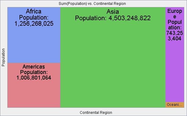 World population grouped and ordered by continental region
Squarify
Alternatively, we can use the squarify algorithm to create a treemap that orders cells by the size of the groupings. For example, the squarify algorithm orders the cells shown in the previous graph by the size of the population in each cell.
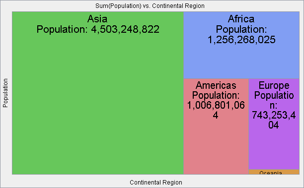 World population grouped by continental region and ordered by cell size
Mixed
The mixed algorithm behaves the same as the split algorithm when only one category is used; however, when more than one category is used, the lowest level category uses the squarify algorithm while all the other category levels use the split algorithm. For example, if we use the mixed algorithm with the continental region and country categories, we get the following world population treemap.
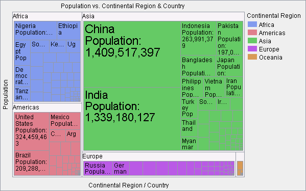 World population grouped by continental region and country using the mixed algorithm
In the above example, you can see that continental regions order the treemap by name whereas the country groupings order the treemap by size. Just like JMP, interactive HTML treemaps can have as many category levels as you would like.
Other treemap options
In addition to the treemap layout algorithms, all of the other treemap options are supported. For example, in JMP you can choose to place the names of groups above treemap cells as shown in the previous examples or you can float the group labels as shown below.
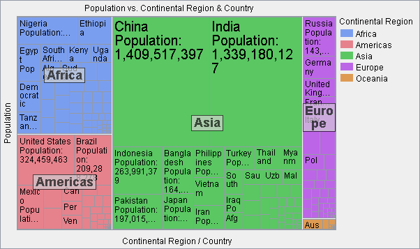 Treemap with floating group levels
Note, too, that cell labels in the above examples have a variable font size. In JMP, you can set the maximum font size as well as when a cell is too small to show any part of a label. You can also choose to display any or all of the following information in treemap cells: category value, category name, color value, and cell size. These labels can be right, left, or center justified.
In JMP, you also choose the summary statistic of interest. In the treemaps shown above, all of the data table rows contributing to a cell are summed together; however, you can choose to size cells by any of a variety of statistics including: count, mean, median, min, max, range, standard deviation, variance, and standard error.
Interacting with treemaps
While the above features allow you to export treemaps that look very similar to the static images exported in earlier versions of JMP, the real difference comes when interacting with the graphs. As with other interactive HTML graphs exported from JMP, you can hover the mouse pointer over a cell to get additional information about the cell via a hover label (note that you tap a cell to get a hover label on a mobile device).
You can also select cells which will show corresponding selections in other exported graphs that are in the same HTML page. For example, two treemaps are shown below. By using hover labels and selections, we can see in a tabular and graphical fashion that the United States population is disproportionately small relative to its market capitalization when compared to China [2].
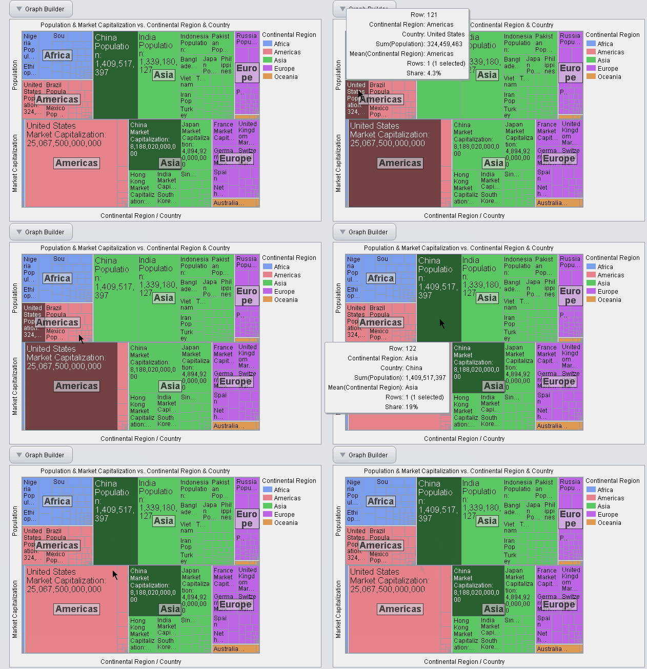 Treemap showing hover labels and selection
Even more powerful is the use of exported data filters, which are also new to JMP 14. Data filters allow you to select or hide cells that are either within a certain continuous range or match certain categorical values. While selection works by darkening the color of the selected cells as shown in the above example, hiding works by lightening the color of the hidden cells. For example, in the graph below the data filters hide cells to show that the vast majority of countries have a population of less than 200 million and a market capitalization of less than $2 trillion.
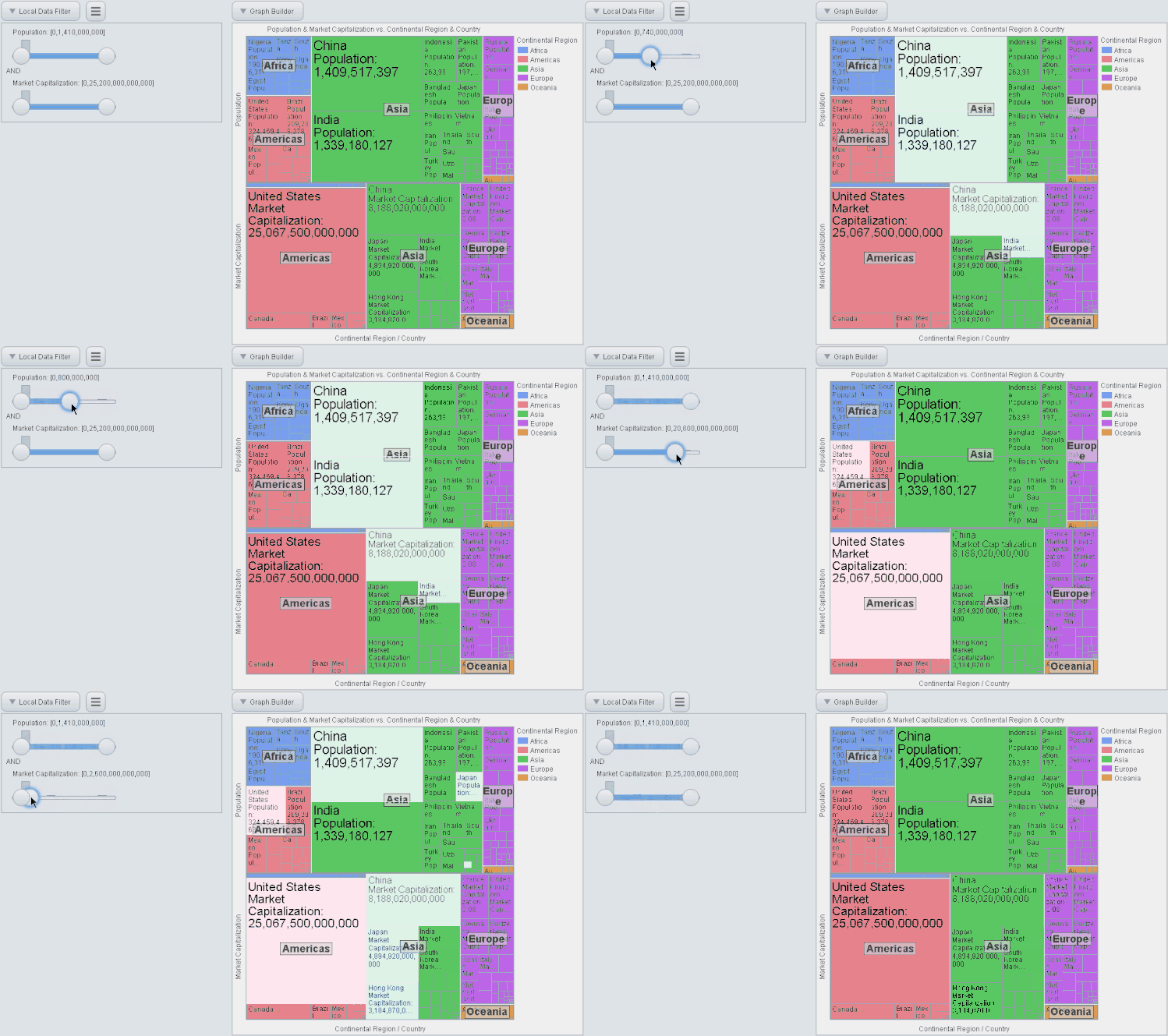 Treemap showing the use of data filters for hiding cells outside a continuous range
You can view more treemap and data filter examples on our interactive HTML examples page.
We hope you find many uses for creating and sharing interactive treemaps!
References
[1] List of countries by population (United Nations),” Wikipedia. 08-Jan-2018.
[2] “Market capitalization of listed domestic companies (current US$) | Data.” [Online]. Available: https://data.worldbank.org/indicator/CM.MKT.LCAP.CD. [Accessed: 08-Jan-2018].