- New to JMP? Let the Data Analysis Director guide you through selecting an analysis task, an analysis goal, and a data type. Available now in the JMP Marketplace!
- See how to install JMP Marketplace extensions to customize and enhance JMP.
JMPer Cable
A technical blog for JMP users of all levels, full of how-to's, tips and tricks, and detailed information on JMP features- JMP User Community
- :
- Blogs
- :
- JMPer Cable
- :
- Image and wafer analysis using functional data analysis
- Subscribe to RSS Feed
- Mark as New
- Mark as Read
- Bookmark
- Subscribe
- Printer Friendly Page
- Report Inappropriate Content
If you're just now tuning in to the series, welcome! This is the third entry in what was supposed to be a simple little blog article to deal with some writer's block on another project. Things escalated quickly…
Here are the other entries in the series:
- A 5-minute introduction to functional data analysis
- Chemical reaction monitoring using functional data analysis
And now on to the subject of this post.
An Interesting Question

This article is an explanation of the thought process and mechanics of how I got image/wafer map data to work in FDE. The trick is to change your point of view. Let me show you what I mean.
Some Motivation
Before we go too far down this path, let's take a second to consider why we would want to analyze wafer maps or images. People are visual creatures. We can easily see patterns in data that (whether they are there or not).
This ability is particularly useful in manufacturing and defect analysis. With wafer maps, it is easy to pick out patterns caused by different processes by eye (like the ones shown above). Having an algorithm that can do something similar that presents the information in a manner that is easy to use in subsequent analyses is priceless. Similarly with image analysis or other data that are presented in the form of heat maps, being able to translate visual information into an analytically friendly format opens many new avenues for analysis.
A Thought Exercise
The biggest problem with getting FDA to work is deciding what the "function" is in the data set. And that's where most people start. In JMP Pro, they will usually sit, staring at the "ID, Function" field trying to figure out what to put in there before they do anything else -- and that is a horrible plan, especially when you're trying to do FDA on images, wafer maps, etc.
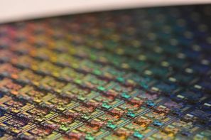
Let me give some context to where I'm going with this. The question that got me thinking about this problem was around something called a wafer map. Here's a picture of one:
In the semiconductor industry, we tend to think of wafer data in one of two ways: a collection of individual cells (called die) or as images, where the wafer is the thing we analyze. From a process perspective, that first method doesn't make sense. Since changes to a process affect the wafer globally (it's tough to adjust process conditions to alter one specific die), each wafer is more like an image. And therein lies our problem. How do we encode the spatial information into a functional data analysis?
Now, what if we stop worrying about defining the function for a second. What if we change our perspective a little and determine what the "time" variable is? If we do that, the path forward becomes more apparent by the process of elimination. It turns out each wafer is a snapshot in time. The same goes for pictures -- just like a movie -- each frame of a movie film represents an instant in time. If someone is doing FDA on image data, they are generally looking at the same field of view collected over time. With images, "time" can also be thought of as slices moving through a volume or changes in energies, exposure times, etc. So "time" is a stand-in for an independent variable (i.e., what you alter in your experiment, etc.).
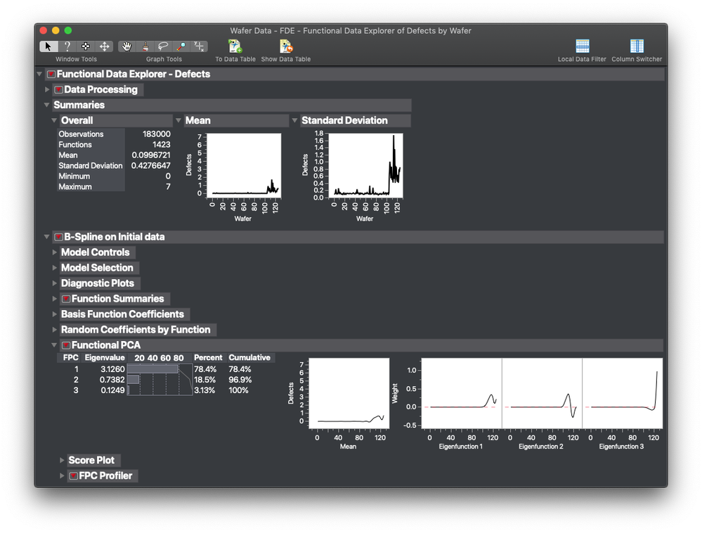
In our semiconductor data set, the wafers all to have a value attached to them called the Wafer ID. These IDs are ordered chronologically. In the 3D scatterplot above, we can use the z-axis (up) as moving forward in time. So, if the wafers (or images) are the "time" variable, what does that leave for us to consider the "function?" The answer is the die or pixels. If we consider the (x,y) coordinate of each die or pixel as an ID of sorts, we can create a unique identifier that we can use as the function ID. Using that logic, we can plot the average response for different families of functions (die) and look at the average number of defects over a series of wafers (the "time" domain). We can see that the edge has a much larger problem with defects than the center of the wafer (to which every semiconductor engineer goes, "Yup, now tell me something I don't know.").
Changing Perspective
It turns out that considering a die or pixel location as the functional ID has some positive and negative consequences. On the plus side, we can do FDA on images and image like structures (wafer maps). On the downside: Within the FDA process, we lose our ability to interpret the results visually. We get it back on the other side, but we're flying blind while we're building the functional forms and have to rely on the numbers.
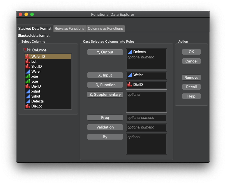
So, how do we change our perspective? The first step, getting the data into JMP Pro, particularly for images, has been covered by @JohnPonte in a couple of Community posts (Image Analyzer presentation and add-in) a few years back. You need a stack of data that has your response of interest, and the (x,y) coordinate pair for each pixel, die, etc. After this, we treat the images (wafer maps) as a time variable and the pixel ID (die ID) as the function ID.

The last step in the FDA process is exporting the FPC values into a new data table with the pixel/die ID column. From there, we can break up the ID column into the x and y components for visualization using column utilities. I am glossing over these steps, but the data sets are available on JMP Public, complete with the formula columns I used to convert the Die/Pixel coordinates into Function IDs and back again.
Example 1: Wafer Map
This first example is looking at defect rates in a semiconductor wafer map. The data set is part of the JMP sample data. Below is an interactive graphic of the FPC's from the study (the other steps are above). Note that FDE was able to tease out two different defect signatures in the data. The first signature is easy to see in FPC1. The second is in FPC 2 and is really weak. It's a more radial signature. FPC2 contains a lot of the random shot noise in the data. The upside of this analysis is that if we want to see what causes the signature represented by FPC1, we can just use FPC in a model/root cause analysis exercise.
Example 2: Image
This image set is a sample data set from the ImageJ package. It is sintered alumina particles, with each image in the original set being taken from a different depth in the thickness of the sample using confocal microscopy. The reconstructed image using the FPCs is shown below. What's interesting about this image is that the FPCs appear to emphasize features at different depths in the sample.
For fun, I took that information and did a 3D reconstruction of the sample using the first three FPCs:
Conclusion
So, it is possible to do some image analysis with FDA in JMP Pro. The key is making sure you consider what the Function and the "Time" domains are in the data set. More broadly, this is really a critical consideration with FDA. It can cause very different results or be the difference between a successful analysis and something nonsensical.
Next week, we're going to cover what the heck you can do with the information you get from analysis like this. We're going to marry a process DOE to functional data analysis. I hope you come back for the next episode!
- © 2026 JMP Statistical Discovery LLC. All Rights Reserved.
- Terms of Use
- Privacy Statement
- Contact Us


You must be a registered user to add a comment. If you've already registered, sign in. Otherwise, register and sign in.