- New to JMP? Let the Data Analysis Director guide you through selecting an analysis task, an analysis goal, and a data type. Available now in the JMP Marketplace!
- See how to install JMP Marketplace extensions to customize and enhance JMP.
JMPer Cable
A technical blog for JMP users of all levels, full of how-to's, tips and tricks, and detailed information on JMP features- JMP User Community
- :
- Blogs
- :
- JMPer Cable
- :
- Chemical reaction monitoring using functional data analysis
- Subscribe to RSS Feed
- Mark as New
- Mark as Read
- Bookmark
- Subscribe
- Printer Friendly Page
- Report Inappropriate Content
I must confess something to you, my dear reader. I have a moderately severe problem with scope creep in my writing. I had planned for the first article in this series to be a one-off. I had planned for this to be a quick little thing that I would crank out while I was working on my next big multipart blog series (which, oddly enough, has an entry almost entirely about scope creep… ?). It was a way to keep writing while avoiding getting burned out on the other topic. As you may have picked up on, things got somewhat out of hand. The good news is that I do have enough discipline not to start publishing a series until I've got the entire thing written. So, rest assured there will be no unresolved cliff hangers. Anyway. On to the first of some interesting applications of functional data analysis.
If you’re wondering what’s going on with heartfelt confessional in a technical blog here’s the first entry in the series: A 5-minute introduction to functional data analysis
An Introduction to the Series
As I was writing the first article in the series, I started thinking about different applications of functional data analysis (FDA) I've explored. I came up with a fairly long list (once you go down this rabbit hole, there are all kinds of ways you can play with FDA). I was able to narrow my list down to three applications that could demonstrate the scope of the things you can do with FDA.
First up: a walk down memory lane with some data from my doctoral dissertation.
An Introduction to XRR for Noobs
Back in grad school (go Ducks!!), I worked with a technique called X-ray Reflectivity. You can find the method in semiconductor manufacturing, among other places, where accurate thicknesses for complex and opaque film stacks are needed. I wanted to see what FDA (and FDE, or Functional Data Explorer in JMP Pro) could do with some of my graduate work.
This example is from an annealing study I did to identify a low-temperature synthetic pathway for a complicated crystal structure.
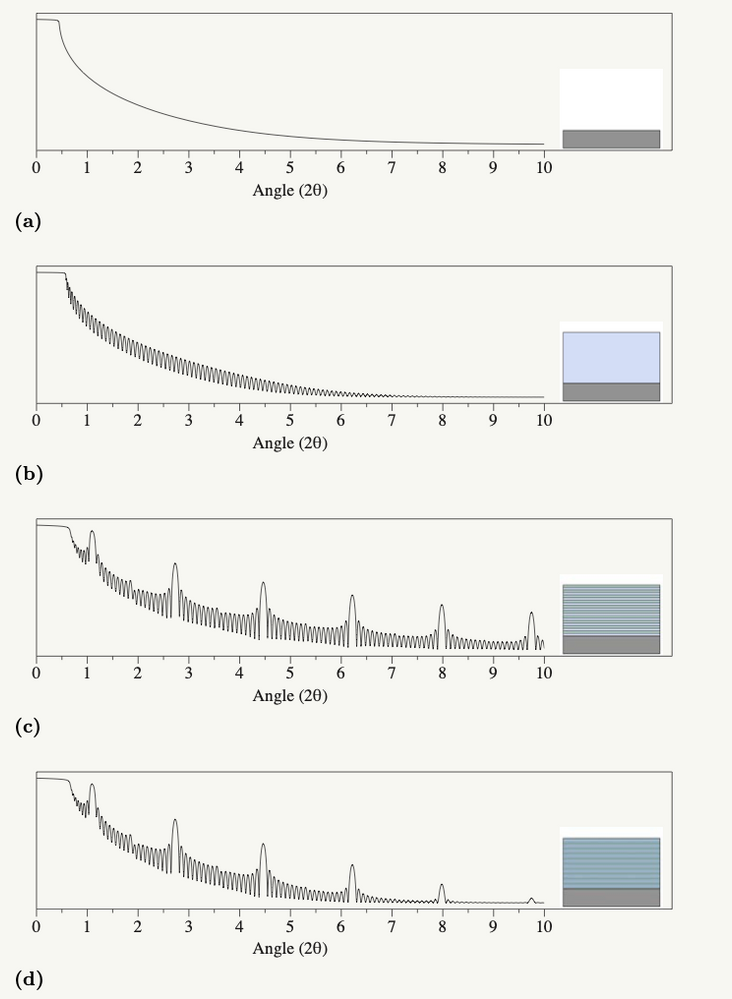
First, for an extremely hand-wavy introduction to XRR… so that you understand what all the squiggles in the graphs are. XRR uses the film stack on the sample as something like a beam splitter. The technique works by effectively separating the incoming X-ray light into beams that continue along the original light path or travel off at a specific angle determined by the sample and the instrument. (Yes, for XRR purists, that's probably a gross oversimplification, but it conveys the relevant points.) This splitting happens at each interface in a film stack (i.e., Air - Film, Film 1 - Film 2, Film - Substrate). The detector picks up the constructive/destructive interference from reflected beams as a series of oscillations during the measurement process. Interestingly enough, roughly the same thing is happening to produce all the lovely rainbow colors you see in soap bubbles. And, if all that makes no sense whatsoever, here’s a picture of what the data looks like from a simulated stack of films:

The series of rounded peaks are from the interference patterns, and they contain the film thickness information. You can see two different families of rounded peaks (one set that’s small and close together, and one that is taller and further apart). These arise from different repeated structures in the film, and that’s as far as we need to go into XRR theory.
The Annealing Study Data
So, in this experiment, I deposited extremely thin (think a few atoms thick) layers of different elements with a specific repeating pattern. I then heated them over a series to temperatures (200℃ to 600℃) and used XRR to see how the film changed. The goal of this study was to figure out at what temperature the stack of thin layers stopped being a stack of layers and turned into a single crystalline film. Here’s an interactive graphic of the XRR data for the films. Note the "AD" film stands for As Deposited. Which was somewhere around room temperature or a little above (we didn't have a thermocouple hooked up to measure the sample temp in the deposition chamber).
You can see, just by inspection, that things in the film change over the range of temperatures I explored. The oscillations dance around a little -- indicating changes in the film thickness. The lone peak off to the right also starts shrinking fairly quickly and eventually disappears -- showing that the layering structure has gone. That’s all great and grand -- with a little extra work, which I did back in the day, I could get the specific layer thicknesses out of this data set. However, my goal with this particular study was to figure out when I could take the material off the heat. I needed to know when I had hit an endpoint in the reaction. In this case, I was also using X-ray Diffraction (XRD) to monitor when a crystalline material was forming, but because XRD took longer than XRR I didn't want to start doing diffraction measurements until I was sure something was happening.
Reaction End-Pointing Using FDE
For this exercise, we’re going to take a look at some of the bits of the FDE report in JMP Pro that we glossed over in the last post. Here's the complete report in HTML5 format:
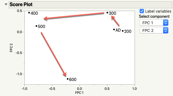
Specifically, I’m interested in generating a function from the Fourier basis functions (because the data is periodic) and looking at how the FPC’s look in the score plot. For those of you that are familiar with PCA, this plot shows how two principal components relate to one another. The closer the data points are, the more closely the rows are related through the principal components.

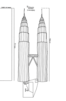
What makes this FDA example interesting is that you can tell more or less what’s going on in the sample just by looking at the score plot. The film in this example is a repeating sandwich of layers (selenium / chromium / copper / chromium / selenium). Each sandwich is about 3nm thick in total. The total film (multiple sandwiches stacked up) is around 50nm thick. Now, since it's really hard to visualize - let me give you some help. Here's a little sketch I did of the Petronas Towers in Malaysia. They are 452m tall. If we were to enlarge a piece of paper (normally 0.1mm thick) to be 452m thick and scaled this film by the same amount the film would be about 8 or 9 inches (~23cm) thick. That's basically the long axis on a standard paperback novel. When I said thin, I meant it!
The critical point here is that selenium -- a rather foul-smelling element in the same family as sulfur -- melts at around 220℃. With that bit of knowledge, take a look at the score plot. Note that the AD (as deposited) and 200℃ film are right next to each other? That’s because nothing significant is happening to the film (there is some stuff happening, but nothing major reaction-wise).
Now, notice that the 300℃ point is a little off on its own? It’s different from the first two films, but not much. The selenium is above its melting point and the sandwich structure is breaking down. It’s still there (which is why it’s closer to the lower temperature samples). The chromium and copper are slowing the mixing process down a little, but it’s a losing battle.
Next, the 400℃ and 500℃ samples are removed from the others significantly. Everything is mixing. The sandwich structure is gone and a new material, CuCr2Se4, is starting to form in the mixture. I know it’s forming based on another measurement not in this data set. From this analysis, I know that those two samples are very different from the others in this study. My subject matter expertise tells me why and what questions I could ask or measurements to take to confirm the hypothesis.
Last we arrive at 600℃- off on its own from everything else. Why? Because it’s completely different from anything else in the data set. The film is probably now a single layer of that CuCr2Se4 compound I mentioned. At the very least, from this data, it’s not the same as the intermediate traces and not the same as the starting point.
Conclusion
So, what did we learn here? Besides the fact that I’m an unapologetic geek who reworks his dissertation data for kicks, I mean. The first time I saw this result, I learned to pay attention to that score plot as part of my analytical flow with FDA (and FDE). Pairing subject matter expertise with that particular plot can yield some exciting insights fairly quickly.
For the next topic in this series, I’m going to follow the white rabbit down and go after the question of dimensionality in FDA. Hope you stick around -- it’s going to be a mind-bending ride.
- © 2026 JMP Statistical Discovery LLC. All Rights Reserved.
- Terms of Use
- Privacy Statement
- Contact Us


You must be a registered user to add a comment. If you've already registered, sign in. Otherwise, register and sign in.