- New to JMP? Let the Data Analysis Director guide you through selecting an analysis task, an analysis goal, and a data type. Available now in the JMP Marketplace!
- See how to install JMP Marketplace extensions to customize and enhance JMP.
JMPer Cable
A technical blog for JMP users of all levels, full of how-to's, tips and tricks, and detailed information on JMP features- JMP User Community
- :
- Blogs
- :
- JMPer Cable
- :
- How to overlay histograms in JMP
- Subscribe to RSS Feed
- Mark as New
- Mark as Read
- Bookmark
- Subscribe
- Printer Friendly Page
- Report Inappropriate Content
There are two methods to overlay histograms in JMP, using the Distribution and Graph Builder platforms. You might want to overlay histograms to review the similarities and/or differences between the distributions of two or more variables. Overlaying the histograms allows you to compare the distributions in a more precise manner than viewing them separately.
Overlaying histograms using Distribution
The first method uses the Distribution platform. Below is an example using the Car Physical Data.jmp sample data table. In addition to overlaying histograms, normal distribution curves are overlayed in this example. If you do not desire distributional curves in your graph, simply disregard the related steps. The structure of Car Physical Data, which has a total of 116 rows, is as follows:
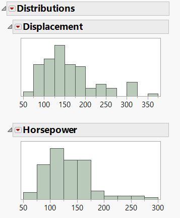
From the data table, go to Analyze > Distribution. Place two numeric, continuous columns, say Displacement and Horsepower, in the Y, Columns box and click OK.
The output will look like the following (I’ve removed some of the default output sections, like Quantiles and Summary Statistics, for simplicity):
If you see the histograms side by side instead of on top of one another, click on the red triangle menu next to Distributions and select Stack to see them as they are in the above image. If the histograms appear in a vertical format, click on the red triangle menus next to each variable name and choose Display options > Horizontal Layout. Another option is, rather clicking on each individual red triangle menu, to press the Ctrl key while making the change for one variable. By doing this, the change broadcasts across all other variables.
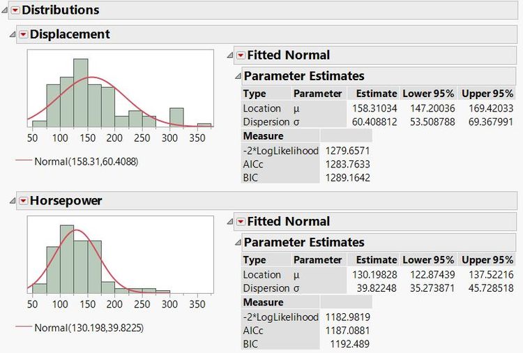
As I mentioned above, I’m going to fit a normal curve to each distribution and overlay those elements as well.
To produce the normal curves, hold the Ctrl key and click (Command + click on a Mac) on the red triangle menu next to Displacement. Then, choose Continuous Fit > Normal. A Fitted Normal distribution appears in the output for both variables, as seen below.
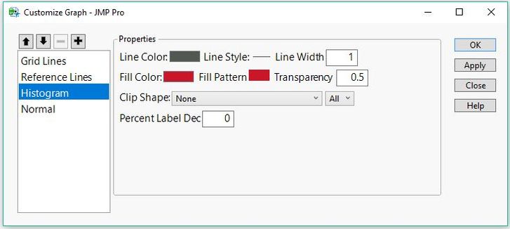
Now, I’ll go ahead and customize the colors of the elements in each plot so we can distinguish them in the final result. I will use red for Displacement and blue for Horsepower. Right click within the Displacement histogram and choose Customize. In the item list in the window that appears, click Histogram. Change the Fill Color to red and the Transparency to 0.5 (so we can more easily observe where the histograms overlap). The Customize Graph window appears as follows:
In the case for Displacement, the normal curve is already red, so we do not need to customize that item. Click OK to close the window.
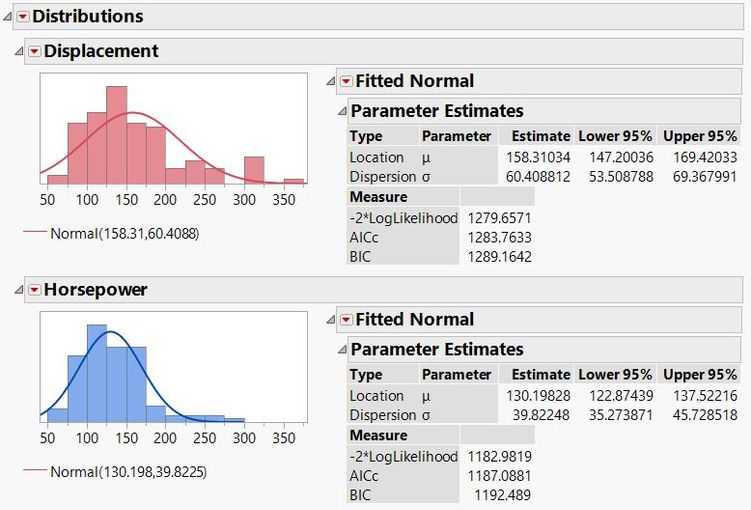
Now, repeat the previous steps to change the Horsepower histogram color to blue and the transparency to 0.5. We want to change the normal curve to be blue as well, so click on the Normal line item and change the Line Color field to blue. Click OK.
Our output now looks like this:
Now, I’ll copy the Displacement histogram and normal curve onto the Horsepower plot so they are overlayed.
To do this, first right click within the Displacement histogram and choose Edit > Copy Frame Contents. Next, right click within the Horsepower histogram graph and choose Edit > Paste Frame Contents. You may have to adjust the axis range in view to see both complete histograms.
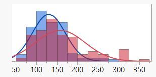
The result is both histograms and normal curves in one graph:
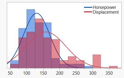
With this method, there is no automatic legend, but you can use the Annotate tool to add text and the Line tool to add a colored line element for a manual legend.
After implementing these tools, my result is something like this:
Overlaying histograms using Graph Builder
The second method to overlay histograms (and distribution curves) uses the Graph Builder platform.
This method requires the data to be in a stacked format so that all continuous values are in one column. To stack the data, go to the Tables menu from the original Car Physical Data table and choose Stack. Place both Displacement and Horsepower in the Stack Columns box. Click OK.
The new stacked data table has a column named Data that contains all data values, and a column named Label that indicates whether that value originated from the Displacement column or the Horsepower column.
From the stacked data table, go to Graph > Graph Builder. Drag Data to the X role and Label to the Overlay role. Right click within the graph and choose Points > Change to > Histogram.
Now, we need to make sure the plot is scaled correctly. I’ll go back to the overlayed plot in the Distribution platform and click on the red triangle menu > Histogram Options > Density Axis. This axis gives us an idea of what the Graph Builder Y axis should be. An axis appears on the right side of the histogram, and I double-click on it to open the Axis Settings window. The maximum value in this case is 0.0117586.
Now, go back to the Graph Builder output, drag the Data column to Y and double click the axis to open Y Axis Settings. Set the minimum to 0 and the maximum value to 0.0117586, to mimic the density axis from the Distribution platform. I also set the increment to 0.002, and the Dec (decimal) field in the Format section to 3.
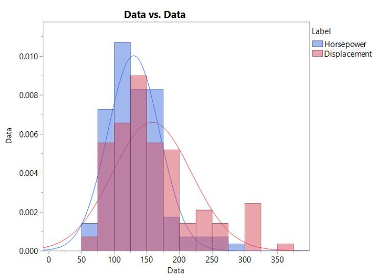
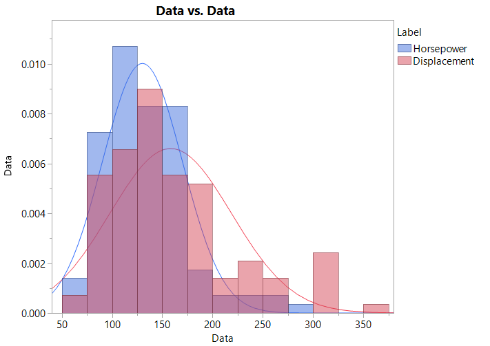
If desired, you can double click on the X axis to open its Axis Settings dialog and customize the minimum, maximum, and increment values. The result at this point is this:
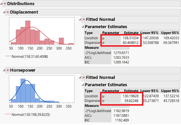
Next, I will overlay the normal curves. First, we’ll need to record the mean and standard deviation values from the fitted normal distributions applied to both Displacement and Horsepower in the Distribution platform. Recall that these values are given in the output after selecting Continuous Fit > Normal.
Recall the values (outlined in red) from the Distribution output below:
With these values recorded, right click within the Graph Builder plot and select Customize. Click on the + icon to add a custom script. We’ll use the syntax below for each normal curve. The Pen Color statement defines the color of the curve while the Y Function draws a normal density curve with specified mu and sigma parameters (recorded from the Distribution output for each variable).
Pen Color( "<color>" );
Y Function( normal density(x, mu, sigma), x );
Using the syntax above and the (rounded) mu and sigma values for the fitted Normal distribution applied to Displacement and Horsepower, I enter the following text into the custom script window.
//Horsepower
Pen Color( "blue" );
Y Function( Normal Density( x, 130.198, 39.8225 ), x );
//Displacement
Pen Color( "red" );
Y Function( Normal Density( x, 158.31, 60.4088 ), x );
Click OK. The result is this:
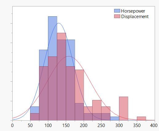
Now, I’ll make a few customizations to finalize the graph to my preferences. I prefer to remove the graph label, the Y axis label, as well as the X axis label. I’ll double click in each field and use the delete key to remove the text. Also, I don’t want to show any tick labels on the Y axis. I double click on the axis to open Y Axis Settings and uncheck the Labels checkbox for major tick marks in the Axis Label Row section of the dialog. Also, I want to move the legend inside the graph. I click on the red triangle menu next to Graph Builder and choose Legend Position > Inside Right. Lastly, I’ll extend the range of the x-axis slightly for a more complete picture. I open X Axis Settings and set the minimum as 0 and the maximum as 400.
Finally, I click on the Done button and am left with the following graph:
The above examples show how to overlay histograms and normal curves using two methods – the Distribution platform and the Graph Builder platform in JMP. If desired, this example can be generalized to overlay more than two histograms and normal curves, or fit other distributional curves to your data.
You must be a registered user to add a comment. If you've already registered, sign in. Otherwise, register and sign in.
- © 2026 JMP Statistical Discovery LLC. All Rights Reserved.
- Terms of Use
- Privacy Statement
- Contact Us


