JMPer Cable
A technical blog for JMP users of all levels, full of how-to's, tips and tricks, and detailed information on JMP features- JMP User Community
- :
- Blogs
- :
- JMPer Cable
- :
- How to make a wafer map in JMP in under 30 seconds
- Subscribe to RSS Feed
- Mark as New
- Mark as Read
- Bookmark
- Subscribe
- Printer Friendly Page
- Report Inappropriate Content
The Engineering Mailbag
Episode 6: Wafer Maps in Under 30 seconds
TL;DR
Here’s me walking you through how to do this in under 30 seconds*!! If you want details, read on!
*The walk through takes me about 3 minutes and 40 seconds, but the mouse clicks take about 30 seconds, tops.
Introduction
How do you make a wafer map in JMP?
I get this question…a lot. So, here’s a quick note from the Engineering Mailbag (an Engineering Postcard, maybe?) on how to create a quick and dirty patterned wafer map in Graph Builder.
The Basic Map
For this discussion, I’m going to focus on the patterned wafer map. These are dead simple to create in a pinch and just require, at a minimum, three pieces of information: the X Die ID, the Y Die ID and something to color the map by (sort bin, Vt, film thickness, particle count, you get the idea). We could go crazy with this topic, and I’ll touch on some of that toward the end, but for this discussion, I want to focus on a super basic, “just-get-me-pointed-in-the-right-direction” wafer map. And, for that we will just need those three pieces of data. Do you have that data?
You do!
Sweet. Then, let’s do this.
If you don’t have a data set handy, there is a sample data set included with JMP (which is also the data set I’m going to use) that you can use to follow along until you do. Just go to Help > Sample Data Library in JMP and select Wafer Stacked.jmp.
The patterned wafer map is just a fancy retooling of something called a heat map. And it turns out that a heat map is just a really, really low resolution image where each pixel in the image represents one thing (a device, die, reticle field, etc.). And, as it happens, heat maps (and therefore wafer maps) are really easy to make in Graph Builder! Funny how that works, eh?
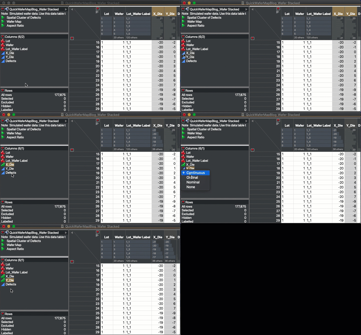
First, we need to make sure the data is set up correctly. It works best with a tall table with one die per row. Making the heat map is also a lot easier if you make your X Die and Y Die columns ordinal data. When you pull data into JMP from a factory database or manufacturing tool, the X Die and Y Die columns will usually be continuous. Normally this isn’t a big deal for analysis, but for visualization purposes, they need to be ordinal. So, right click on the data icon and change them from blue triangles (continuous) to green sorted histograms (ordinal).
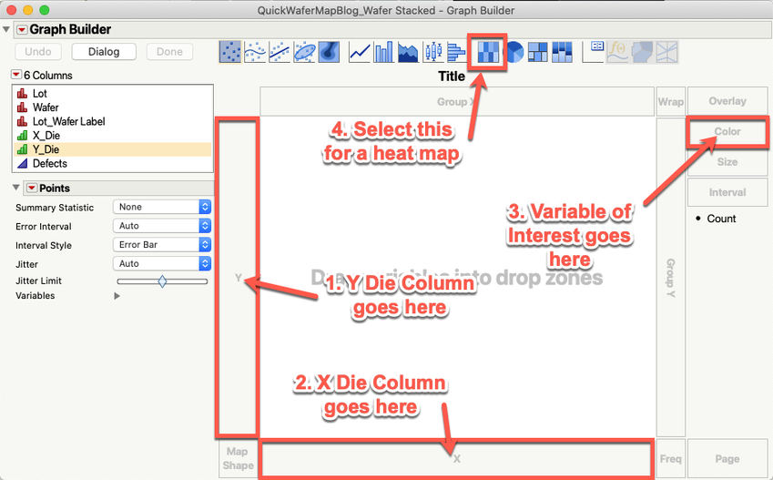
Now, for the fun part. Open Graph Builder (Graph > Graph Builder in JMP). Drag your X Die column to the Bottom X Axis Drop Zone. Drag your Y Die column to the Left Y Axis Drop Zone. Drag your parameter of interest to the Color Drop Zone on the far right of the window. Last, select the Heat Map Graph Element from the list along the top of the interface. Click Done! You have now created a wafer map.
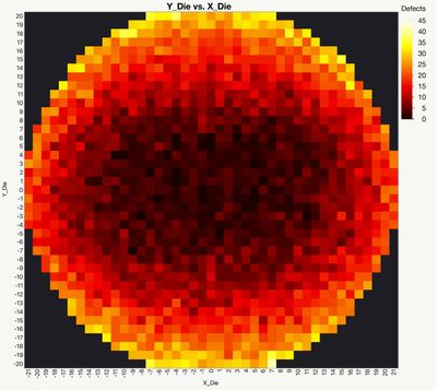
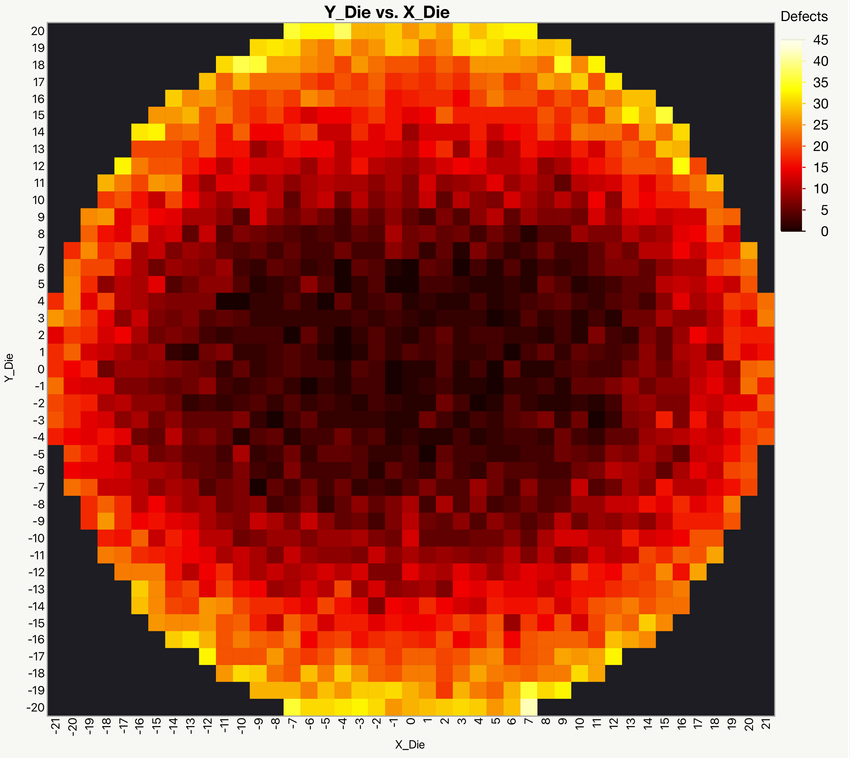
And here’s a finished wafer map in Graph Builder using the Wafer Stacked.jmp data set (and some tinkering with colors).
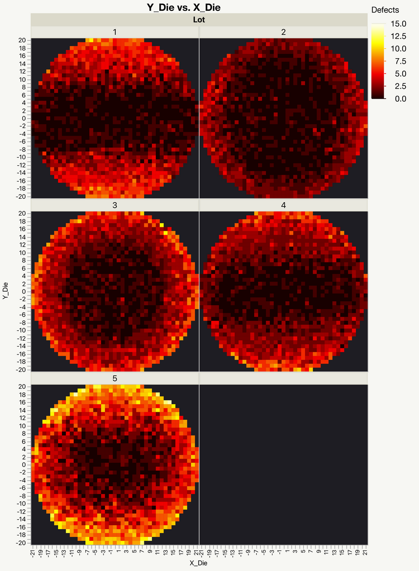
If you want to break the map up (by wafers in a lot, process step, etc.), just put the variable you want to map by in the Wrap Drop Zone (to the left of the Color Drop Zone). You can break it up further using the Page Drop Zone (bottom right of the interface) or the X/Y Group Drop Zones. Try them all out and see which ones you like. They all have their advantages and disadvantages. Here’s an example in which I look at lot defect totals using the Wrap Drop Zone (again using some creative coloring):
Refining the Aspect Ratio
Let’s do a little refining. We generally expect wafer maps to be circular, but the aspect ratio of the die can confuse the heat map. This is really an aesthetic consideration as the information is still conveyed effectively even if the wafer looks a little wonky. Think about how many slide decks you’ve seen with distorted screenshots of wafer maps. They may look awful, but they still do the job.
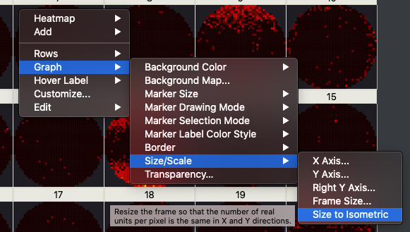
Anyway, there is a trick that we can use to pretty-up the map a bit. Just right-click on the graph and select Graph > Size and Scale > Size to Isometric.
This will usually correct the problem by adjusting things, so the aspect ratio more closely approximates what’s in the data set. However, if you’re not looking at full wafer maps, you might need to manually adjust things using the Frame Size option (which is above Size to Isometric in the menu).
Conclusions and a Shameless Plug
So, that’s really it. Wafer maps are just that simple. Now, if you came here looking to make un-patterned wafer maps (also called bare wafer maps), those are a little harder to create because the data set is sparse and the sampling plan sometimes imparts some bias to the results. But, I did do a paper on how to do bare wafer maps at the 2016 JMP Discovery Summit. You can find that here: All Wafer Maps Are Wrong: An Adventure in Semiconductor Data Visualization. Now, if you want to make the basic heat map look even prettier, or want to quickly make bare wafer maps, or just want to have an add-in do the heavy-lifting for you, there is an add-in called the Semiconductor Tool Kit (STK). It was launched as part of that same Discovery Summit presentation. I’m not going to go too deep into it now, but look for some additional articles on the latest version of the STK later in 2021.
So for now, just remember one thing: Wafer maps are just heat maps – that look like circles.
You must be a registered user to add a comment. If you've already registered, sign in. Otherwise, register and sign in.
- © 2026 JMP Statistical Discovery LLC. All Rights Reserved.
- Terms of Use
- Privacy Statement
- Contact Us

