- New to JMP? Let the Data Analysis Director guide you through selecting an analysis task, an analysis goal, and a data type. Available now in the JMP Marketplace!
- See how to install JMP Marketplace extensions to customize and enhance JMP.
JMPer Cable
A technical blog for JMP users of all levels, full of how-to's, tips and tricks, and detailed information on JMP features- JMP User Community
- :
- Blogs
- :
- JMPer Cable
- :
- Hierarchical Clustering, Ternary Plots, and Row State Customizations
- Subscribe to RSS Feed
- Mark as New
- Mark as Read
- Bookmark
- Subscribe
- Printer Friendly Page
- Report Inappropriate Content
The Engineering Mailbag
Episode 2: I See Your True Colors
Every now and again, JMP Systems Engineers run into interesting questions that fall somewhat outside the typical range of JMP usage. These applications are generally clever and bring home how using data isn’t just for business or technical problems. Below is an example from another colleague from New York state that I thought would be fun to share.
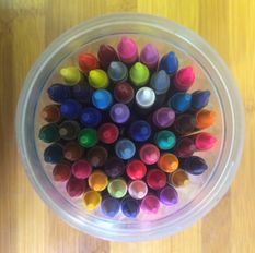
Jim was trying to analyze the data on 150 Crayola crayons as part of some volunteer work. He hoped to show students cool data visualizations that would spark their interest in STEAM (Science, Technology, Engineering, Art & Design and Mathematics).
The Question
Hi, Mike [JMP],
I've finally got a question for you. I'm creating a data set for a STEAM presentation. For the Art & Design part, I have data on Crayola crayons (150 rows). I am trying to create a ternary plot using the color coordinates (R,G,B), which I have for each row (color). I can create the plot without difficulty, but I want to have each marker on the plot be the actual color represented in each row. I've been able to do this by hand, but I assume there must be an easier way (without having to write a script).
Any guidance in this direction would be appreciated! (There is no rush at this point.)
Thanks.
Jim [User]
My Response
Try this out.<data table attached>
Well … that was an informative exchange, wasn’t it?
This is an example of one of those rare cases where the only way to show someone how to do something is to actually do it for them. I’m generally not a fan of doing this, but sometimes that's the best way. And yes, in this case, the answer is a script. Let’s take a second and walk through the data and what I did. The data Jim provided (available here) looks like this:
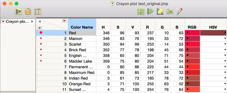
What we see are columns for the crayon name and the HSV RGB coordinates for that color. I didn’t actually use the HSV coordinates for my solution. Jim would like to figure out a way to programmatically assign a color to the row state that matches the color described by the RGB coordinates. (If that sounds complicated, just hang on – it’s not that bad.) Here’s the data table I sent back:

Note the table scripts that I included (next to the green arrows on the left). The first one is where the magic happens. The others are some fun analyses that I’ll talk about later.
Well, Tickle Me Pink!
First, let’s look at this coloring business. Depending on what you are trying to do, JMP needs the RGB coordinates to be formatted differently. Working with the cell colors (the backgrounds of the color names in the columns) and the row state colors requires RGB to be scaled between 0 and 1. So, because I was trying to be transparent with what I was doing, I created a set of columns (Red, Green, Blue) to rescale the RGB coordinates from the 8-bit color scale (0-255) to between 0 and 1. The Table Script, “Color Cells,” then does two things. First, it goes through each row using a For Each Row() loop and the :Color Name << Color Cells() message to set the cell colors. Then, again for transparency (and probably because I did this over the course of a couple of days – I can’t remember which, to be honest), I used a second step involving a For() loop to set the row states using the columns I created.
Names Default To Here( 1 );
dt = Current Data Table();
dt << Clear Select;

For Each Row(
       // get RGB values
       red = Column( "Red" )[Row()];
       green = Column( "Green" )[Row()];
       blue = Column( "Blue" )[Row()];

       // color the "sample" column cell with the sample color
       :Color Name << Color Cells( RGB Color( red, green, blue ), Row() );
);

For( i = 1, i <= N Rows(), i++,
       // get RGB values
       red = Column( "Red" )[i];
       green = Column( "Green" )[i];
       blue = Column( "Blue" )[i];
       dt << Select Rows( i );
       dt << Colors( RGB Color( red, green, blue ) );
       dt << Clear Select;
);
Running this script creates the colorful table I sent back to Jim.
Now, while this table is quite colorful, consuming this kind of data really begs for some powerful visualizations. Since RGB is a ternary coordinate space, a Ternary Plot seems like an appropriate starting place:
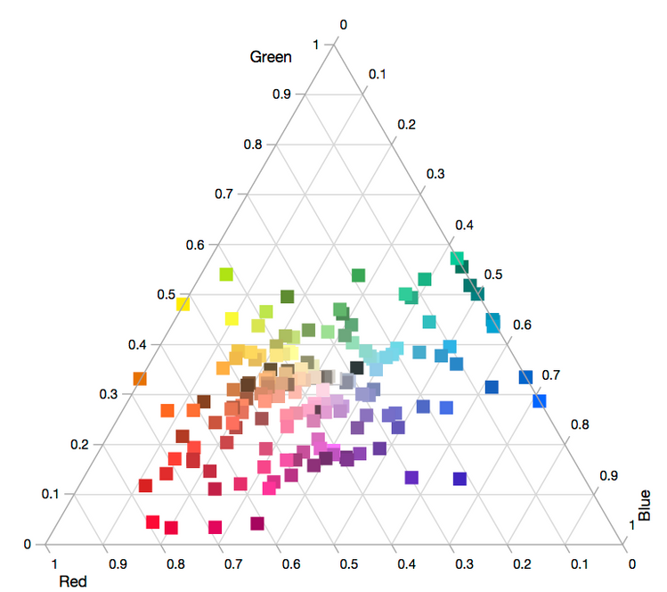
The row state coloring provides a clear picture of where each crayon sits in the RGB color space. I should also point out there is a little bit of a caveat emptor on the use of Ternary Plots for this application. Strictly speaking, the Ternary Plot platform expects the three values provided for each coordinate to sum to 1. When the data provided doesn’t meet this criterion, it normalizes the data points so they do. So, while the Ternary Plot is really neat, it’s not a 100% accurate representation of the color space. However, since the point of the exercise was to produce some graphics that would excite STEAM interest, I think trading a little accuracy for visual impact is OK…
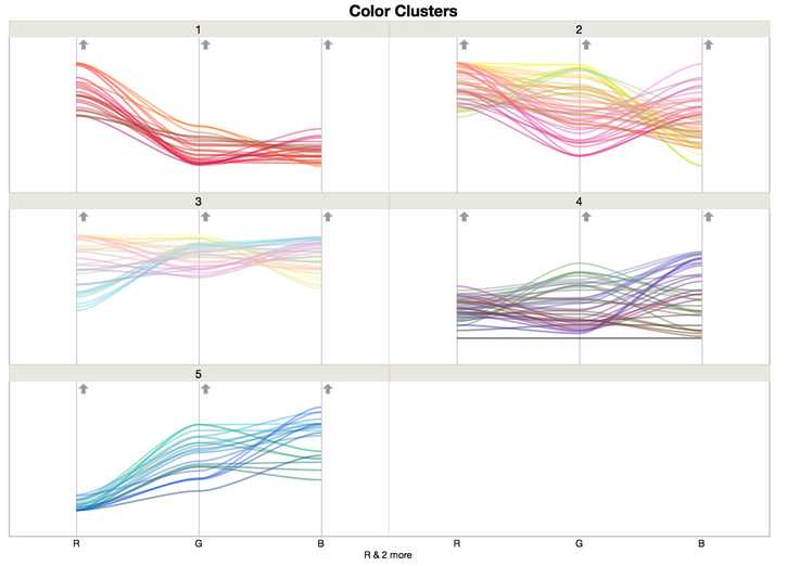
Analytically, it’s possible to group the crayons based on how similar their colors are using a Hierarchical Clustering. Here, I’ve shown the Constellation Plot, which is my favorite way of looking at a dendrogram, from running Hierarchical Clustering on the RGB space coordinates:
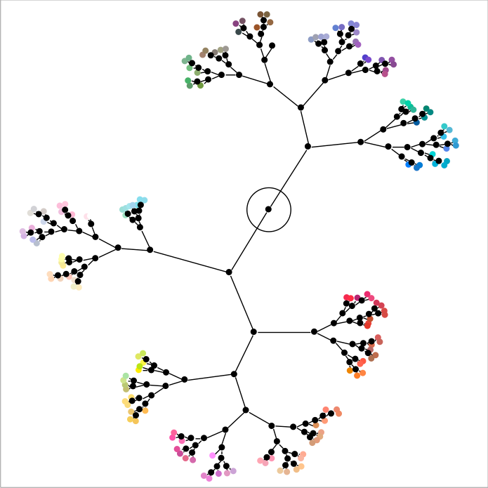
From this, I can see that there are somewhere between 5 and 7 groups of colors. I set the number of clusters to 5 and then looked at the parallel plots. The differences in the clusters are easily seen, as are the similarities within the clusters. I found it interesting that the pastel and day-glow colors were put into their own clusters (clusters 2 and 3).
You can see similar results with the k-Means clustering script.
Postscript
As always, revisiting something after putting it down for a while provides a new perspective. I’ve revisited this data set a couple of times since Jim originally reached out. What can I say? I’m a nerd, and it’s a fun little data set to play with. First, in the process of writing this post, I realized I made this code much more complex than I needed to. The entire coloring operation could be done using a single For Each Row() loop. I can also simplify the coding by creating a list and transforming the list to get the coordinate set JMP needs without creating new columns.
Names Default To Here( 1 );
dt = Current Data Table();
dt << Clear Select;

For Each Row(
       // get RGB values
       r = Column( "R" )[Row()];
       g = Column( "G" )[Row()];
       b = Column( "B" )[Row()];
       rowVal = {r, g, b};

       // create a scaled set of colors
       rowValS = rowVal/255;

       // color the "sample" column cell with the sample color
       :Color Name << Color Cells( RGB Color( rowValS ), Row() );

       // apply a row state to each row
       dt << Select Rows( Row() );
       dt << Colors( RGB Color( rowValS ) );
       dt << Clear Select;

);
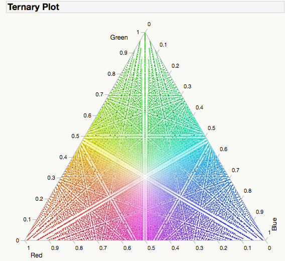
Next, I really liked the Ternary Plot from Jim’s original data set (issues with accuracy aside). It got me thinking about what would happen if I generated a space-filling example that would map out all the combinations in the RGB space. The script I came up with is fairly complex. I uploaded it to the File Exchange as RGB Color Space Mapping if you want to have a look. Regardless… the Ternary Plot it produces is pretty impressive. In retrospect, maybe I should have titled this post “Dark Side of the Moon."
A Note From The Author
For those of you reading this again, no you’re not crazy, the title did change a little. I received a request to update the title so that it would be easier for our search engines to find. I can only guess this is because some search engines are modern incarnations of 19th-century reference librarians with no sense of humor. Apologies for any inconvenience. -M
You must be a registered user to add a comment. If you've already registered, sign in. Otherwise, register and sign in.
- © 2026 JMP Statistical Discovery LLC. All Rights Reserved.
- Terms of Use
- Privacy Statement
- Contact Us
