- New to JMP? Let the Data Analysis Director guide you through selecting an analysis task, an analysis goal, and a data type. Available now in the JMP Marketplace!
- See how to install JMP Marketplace extensions to customize and enhance JMP.
JMPer Cable
A technical blog for JMP users of all levels, full of how-to's, tips and tricks, and detailed information on JMP features- JMP User Community
- :
- Blogs
- :
- JMPer Cable
- :
- Practical mapping and data visualization in Graph Builder
- Subscribe to RSS Feed
- Mark as New
- Mark as Read
- Bookmark
- Subscribe
- Printer Friendly Page
- Report Inappropriate Content
The Engineering Mailbag
Episode 1: The Economics of Snow Plow Services
Every now and again, we JMP Systems Engineers run into interesting questions that would fall somewhat outside the normal range of JMP usage. These applications are generally clever and bring home how using data isn’t just for business or technical problems.
Here is an example of a question I received from a user (also named Mike) in New York state that he and I thought would be fun to share.
The Question
Mike [JMP],
I’m playing around with JMP using data I found for snowfall totals last year. I moved to a new house this summer, and I now have a 387-foot-long driveway that will need to be plowed. I was recently talking with a snowplow contractor, and he was trying to talk me into a seasonal contract. Normally when he charges per push, it’s done anytime we have 3 or more inches of snow at $75 per push. He offered a price of $2,000 where he plows anytime we have snow. Last year, he told me, that we had 3” or more of snow about 20 times, so if this happened again this year I would end up paying $1,500 ($75 x 20). So I would only need to pay $500 more to have him plow every time it snowed.
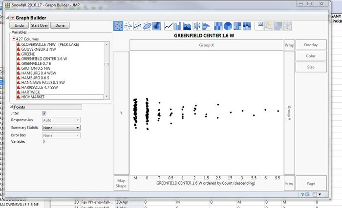
As you can see from my data, there were only 5 times last year with 3” or more of snow. Of course, I told this contractor I was not interested. I ended up hiring another guy that will do it for $50 a push. My question for you is why does JMP put the 15” snow total on the graph between 2.5” and 3.0”? Since the totals are in descending order, why isn’t the 15” all the way to the right?
Thanks,
Mike [User]
My Response
Hi, Mike!
In answer to your question, I think you’ll find that the column “Greenfield Center 1.6 W” has the Data Type set as “Character.” Beyond the obvious alphabetical order the ordering gets convoluted with character data. When you pair that with the Count-descending option in Graph Builder it gets more challenging to predict.
Here’s what I think is happening: Graph Builder is ordering by “Count Descending” first. So, the categories with the most rows will appear on the left and decrease as you move to the right. When you have multiple groups with the same number of data points, i.e., 1 & 2, 1.5 & 2.5, and 15 – 9.5, Graph Builder will use normal ordering rules. Since the column is character, that means that it will follow a pseudo-alphabetical order. This means that the ordering for the last group would be 15, 3, 5.5, 6, 9.5, because alphabetical order is by character, left to right. Using a more controlled example, how JMP orders the numbers between 1 and 20 is different depending on if the data type is character or numeric. Numerically, it would be 1,2,3, …, 20, like you’d expect. Alphabetically, it would be 1, 10, 11,12, 13, …, 19, 2, 20, 3, 4, 5, 6, 7, 8, 9.
A way to override this issue is to use a Value Order column property. You can define the order you want JMP to use and it overrides the default. With a user defined Value Order the hierarchy used in Graph Builder would be Count Descending, then Value Order, then the default for anything not defined in the Value Order column property.
Best,
M
More Thoughts
After thinking about this, I realized there were some additional ways to approach this and some more visualizations that could be used to prove the point. First, let’s deal with some data clean-up. The data Mike used comes from the NOAA’s website. The site is set up to download a month at a time, so it requires some concatenation work. Looking at the data, there are some character codes used in the otherwise numerical precipitation data for each station. M and T are used for “missing” and “trace” respectively. This means two things. First, we have Ghost Data.
Second, we have some threshold below which reporting of specific values is not deemed necessary by the NOAA. We’ll have to deal with these somehow. Also, the data is provided with a day-month format that JMP considers Character and is missing a year. This means that if we were to generate a time series scatterplot, the ordering would be incorrect. This will also need to be corrected.
First, correcting the date is a series of Find & Replace operations using “-<mon>” as the "find" and “/mm/yy” as the "replace." In practice, this looks like this:
After the dates have been corrected, it’s probably a good idea to stack the data. This gives more options for analysis. With the data stacked, I can now assign a missing value column property to have JMP consider the “M” as missing. I can also use recode to change the “T” to a numerical value. The NOAA's FAQ says it considers trace to be “a small amount of precipitation that will wet a rain gauge but is less than the 0.01-inch measuring limit.” In this case, I’m just going to recode it to 0.01.
The last thing I’m going to do is create a new column, “Precipitation Groups.” I actually used Brady Brady’s Interactive Binning (V2) Add-In, but the logic is pretty straightforward to do in Formula Editor. If “Precipitation” is greater than 3 inches, then it returns “Plow”; less than 3 inches is “No Plow”; and if the data is missing, it returns “Missing.”
After I set this column up, I hid and excluded all the missing values.
There are three types of visualizations that come to mind in this case. A Distribution, a bar chart, and a bubble plot. Since the data is stacked, each of these is going to use a Local Data Filter to select the station of interest. The Distribution, built on the indicator column I created earlier, shows very clearly that plowing would have been required five times in the 2016-17 season.
A bar chart, created in Graph Builder, using a reference line and coloring by whether plowing was required, shows a similar story.
Bubble plots are just fun, and animating the story is a great way to improve the impact of the message. There are several ways of approaching the visualization, depending on taste and message. The bubble plot can also be exported to interactive HTML5 (export by running the scripts in the attached data table and then using the correct export option for your OS).
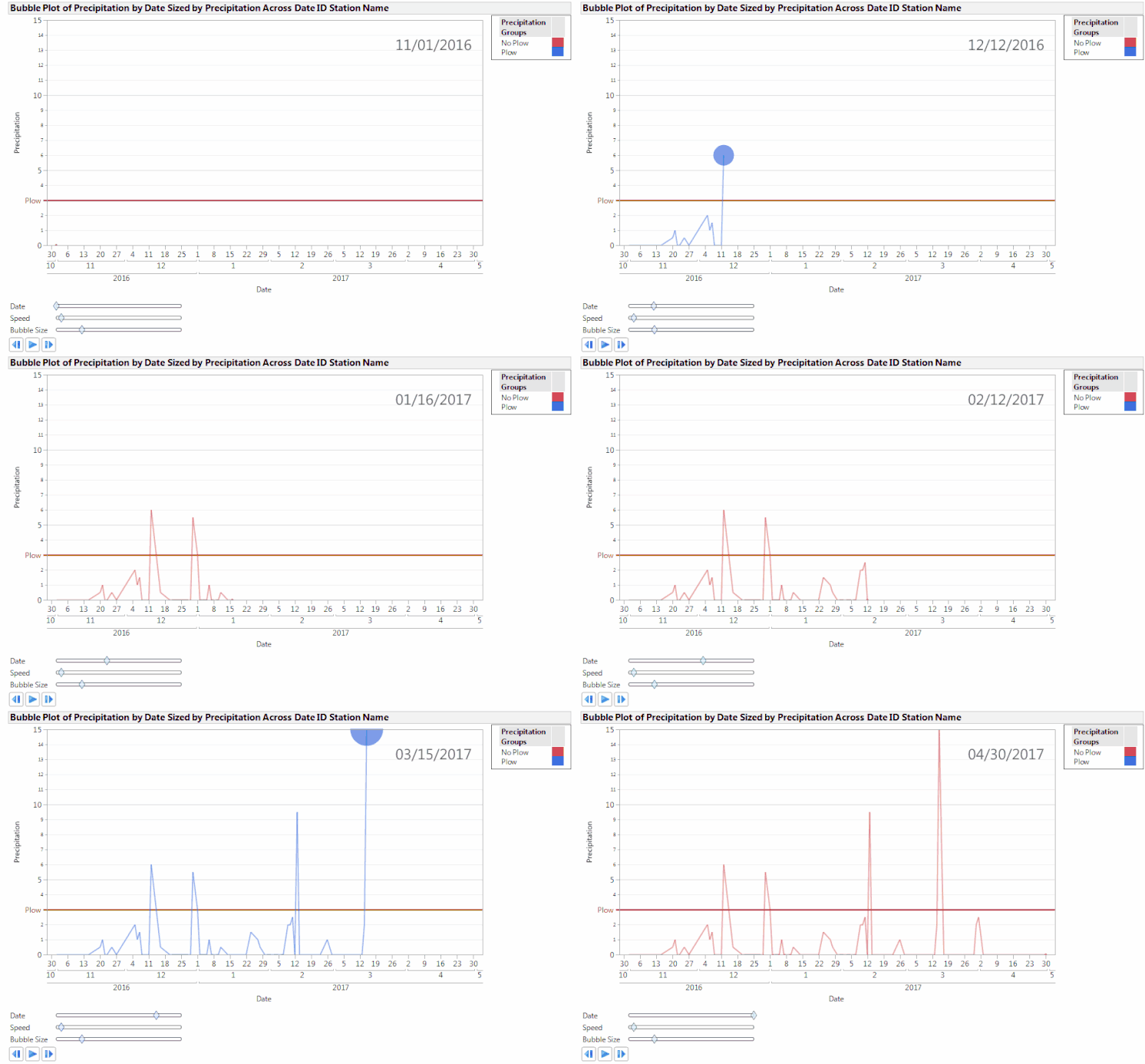
The first bubble plot is an animated time plot. When animated, it traces the daily precipitation and colors the line based on the how close the precipitation level is to the critical 3-inch level for plowing.
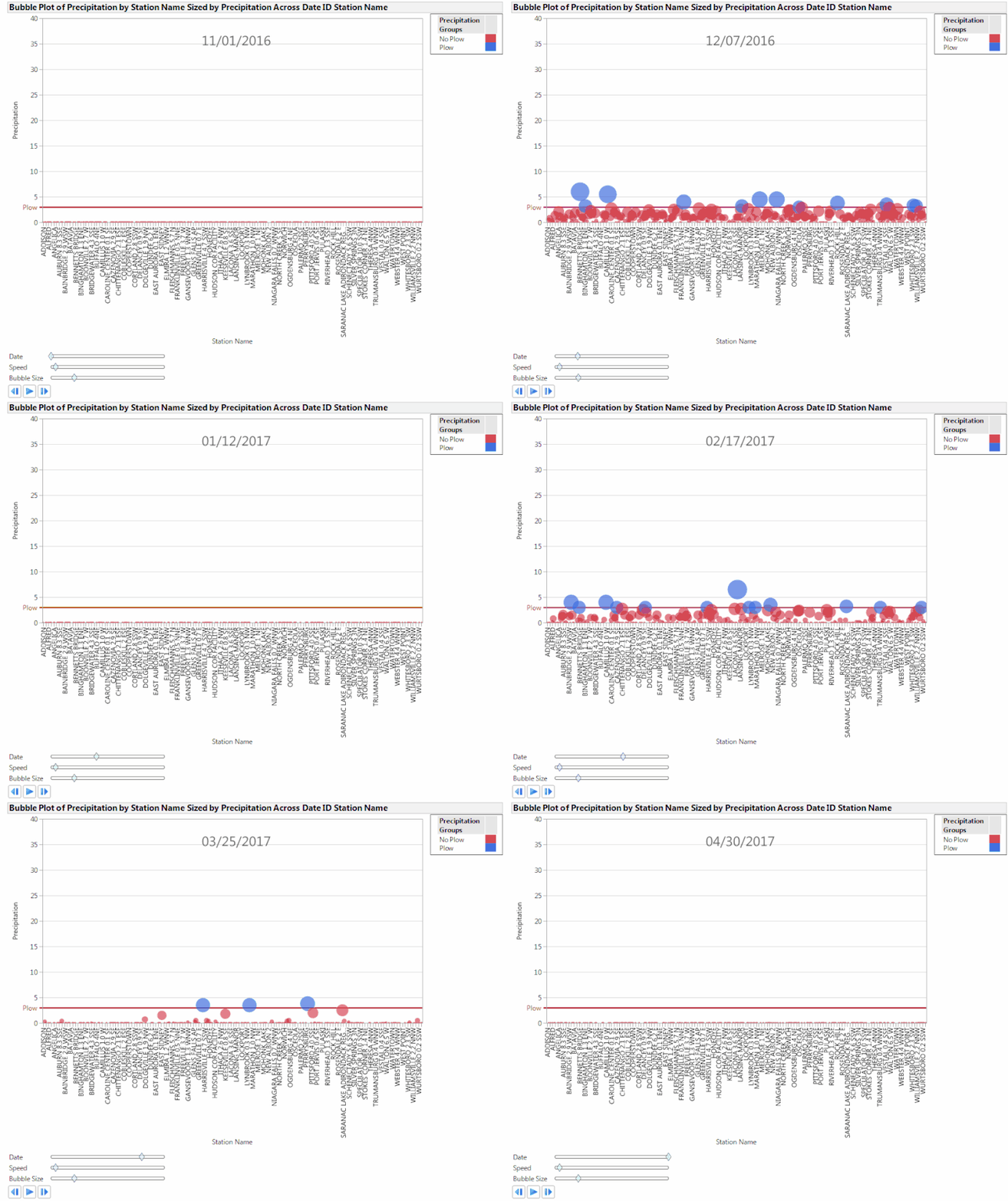
The second example shows all the stations in the data set, again with the daily recorded precipitation on the y-axis. In this example, I included the precipitation value as a sizing variable so the markers get bigger as the climb the y-axis.
The map example was created by locating the NOAA station coordinate list on the same site the data came from. I created a look-up table and used a virtual join to bring in the latitude and longitude for each station based on station name. Like the second bubble plot, the markers are sized by the daily recorded precipitation at a given station. The map isn’t particularly important for the original question, but when animated it provides an interesting visual for when, where, and how severe the snow storms in New York were during the 2016-17 winter season. For a little fun, see if you can locate the storm that allowed people to snowboard in Times Square in New York City (hint: it was in 2017).
Do you have fun questions or data sets that you’d like to have a systems engineer look at? Leave me a comment or message. Maybe we’ll turn this into a running thing.
A Note From The Author
For those of you reading this again, no you’re not crazy, the title did change a little. I received a request to update the title so that it would be easier for our search engines to find. I can only guess this is because some search engines are modern incarnations of 19th-century reference librarians with no sense of humor. Apologies for any inconvenience. -M
- © 2026 JMP Statistical Discovery LLC. All Rights Reserved.
- Terms of Use
- Privacy Statement
- Contact Us


You must be a registered user to add a comment. If you've already registered, sign in. Otherwise, register and sign in.