You may recall my recent blog post, Control Limits and Specification Limits: Where do they come from and what are they. Now that we understand the difference between control limits and specification limits, let's focus on control limits and the stability of a process.
Here, I will use Control Chart Builder to create a control chart, describe how the control limits are calculated and discuss how these limits can be used to make decisions about stability.
Stability or capability? Which one should be performed first?
Now that the differences between control limits and spec limits are clear, what should we assess first? Capability or stability? If your process is unstable or out of control, it will always produce unpredictable results. Since the results are unpredictable, the capability analysis will more than likely be inaccurate. Therefore, you should always check stability first.
Example
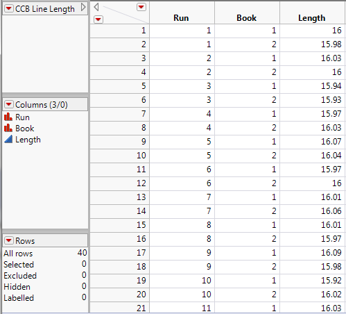
Let’s consider a printing process. Variations can cause distortion in the line, including skew, thickness, and length problems. For this example, let’s consider the length of the line. The line is considered good if it has a printed length of 16 cm +/- 0.2 cm. Any longer and the sentence may run off of the page. Any shorter and there would be a lot of wasted space on the page. For every print run, the first and last books are taken for measurement. The line lengths are measured on a specified page in the middle of each book.
Is this process in control (stable)? Are we getting consistent print quality? To answer these questions, we need to generate a control chart.
Creating a control chart
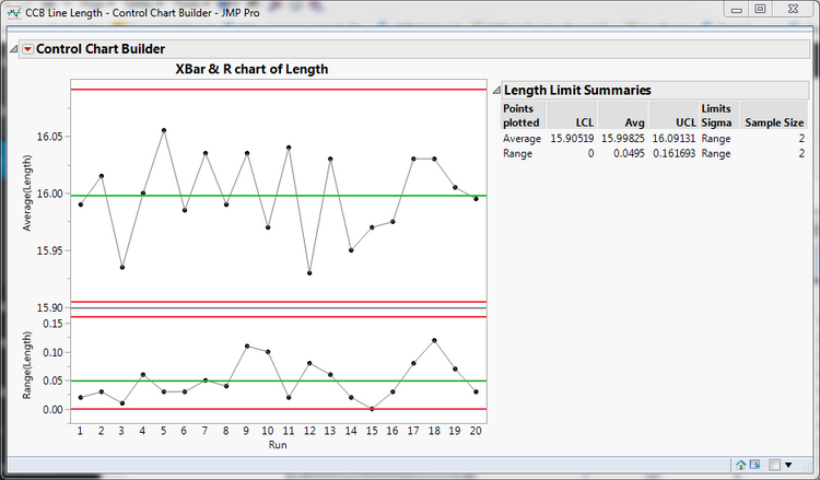
In JMP, go to Analyze->Quality and Process->Control Chart Builder. Drag Length to the Y drop zone. You are presented with an Individual & Moving Range chart of Length. This chart would be appropriate if you had no natural subgrouping in your data. Our example does have a natural subgrouping, which is Run. Drag Run to the x-axis (subgroup role) and drop it. You now have an XBar & R chart of Length.
Details
The XBar chart is typically referred to as the location chart. The R or range chart is typically referred to as the dispersion chart. Each of these charts has three lines drawn horizontally across them. These are the calculated LCL (Lower Control Limit), Avg (Average) and UCL (Upper Control Limit).
As I noted in my blog post on spec limits vs. control limits, control limits are calculated generally as follows x-bar +/- 3 * sigma-hat where x-bar is the average of the data and sigma-hat is the estimate of standard deviation for the chart. To see the specific control limit formulas for Shewhart control charts, including XBar and R, please read this FAQ.
I have often been asked why sigma does not match the standard deviation from the distribution menu item. Each type of control chart has its own method of calculating sigma. To see the specific standard deviation formulas for Shewhart control charts, please see this FAQ.
What does the control chart tell us?
Ideally, we would like for all of our points to fall within the control limits, and we would like for the points to be randomly placed within these limits. Looking at the graph, we see that no points fall outside of the control limits, and there does not appear to be a pattern to the points. There are a set of Eight Tests for Special Causes that are often used to check for patterns. These are often referred to as the Nelson tests or the Western Electric Tests. Let’s add these to our graph so we can see if any of these tests fail. Right-click in the location chart and select Warnings->Tests->All Tests. No points were flagged. This means our process is in control or stable.
Next steps
If we had determined that our process was not in control, we would do further research to figure out how we could alter our process so that it is in control. For this example, since the process is already in control or stable, we can skip that step and move on to determining whether or not the process is capable. Look for a future blog post about the capability of this example.