In my blog post "4 ways to use fixed/baseline (historical) control limits in Control Chart Builder", I discussed four different methods of entering historical control limits. In this particular blog post, I will specifically discuss setting historical limits for a control chart when there is a phase variable involved.
The column property, set control limits, and excluded row state methods will not work in this scenario because JMP only allows one set of control limits to be defined for the entire chart using these methods. The only method that works for a phase control chart in which you want different limits for each phase is the get limits method. This blog post goes into detail about the get limits method with respect to a phase control chart.
Example
In my blog post "Generating control limits using Control Chart Builder," I introduced a printing process. For the purposes of this blog post, the printing company wishes to reduce the variability of the force needed to break the bond between paper and the book spine. They want to do this for each of three different factories. A new process is decided upon based on a designed experiment. Data is gathered from the new process. The goal is to plot the new data on a control chart with historical limits from the old process. This way, the printing company can compare the new process to the old process limits.
Each factory has different machines, different operators, and is also located in different countries; therefore, each factory has a unique set of historical limits and information. Historical control limits were calculated with old data (before the process change). This phase control chart can be seen below.
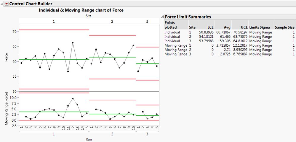 Figure 1: Phase control chart with historical data
Limits Table
To use the get limits method, we must have a limits data table. Three columns are needed in this limits table:
- A _LimitsKey column, which defines the statistic.
- A column with the same name as the process variable that contains the value of the statistic listed in the _LimitsKey column.
- A column with the same name as the phase variable that contains identifying information about which phase the statistic applies to.
JMP 13.1 and above will create this table for you if you click on the red triangle next to Control Chart Builder and choose Save Limits -> in New Table. For versions of the software prior to JMP 13.1, you can easily create this table yourself from the Limit Summaries table of a Control Chart Builder report. To create this table, right-click in the Force Limit Summaries table shown in Figure 1 and choose Make into Data Table.
 Figure 2: Force Limits Summary table
You will need to perform some data table manipulations to get this table in the proper format. Choose Tables->Stack. Select LCL, Avg, and UCL and click Stack Columns. In the box next to Output table name, type Force Limits. Change the Stacked Data Column name to Force.
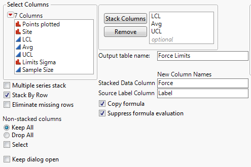 Figure 3: Stack dialog
Click OK. We need to create the _LimitsKey column. JMP is looking for _LCL, _Avg, and _UCL rather than LCL, Avg, and UCL. For the dispersion chart, JMP is looking for _LCLR, _AvgR, and _UCLR. We can do this using a formula. In the newly created Phase Limits Table, select Cols->New Column. Name the Column _LimitsKey. Click Column Properties and select Formula. Enter the following formula.
 Figure 4: Formula for the _LimitsKey column
Click OK.
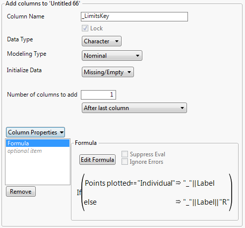 Figure 5: New Column dialog
Click OK. Your new limits table should look like the following.
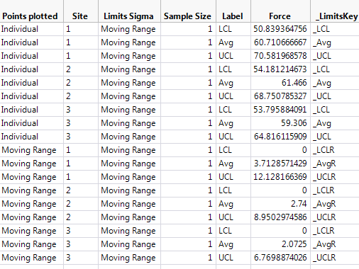 Figure 6: Force limits data table
Phase control chart with historical limits
A change has been made in the process that the printing company hopes will reduce the variability of the force needed to break the bond between the pages and the spine of the book. We have a new data table that contains 70 rows of data that were recorded after this change was made. We would like to use the historical limits on the new graph so that we can see how the new data (after the process change) compares with our historical information (before the process change).
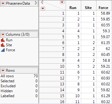 Figure 7: Data from new process
To create the control chart, go to Analyze->Quality and Process->Control Chart Builder. Drag Site to the phase role. Drag Force to the Y role. Drag run to the x-axis.
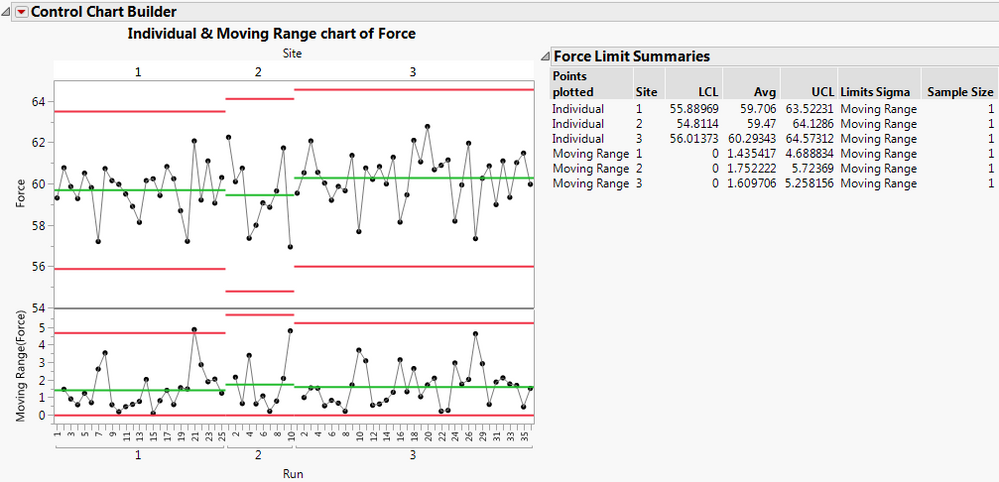 Figure 8: Force control chart with new data
To apply your historical limits to this graph, click on the red triangle next to Control Chart Builder and choose Get Limits. Pick the Force Limits.jmp table that you created in Figure 6.
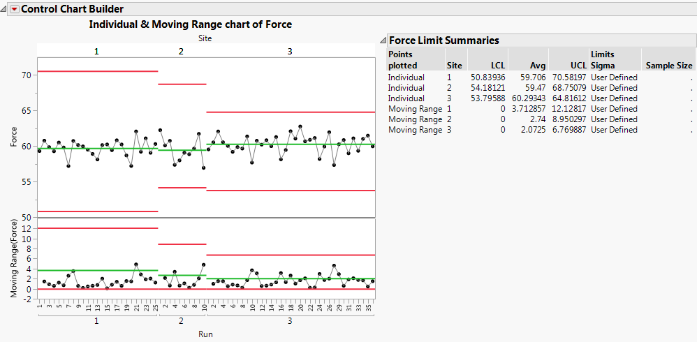 Figure 9: Force control chart with historical limits
Conclusions
None of the points fall outside of the control limits for either the location or dispersion chart. The goal was to reduce variability. Looking at the moving range chart, we see that most points fall below the average line. Especially for sites 1 and 2, it is clear that the variability of force needed to break the bond between pages and the book spine has been decreased. Site 3 is not as obvious as sites 1 and 2. It appears that the variability may have been reduced some. However, it is unclear if this is a significant change or not. The improvements to the printing process have succeeded in reducing the variability.
References
JMP Software: Statistical Process Control Course Notes